Design of Residential Space

Projet
Introduction
.
Residence 0110 is the refurbishment of my own apartment. It is located in the Poble Nou neighborhood, Barcelona, where the ‘Cerdá Eixample’ begins to be disfigured, and where recently the 22@ district is introducing contemporary architecture in clear contrast to the area's industrial past.
The apartment is located on a high floor of a chamfered block, facing south-east, which benefits from the proximity of the train tracks to extend its views up to the Montjuic mountain. The existing state presented a house developed according to two bays parallel to the façade, both very narrow, barely 3m, with a sequence of very small rooms in each bay, without any interest, and impossible to adapt to contemporary living habits.
The project is the materialization of the architecture with which I feel comfortable and with which I like to move forward: simple geometric figures that in their spatial composition create complex environments, in which construction, together with material codes, ends up defining and filling in the spaces, blurring their limits.
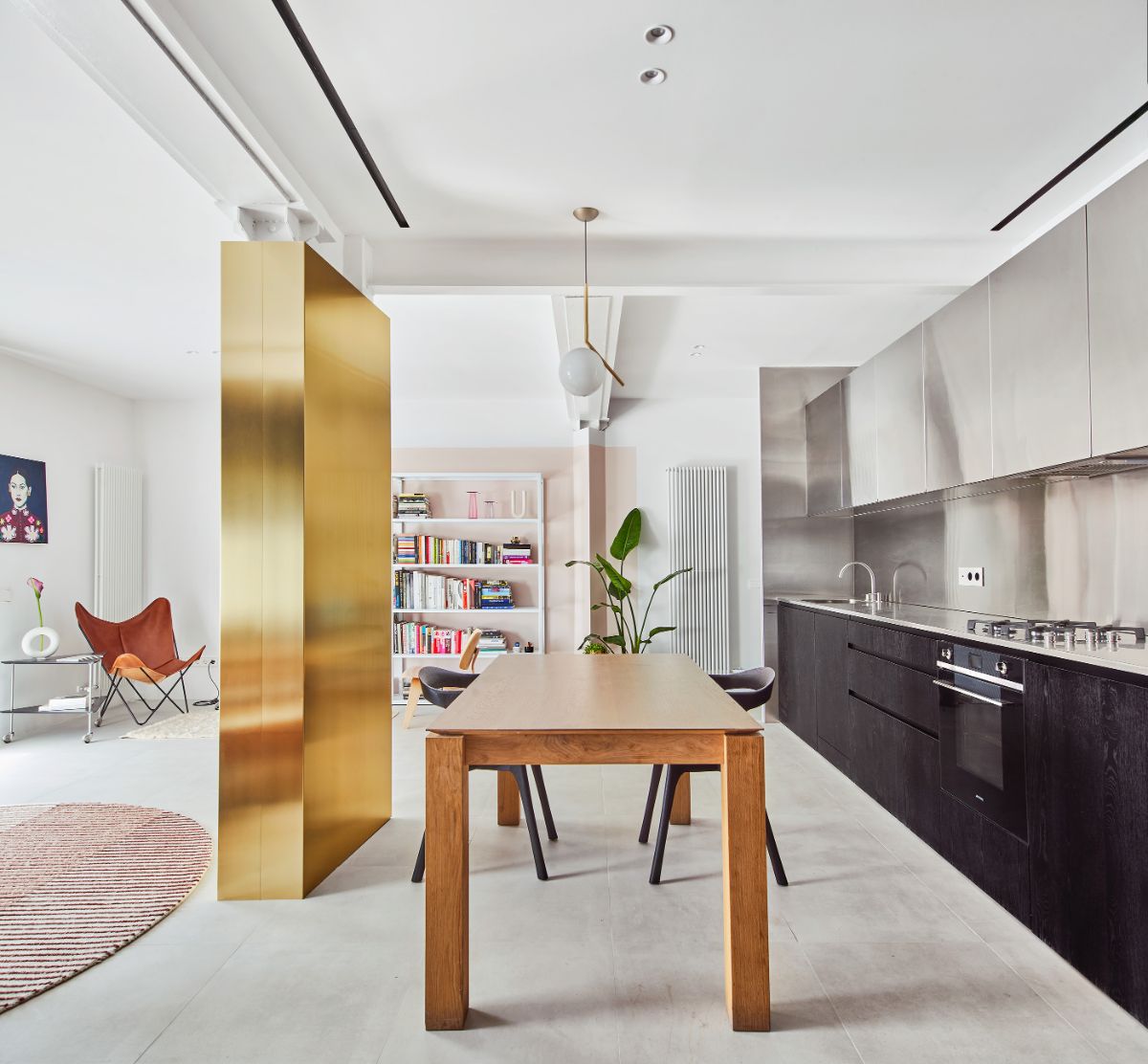
Thus, the project is a perfect square, 6.15m on a side, and a right triangle that makes the transition / turn of the chamfer. There are only four rooms, as in the villas of Palladio, who considered that four rooms were enough for a house.
The square is the central space of the residence, which brings together the kitchen, the living room and the dining room, and freer spaces for the library, reading area, play area ... It is the space that is intended to be the heart of the house. This figure is inserted by knocking down the structural walls of the house, carrying out an important work of structural reinforcement, of which a corner of the old walls remains, almost centered, necessary for structural reasons, but also for spatial ones. This corner/pillar is a subtle division between the kitchen/dining area and the rest of the space, it is a very small limit, but enough to hint at a possible use of the spaces. Adjacent to the square is the triangle, with no physical separation between the two, but the lower ceiling indicates a transition of spaces. This triangular space gives direct access to the rest of the rooms: the two bedrooms (one with an en-suite bathroom) and a second bathroom.
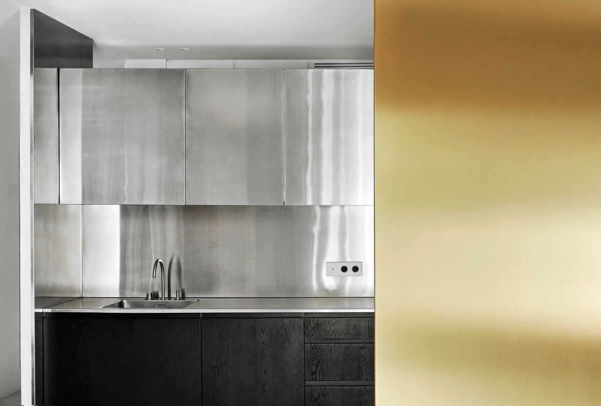
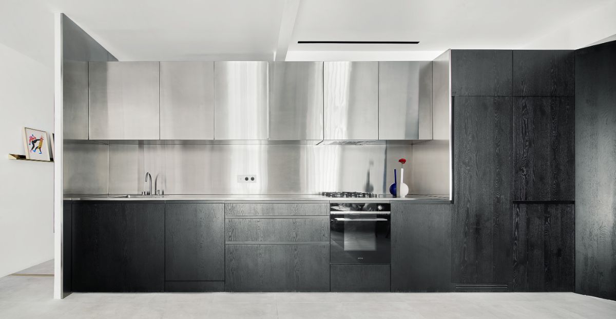
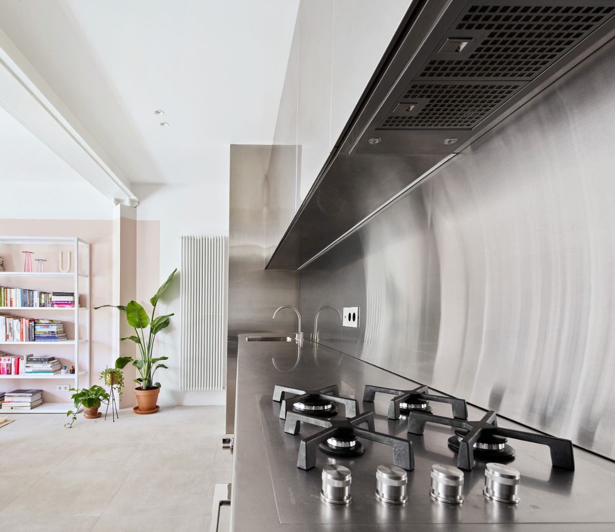
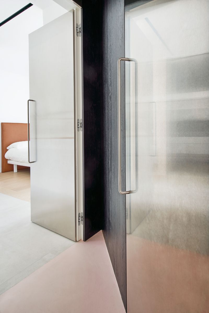
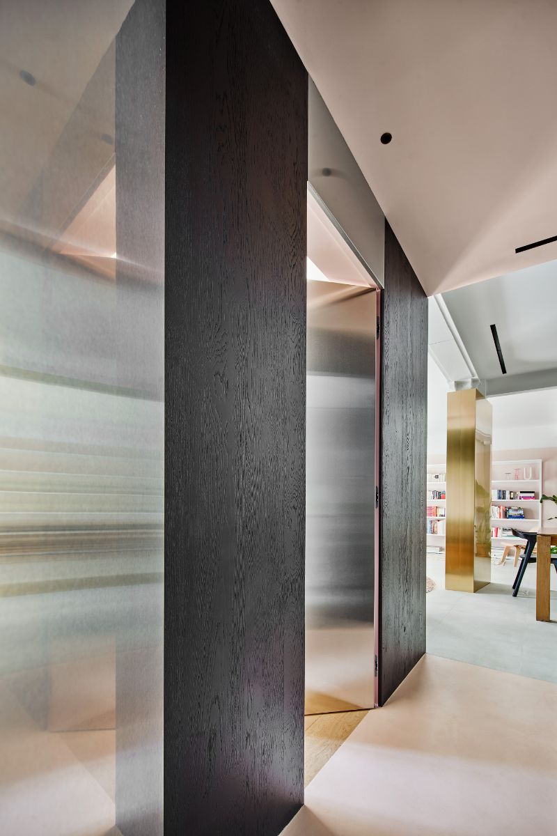
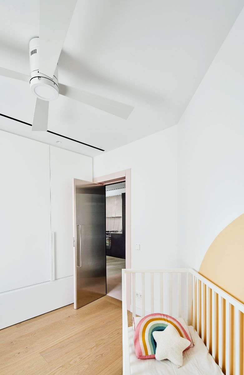
Given the simple spatial distribution, the materials come into play to multiply the sensations and increase the spatial complexity. A continuous strip of oak wood stained black with an open pore runs through several walls of the square space, up to the height of the triangle, entering it and finishing off the lower part of the kitchen. Thus, it is the material that unites initially separate spaces, and assimilates different functions with the same texture. This wooden stripe is interrupted by the doors of the rooms, made of stainless steel, flush with the wood, and this same material finishes off the upper parts of the kitchen. The rest of the environment in the central space is mostly painted white, with the exception of the wall of the bookcase, with a trimmed background of pale pink, which is the same color that is found on the floor and ceiling of the triangle. As a remnant/vestige of the existing structural system, the central pillar is covered with brass, again up to the height of the false ceiling of the triangle, highlighting the importance of this element as a configurator of the space, but also as a structural support for the reinforcements executed.
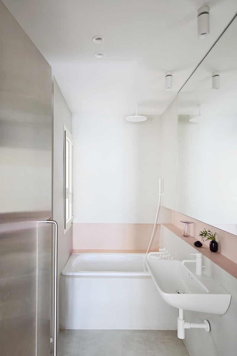
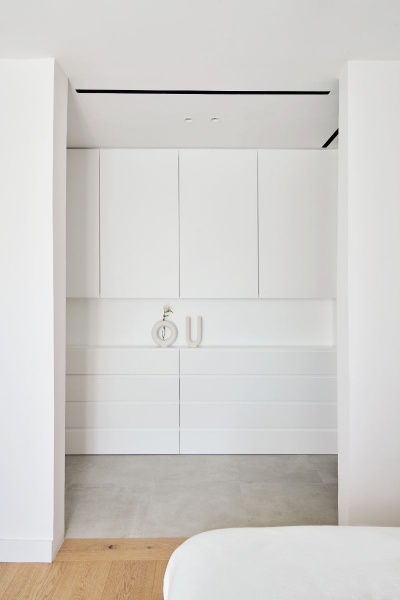
The bedrooms are accessed by going through the stainless steel doors, and entering spaces where white is the protagonist, next to the natural oak wood floor. The bathrooms play with the dominant materials and textures: gray microcement wall finishings, pale pink accents, and black macondo marble.
Conceptually, the triangle is the generator of the spaces, establishing the rotation of the plant, and this formative idea, the triangle, the diagonal, is reproduced in a multitude of minor details: the central brass pillar is actually a trapezoid with one side in diagonal; specially designed brass furniture repeats the triangle motif; the access door to the en-suite bathroom, a large pivoting door in brushed stainless steel, is divided into two parts to provide privacy, by means of a diagonal that draws a triangle, as is the case with the cutting of marble in the same bathroom. Even the layout of the 60x60 tiles in the central space, to resolve the 615cm length, draws a diagonal with interleaved 15cm pieces.
Much of the furniture has been designed for this project, such as the brass pieces, the marble washbasin, or the sofa itself, in natural leather, which is another architectural element, solving a corner. The rest are fetish pieces for me, like the BKF chair, the LCW armchair by Vitra, the pull handles by Knud Holscher, or some pieces by Arne Jacobsen.
Black wood, brass, stainless steel, pink colors, white, black marbles, leather, cementitious surfaces, form a sober and elegant universe, but at the same time with playful and fresh counterpoints, reflective and matt, smooth and rough, simple and complex.
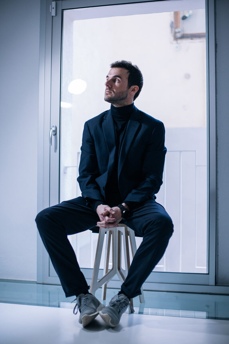
Design by Raul Sanchez
Raúl Sánchez graduated architect from the architecture school in Granada, Spain. Since 2005 resides and works in Barcelona developing a professional activity which escapes specialization in order to cover all types of work and projects related to architecture, interiorism and design.
He is professor in ‘private perimeters’, a postgraduate diploma in interior design in Elisava School of Design, Barcelona.
The work of the office has numerous awards and is published worlwide in printed and online media.
Our approach to architecture and design is based on the encounter of humanism+technique: the former relies on the world of ideas, on the conceptual and cultural focus, while the latter brings the constructive coherence, the grammar, into the equation.
We don’t work with methods, we use no preconceived formulas, we just work with the space, and the space is the conjunction of material, construction, structure, light, color, texture… and thus, each new project is a new challenge


