Design of Real Estate Sales
Projet
Introduction
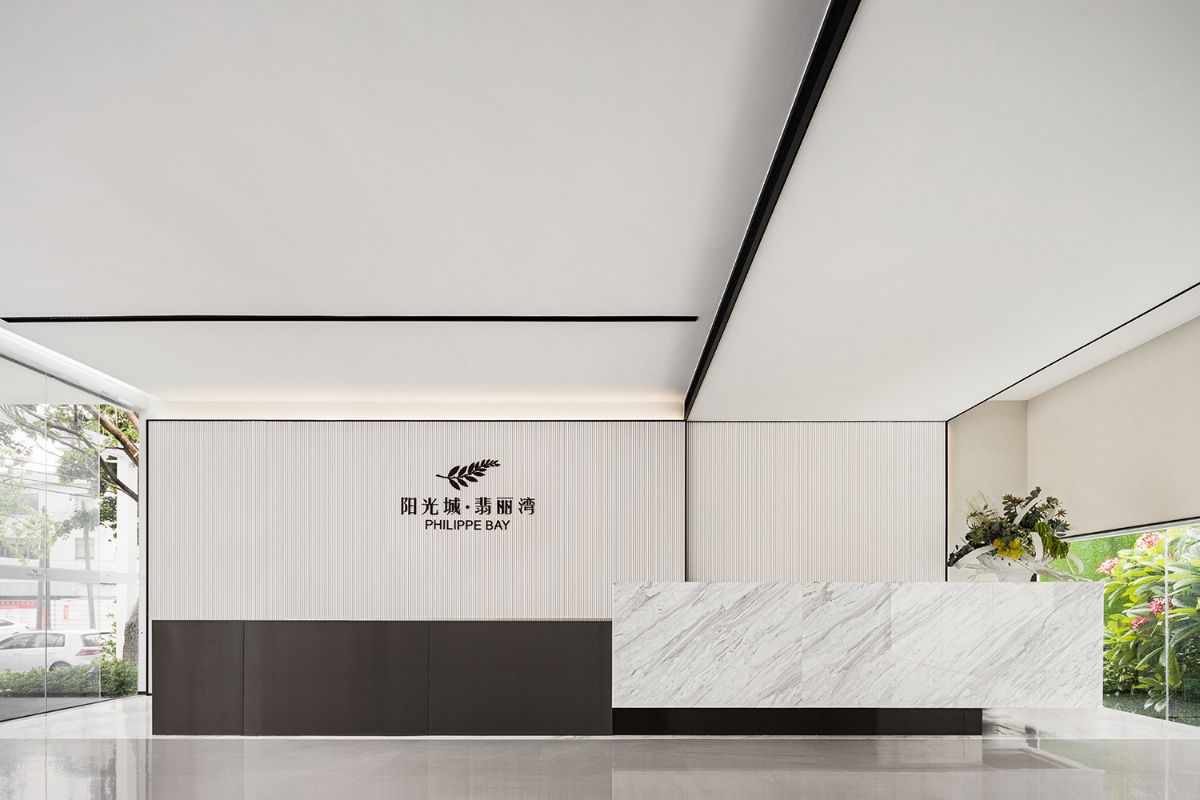
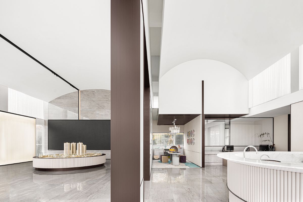
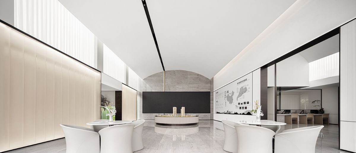
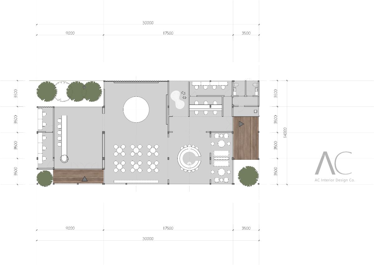
The marketing center is 338 square meters. It is also a great challenge to integrate every function into the building perfectly. The advantage lies in the integrated design of architecture and interior, because the two design tasks of architecture and interior are both challenges and opportunities, which can fundamentally avoid the contradiction between architectural space and interior space. The design began to divide the entire plane. It is necessary to ensure that the reception area has sufficient depth and that the sand board area is empty based on the opening of the space. The water bar area should be connected with the negotiation area, the sand board area, the VIP line of sight and the line of sight. Also put down the functions of cash register, children's activities, and bathroom, this 338 square meters has no waste of an inch of space, and the material is extremely useful!
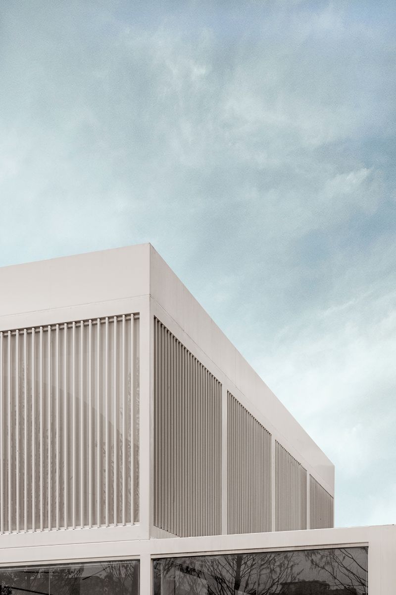
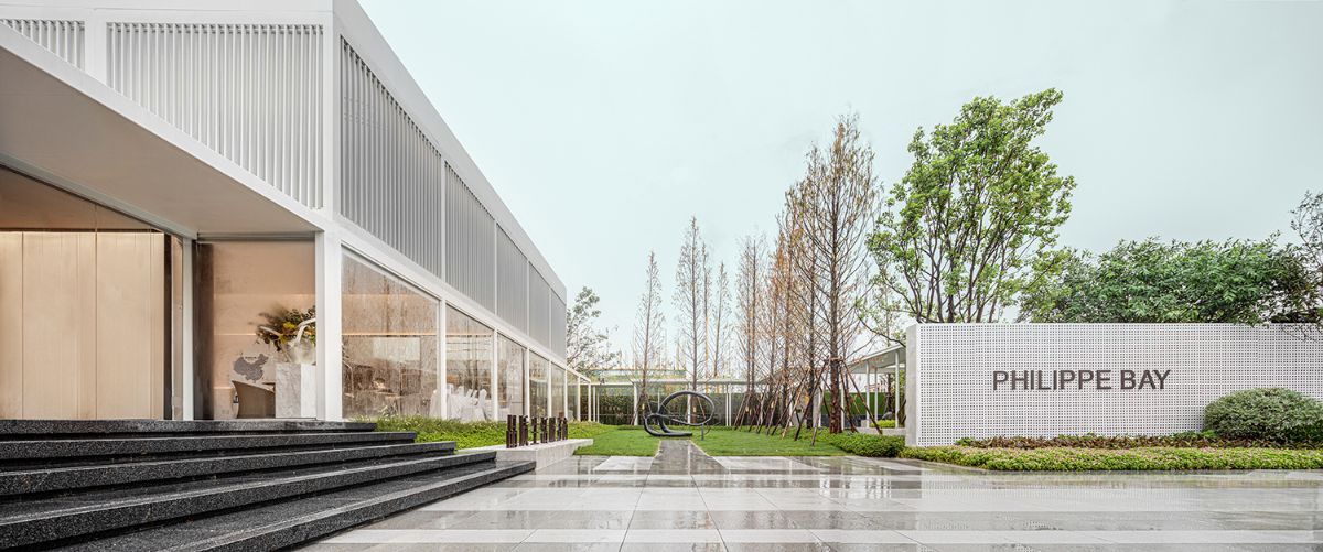
Through the interspersion of building blocks and the interconnection of natural landscapes, in order to better integrate the interior design, the interior color uses a large area of white as the background color, and the ground stone uses light gray as the adjustment color. The reception desk, ceiling, wall dividing line and closing materials are made of dark brushed stainless steel, which outlines the outline and edges of the space, so that the entire space presents a three-dimensional effect, and the color relationship makes the entire space light and stable.
The sand board area has achieved the effect of double-layer emptying in the treatment of the building. The layering of the entire space is richer and full of tension. In order to break the fixed pattern of straight-block-line in the entire space, the suspended ceiling is combined with the golden ratio through minimalist processing techniques. The arc makes the whole space full of agility and lightness without destroying the coordination of the whole space, which is the finishing touch.
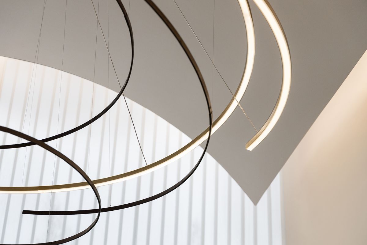
Above the water bar area is surrounded by a chandelier, which is graceful and colorful, injecting vitality into the entire space. The chandelier echoes the shape of the water bar. The color of soft furnishing furniture in the negotiation area uses beige as the background color, and the ornaments and floral art are embellished with a light jump color, and the color relationship of the entire space is harmoniously matched.
The design opens a window for the children's activity area, and the whole main line runs through the beginning and the end. The borrowed scenery in the lobby, the borrowed scenery in the sand board area, and the borrowed scenery in the children's activity area continue intact. With the "scene" and the "light", I feel a light hitting you, not just a light but also a share' Warmth and strength.

Design by AC Studio
之晏设计(AC Studio)由昌影女士于2016年6月在上海创立,是一家年轻且充满活力的公司。公司主要服务于包括:阳光城、金隅、建发、融信、路劲、置地等国内各大地产公司、企业办公室及高端私宅客户。

