Design of Commercial Space

Project
Introduction
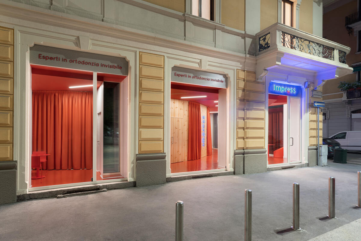
The Impress Milano clinic is located in a privileged location, on the corner, facing south, in a well proportioned space.
The Impress dental clinic concept is aimed at a young audience, which has grown with new technologies, since its offer is based on online treatments that reduce face-to-face visits. From the first moment, Impress looked for a fresh design, that represented the brand and its values, that moved away from the clichés of a dental clinic (white colors, aseptic environment).
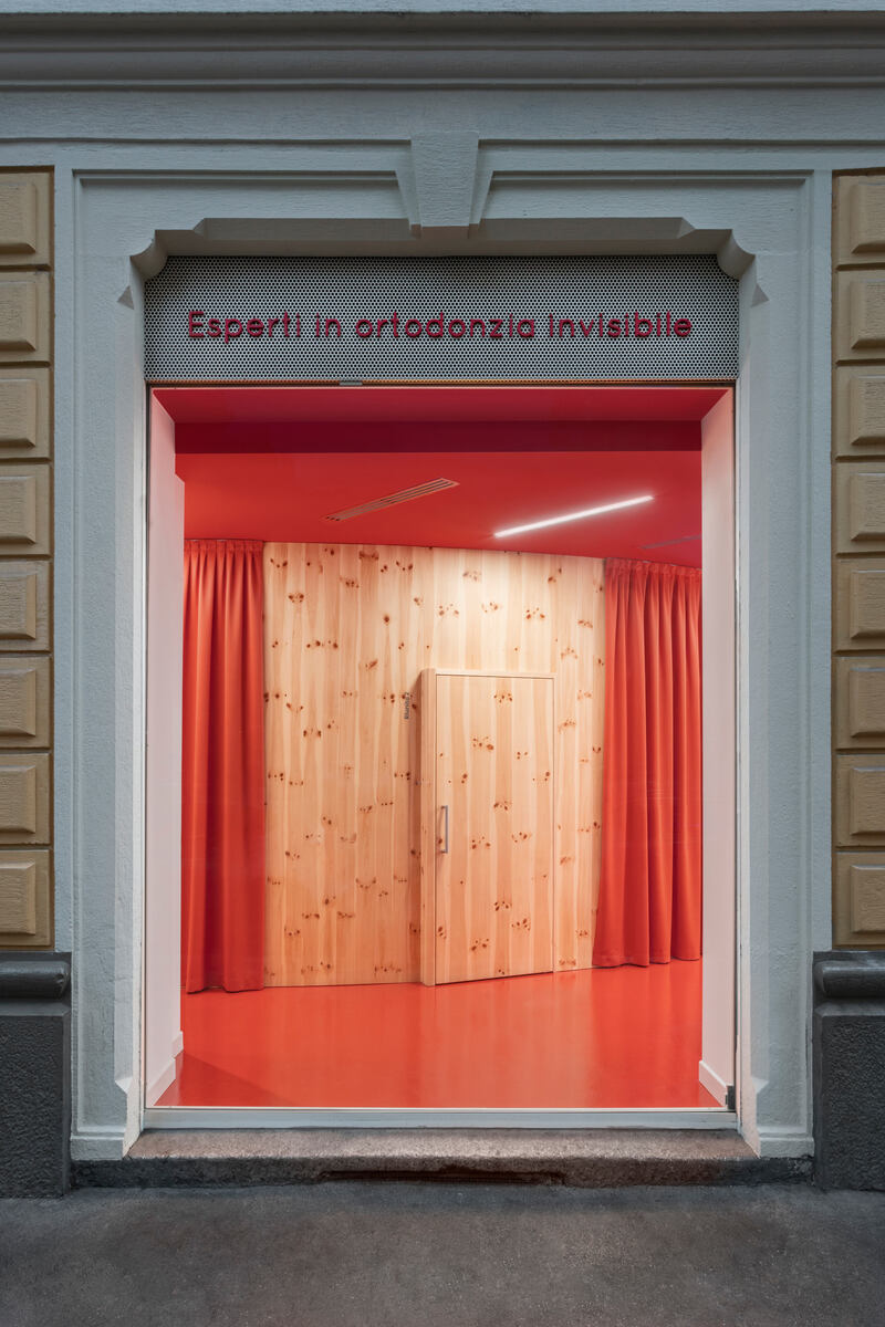
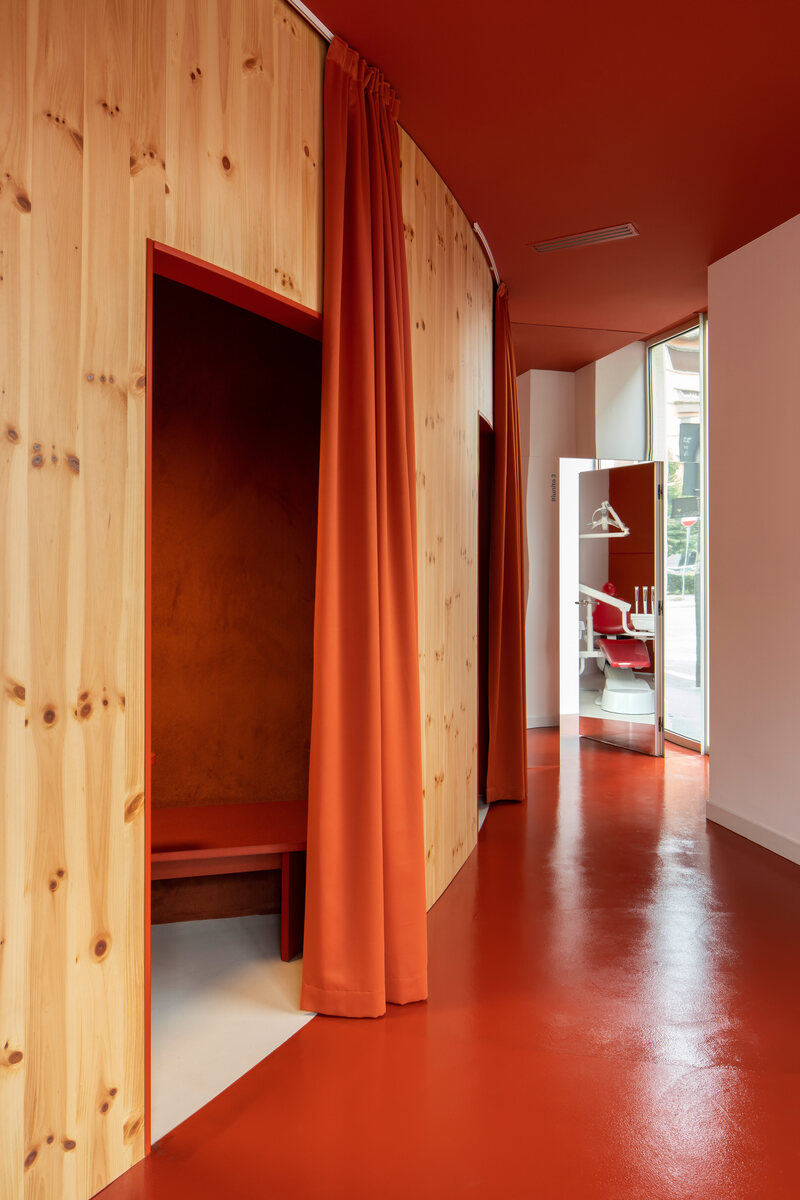
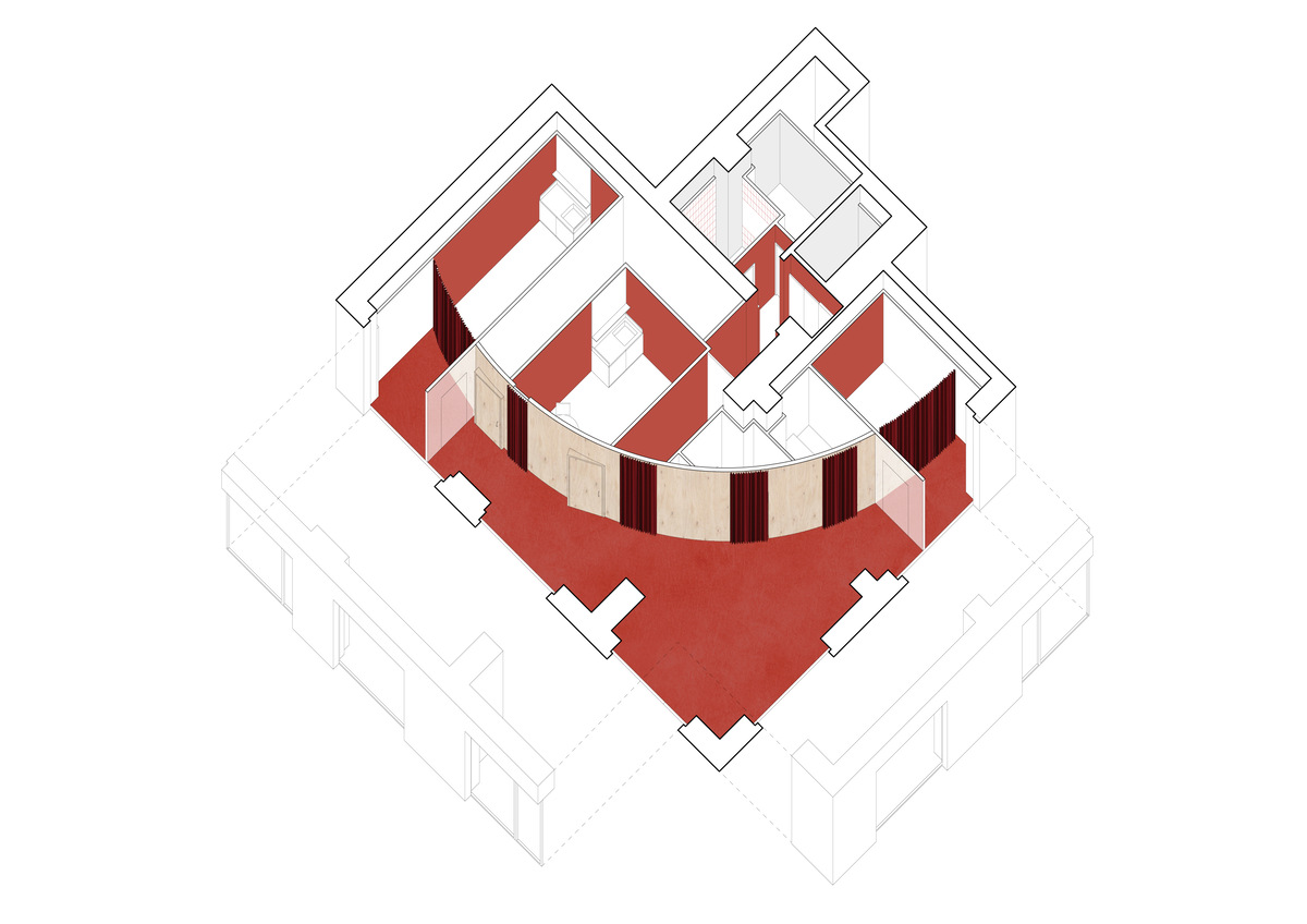
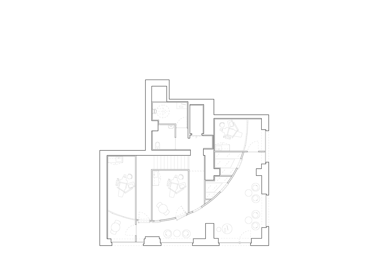
The design takes into account the values of Impress and solves the entire program through a single gesture that organizes all the spaces: a single curve runs along the inteior accompanying the turn of the corner, encompassing all the functional spaces towards the interior, and freeing the area in contact with the facade to function as a waiting room or reception, allowing a global view of the interior from the street.
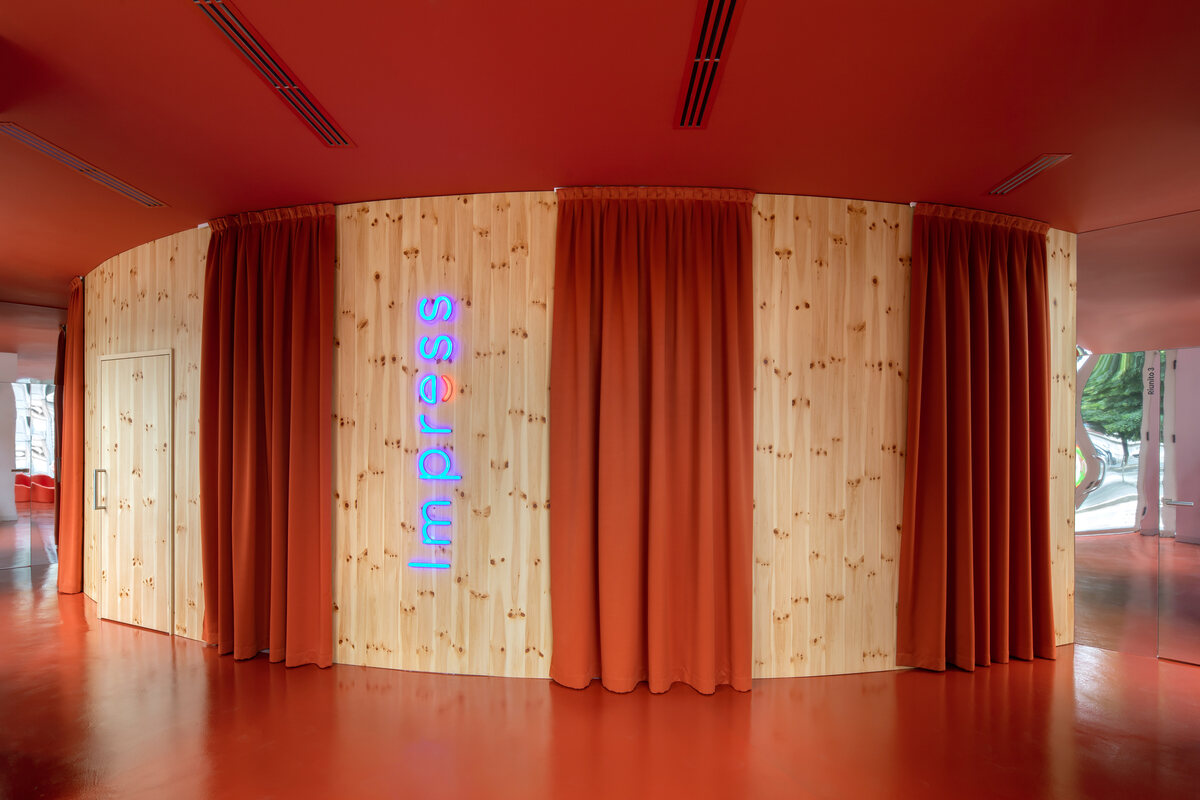
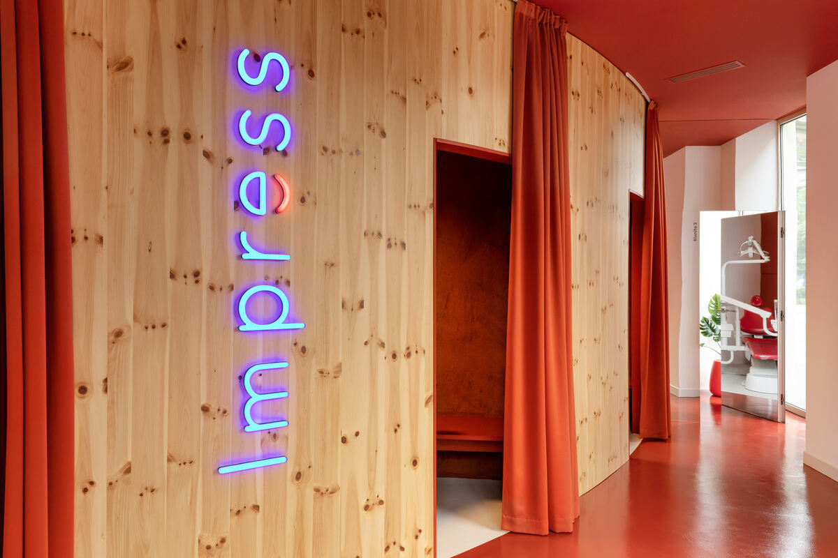
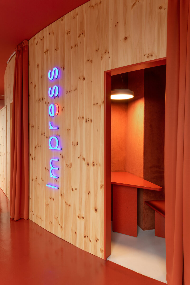
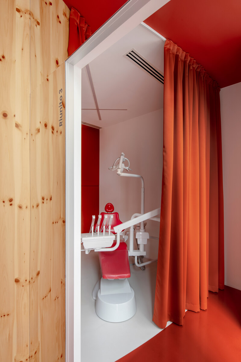
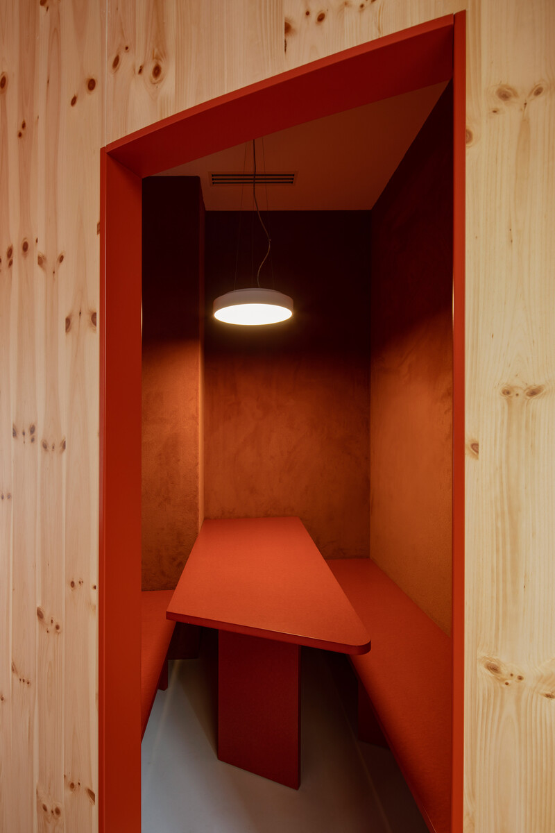
The curve itself is the abstraction of the Impress logo. In this way, the clinic is represented towards the outside in a very abstract way, since there are no clues about the use of the rooms, and at the same time very theatrical, where red color dyes floors and ceilings, and is repeated in the curtains which subtly enclose the small spaces that function as sales points, also cladded with red carpet on the walls, and with the furniture resolved with MDF boards also colored in red.
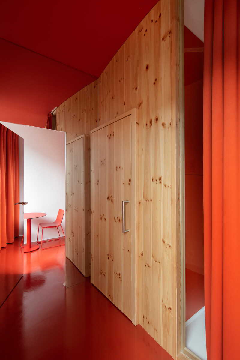
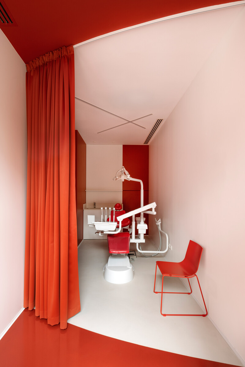
The curve is materialized in pine wood, giving, on the one hand, warmth to the whole, but also material refinement. When entering the cabinets, when crossing the line of the curve in plan, the colors shift, reds turn white and vice versa, highlighting the transition between different ambiences by means of the material code. This is specially outlined in the two dental boxes at both ends, where the wood curve is interrupted and continued by curtains, creating gathering spaces towards the street and treatment spaces towards the interior.
This representative and theatrical aspect not in vain refers to Teatro alla Scala in Milano, resolved in the same tones.
All ceiling elements are rotated 45º, again echoing the corner position; mirrors cladd doors and duplicate the spaces, again adding complexity to the interior spatial experience; the furniture is always red; the dental chairs are red and white… all the elements have been taken care of in detail to reinforce the conceptual and material coherence of the design.
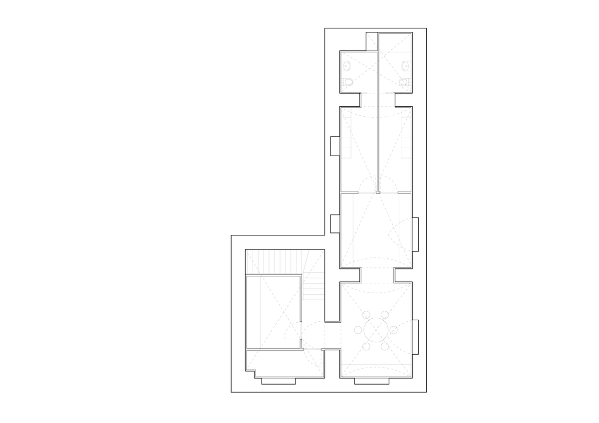
The rest of the rooms, more functional, such as dressing rooms, sterilization room, staff room, are resolved in the basement.
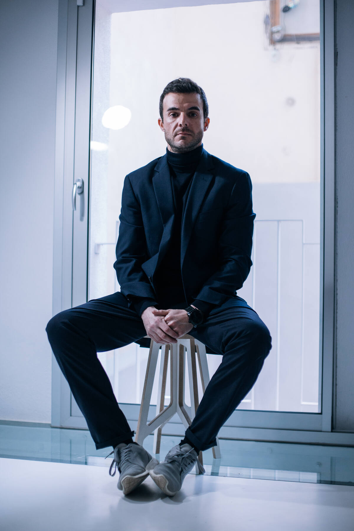
Design by Raúl Sánchez
Raúl Sánchez graduated architect from the architecture school in Granada, Spain. Since 2005 resides and works in Barcelona developing a professional activity which escapes specialization in order to cover all types of work and projects related to architecture, interiorism and design.
He is professor in ‘private perimeters’, a postgraduate diploma in interior design in Elisava School of Design, Barcelona.
The work of the office has numerous awards and is published worlwide in printed and online media.
Our approach to architecture and design is based on the encounter of humanism+technique: the former relies on the world of ideas, on the conceptual and cultural focus, while the latter brings the constructive coherence, the grammar, into the equation.
We don’t work with methods, we use no preconceived formulas, we just work with the space, and the space is the conjunction of material, construction, structure, light, color, texture… and thus, each new project is a new challenge


