Design of Commercial Space
Projet
Introduction
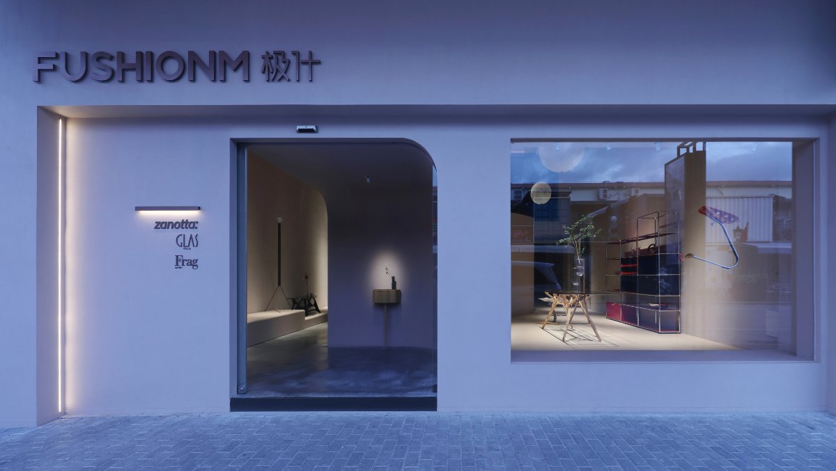
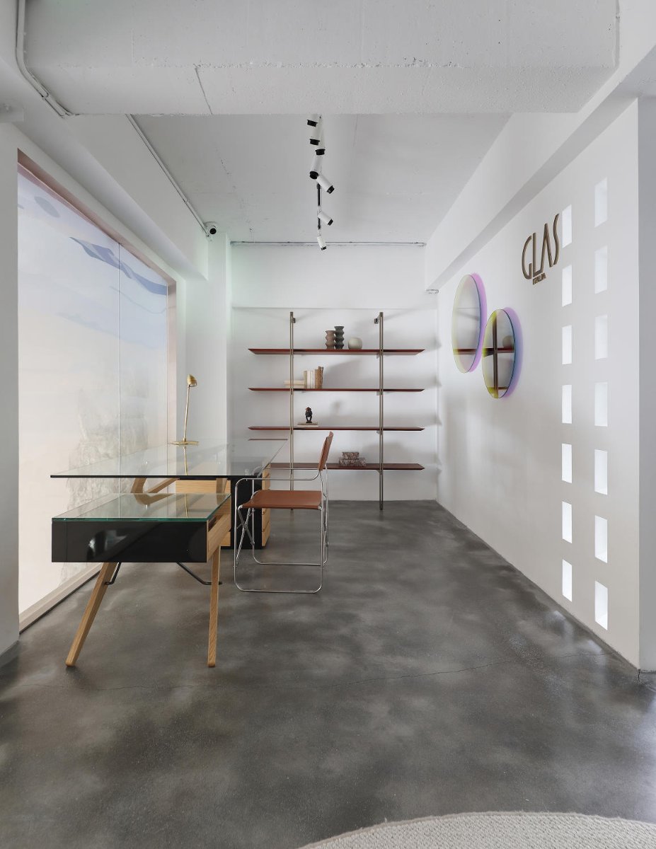
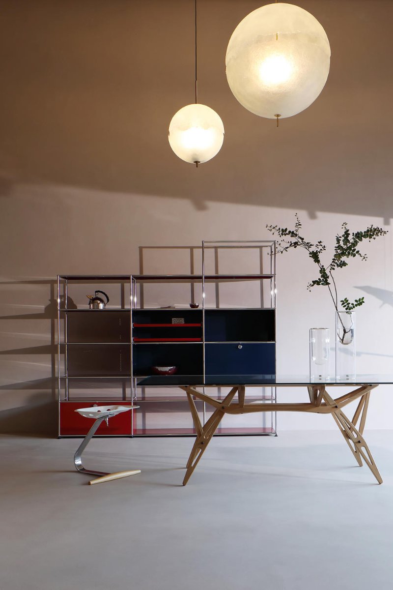
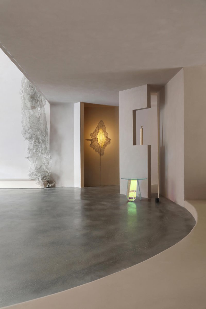
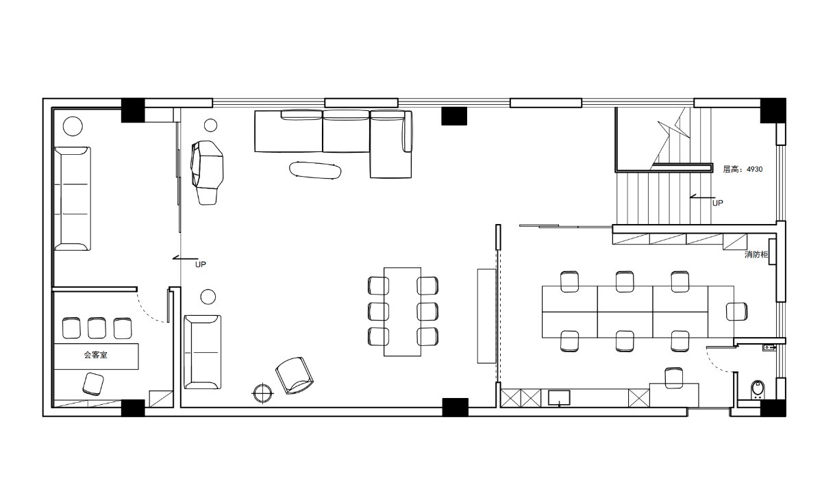
This space is called Fushionm. It is a furniture shop rebuilt from an old factory in Amoy. The designer takes the private museum as the design concept, and the space layout is open and independent. It is like entering a contemporary art museum intertwined with longitude and latitude, which brings visitors a feeling and impression of visitors.
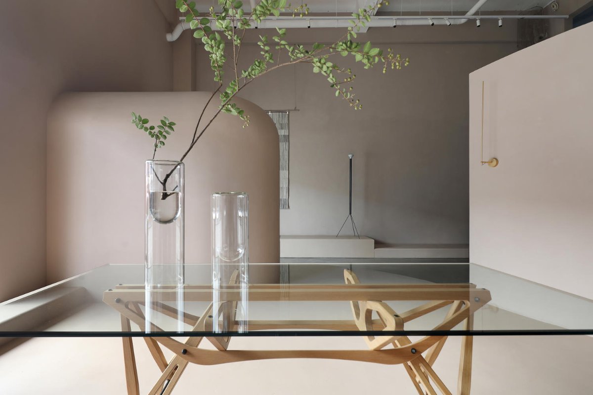
A large area of micro cement and plaster on the wall and floor are used together. The light is introduced from outside the window, and the light and dark atmosphere continues to spread in the warm space
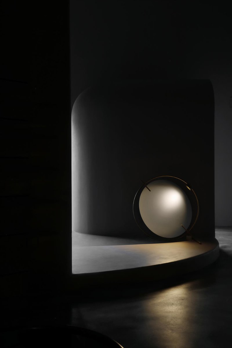
The beauty of space continues to appear. A semi closed space plays a guiding role. It is the beginning of the expansion of the whole space. The gentle radian indicates that a new world will be displayed in front of us.
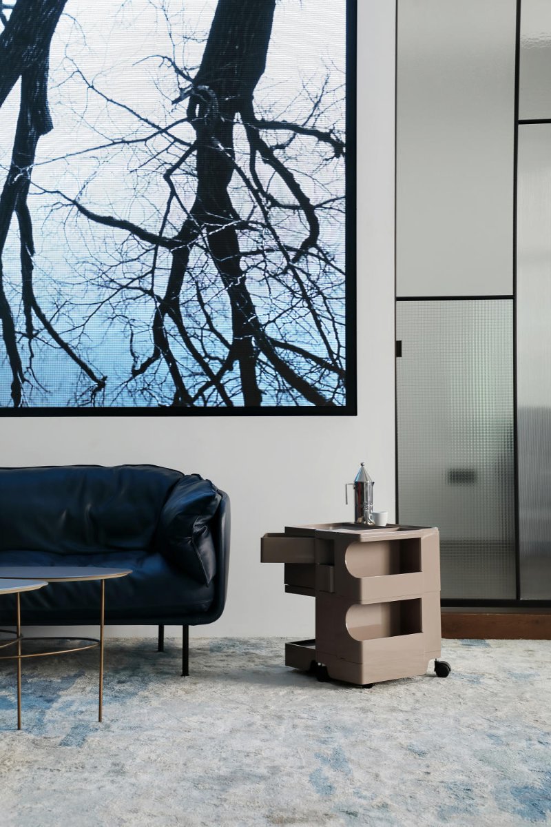
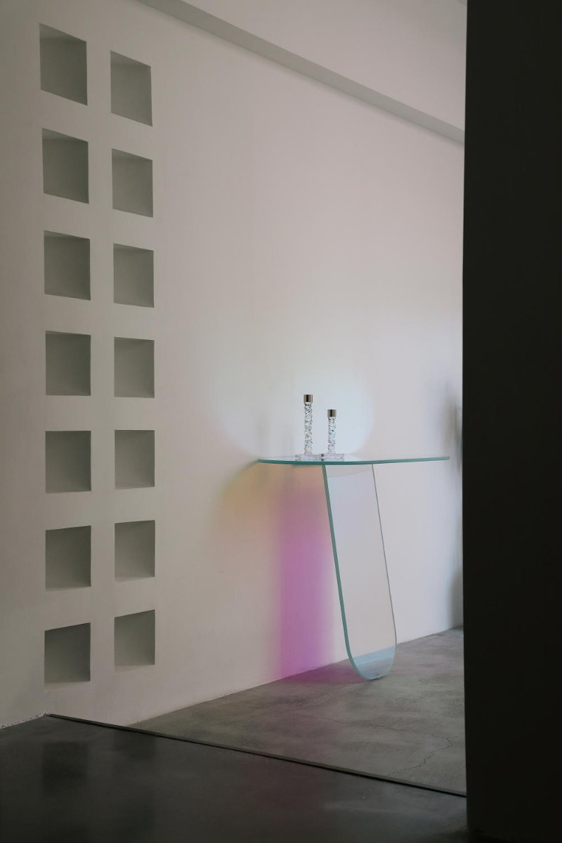
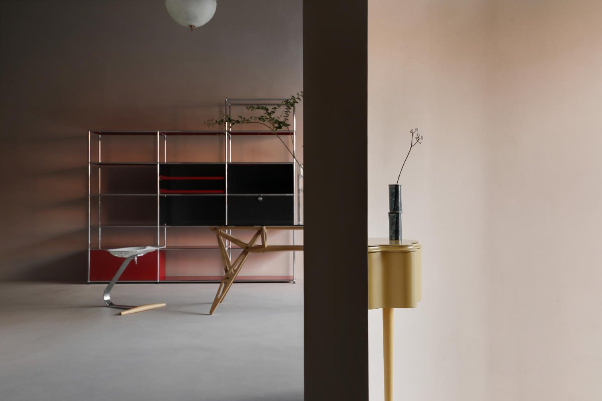
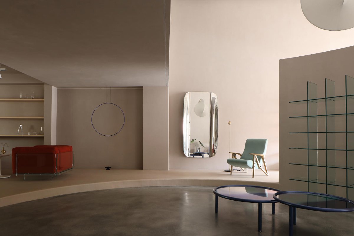
The exhibition areas with different scales are intertwined and unfolded slowly. Each area welcomes visitors with different attitudes. Light, it tells the space in its own language. It has a gentle shape and the interweaving of light and shadow. The whole space always exists in a strange way. It is not noisy, does not dominate the host, and is calm and comfortable, which is unforgettable.
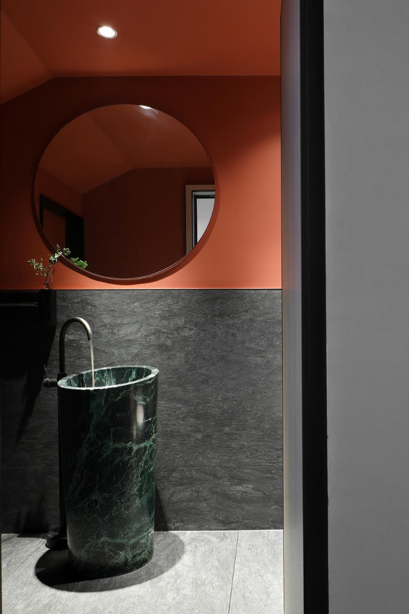
The half high arc wall in the center is like the curtain slowly opened on the stage. It is a partition but not a separation. There are protagonists in front of and behind the scenes. The sharp edges between the square and the circle are in charge, and the arc curves and sharp right angles are intertwined. The introduction of light promotes the construction of visual moving line, and the relationship between light and shade endows the spatial color tone with rich connotation.
Geometry, light and shadow are the eternal design propositions of artists and architects. If light is a work of art given by nature, then geometry is a vessel for holding works of art. It is such a simple but aesthetic thing that can directly attack the heart and capture the soul.
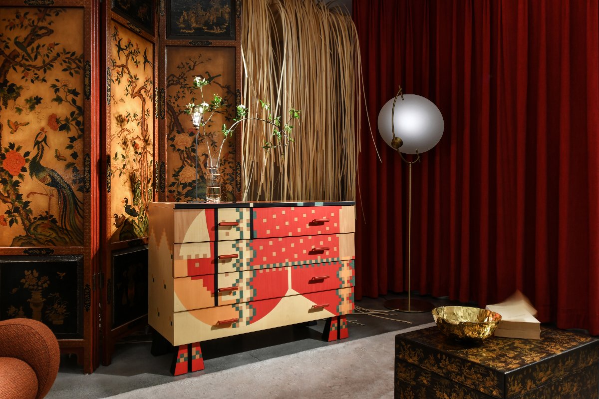
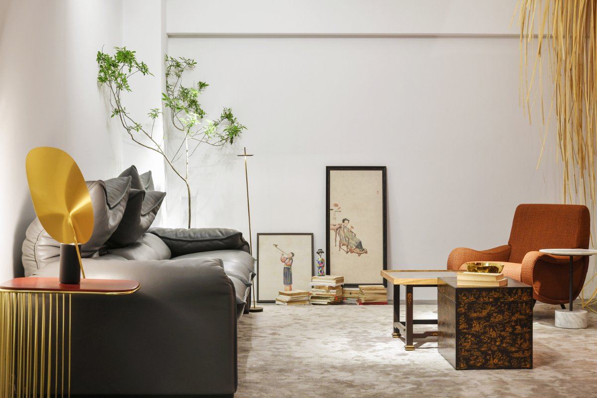
Designers hope that the overall design not only has the concept of Museum in layout, but also reflects the inclusiveness and integration of Museum in culture and art. Space always serves people and things. Its most beautiful side is that it can accommodate and absorb the culture and art of different regions and display them perfectly in front of the world. Between ancient and modern times, there is capacity to ask the West and the East. This is not only the mission of space given by design, but also our pursuit on the road of design.
Design by Lynn
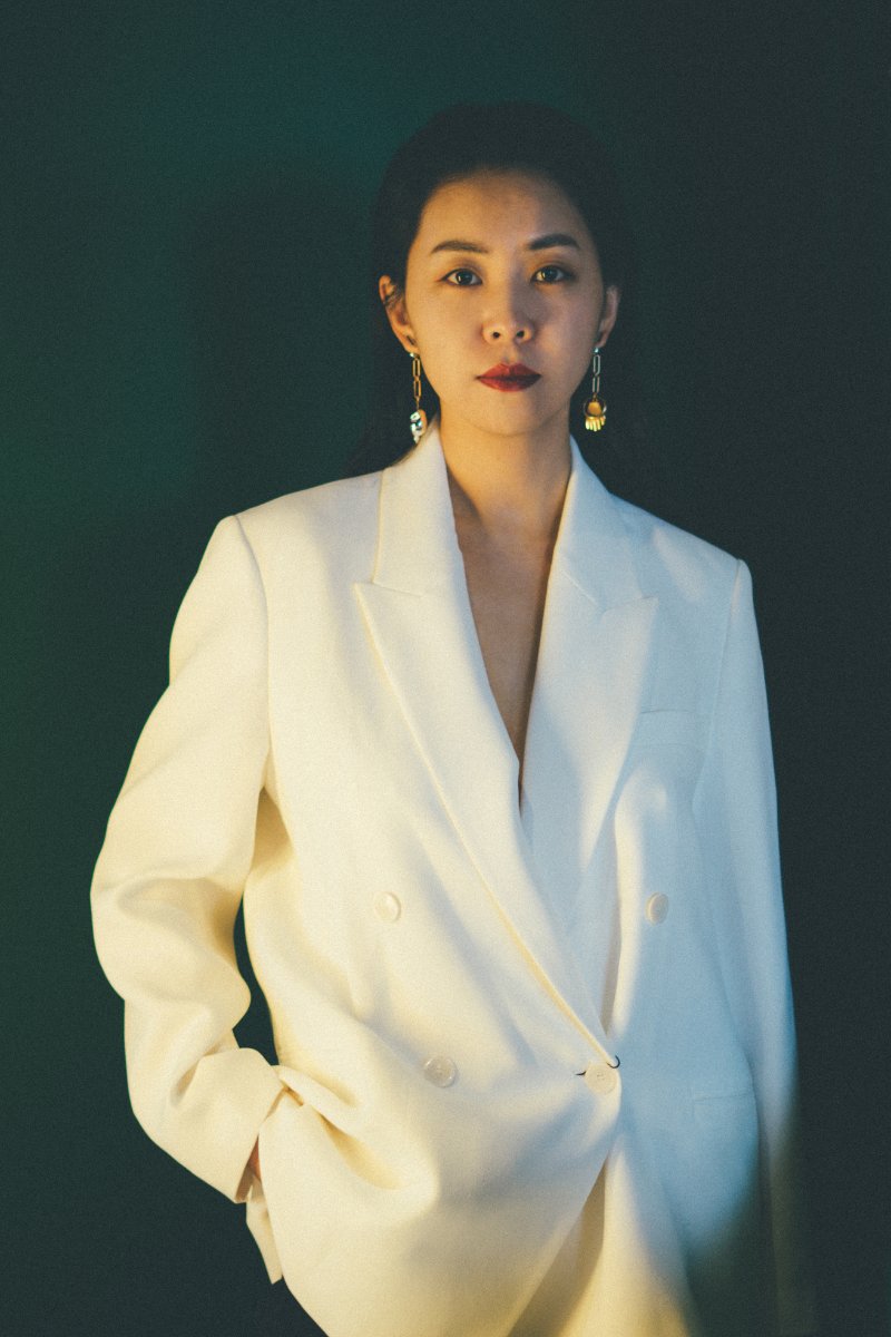
From 2012 to 2017, the independent designer established the walking studio in 2017. The team concept: open the constraints of the original space, define the texture of life with novel lines and color matching, give users more interactive emotional connection, and strive to create a comfortable and warm space for everyone who pursues the quality of life.

