Design of Residential Space

Project
Introduction
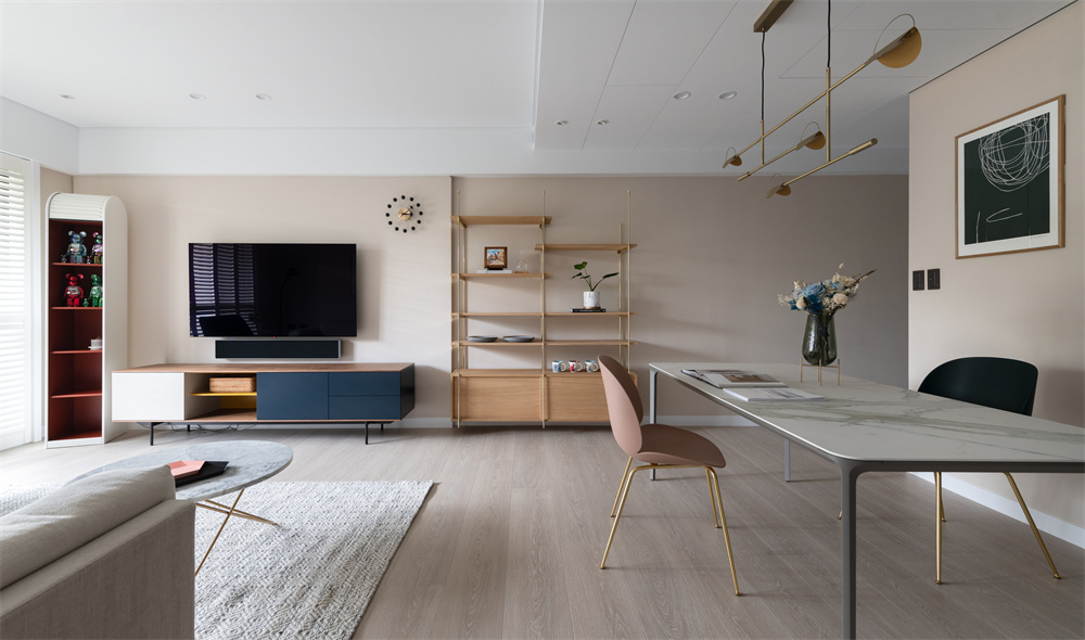
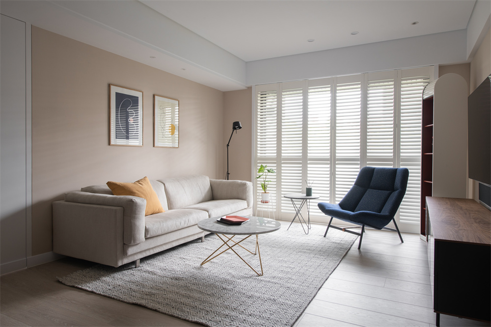
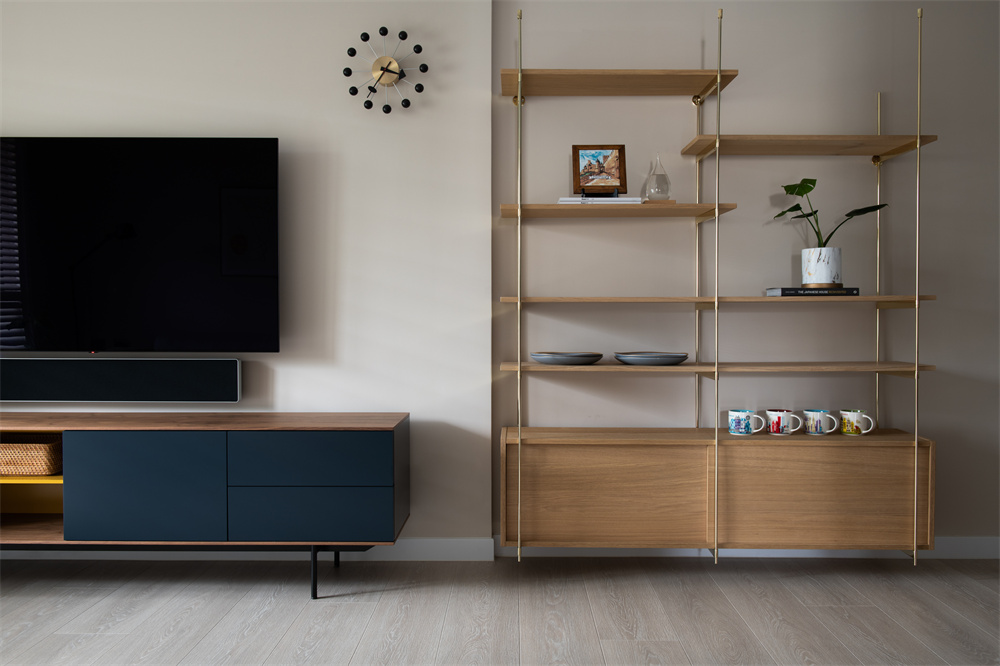
With simplicity as the axis, the open public area is free from overly ornate and flashy layers. With metal lines and the natural stone patterns decorated partially, the light wood tones and milk tea color scheme elegantly ooze low-key yet luxurious vibes. To prevent the space from being too plain, the furniture and fabrics feature vivid contrasting colors in warm tones to add layers of changes to the scene.
Upon opening the door, the mellow white light gently diffuses into the room through the wood shutter. Thanks to the unobstructed traffic flow, the whole room is bathed in soft light evenly. The skin-friendly wood flooring leads the way to the public area. The milk tea color is extended to the wall gradually from the entrance, connecting different areas. The TV wall and the wall behind the sofa are covered in beige. A gradient palette creates a hidden link and conceals delicate details.
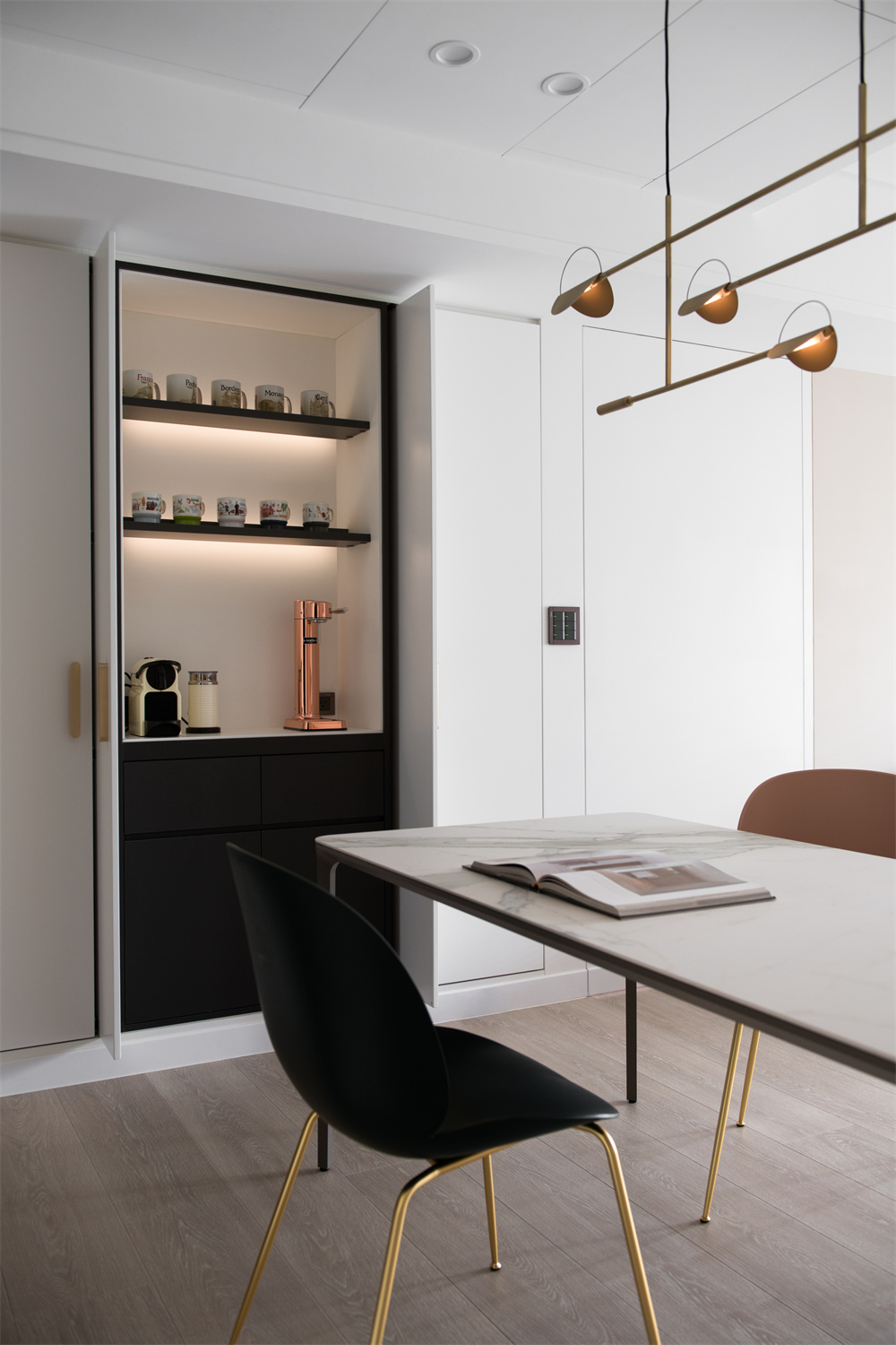
The spacious blank breathing room on the dining sideboard maintains a sense of simplicity visually. Its gold-colored knobs add a touch of elegance. A small appliance cabinet is hidden behind the double sliding doors. The ink color painted inside, and the white surface create visual tension between light and dark, injecting personality into the soft dimension.
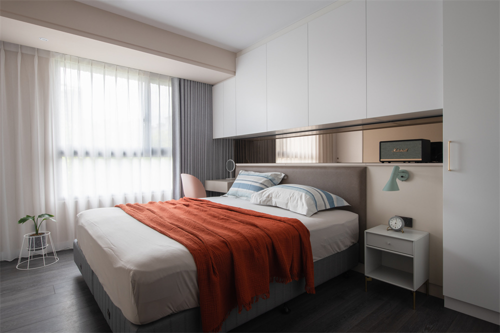
The master bedroom continues the clear and simple tone to create a comfortable sleeping environment. A gray mirror is embedded in the strip of the bedside wall to expand the depth of vision through the reflection. The storage cabinet and dressing table are integrated one by one on the main wall to create an aesthetic of simplicity without compromising functions. The secondary bedroom features deep ocean blue and stable wood tones to create a soothing atmosphere for a peaceful night's sleep.

Design by SHIHSHIH PEOJECT

