Design of Commercial Space
Projet
Introduction
Design description:
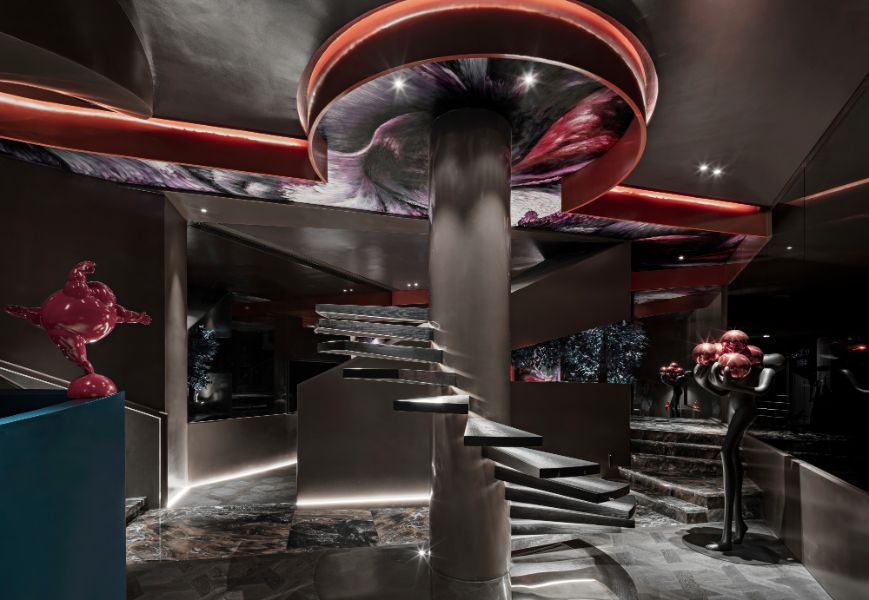
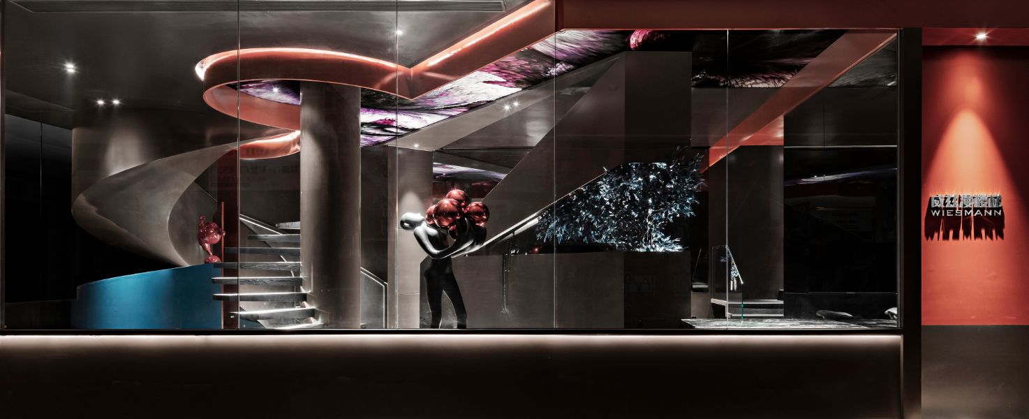
Project positioning: This project is located in the Jockey Club Home Furnishing in the center of Guangzhou, which is a staircase building materials exhibition hall. The owner's brand positioning is high-end, hoping to convey the brand concept and product characteristics through the design, so that the exhibition hall will stand out from the crowd of stores and create an immersive space experience for customers.
Space artistic conception:
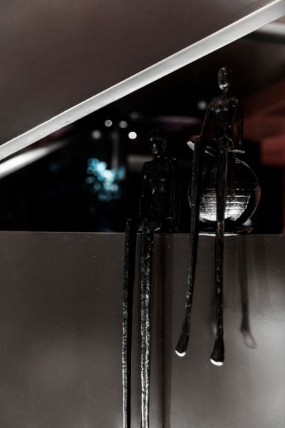
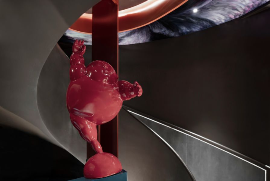
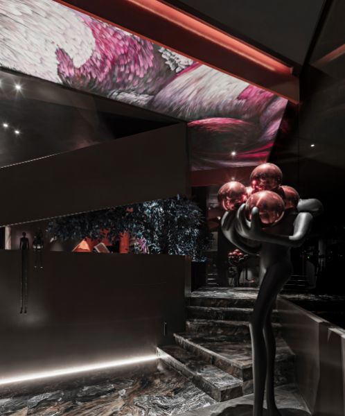
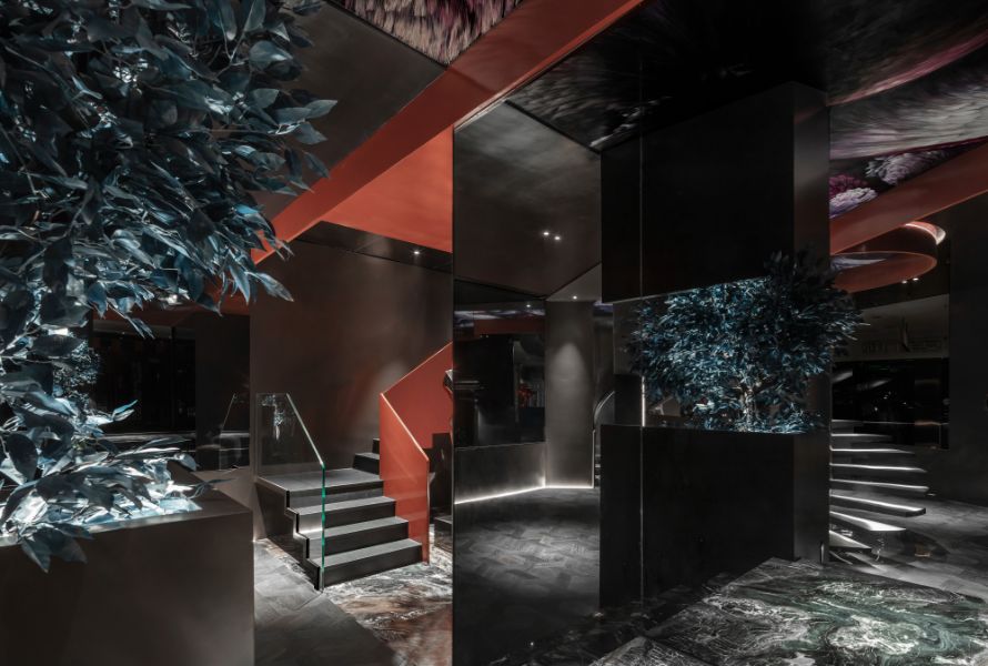
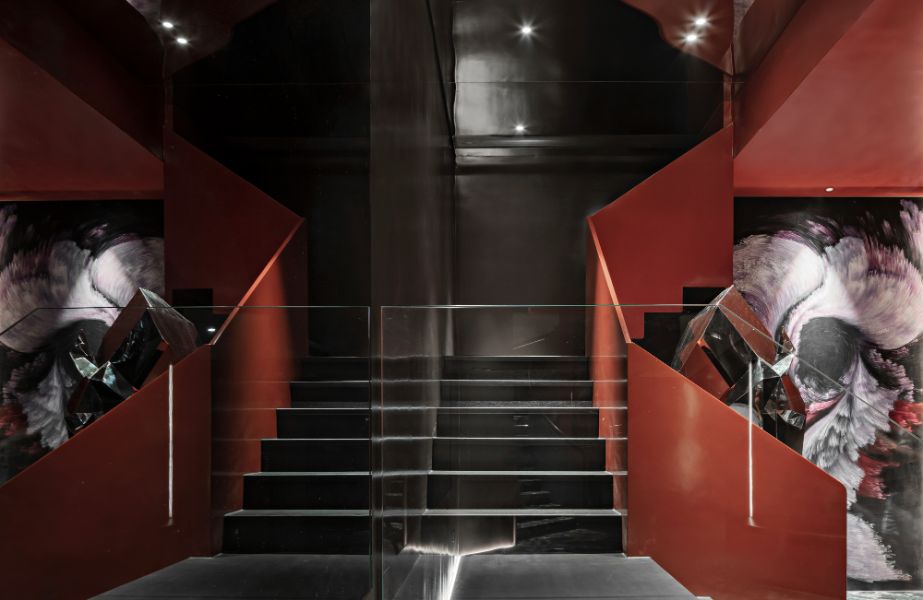
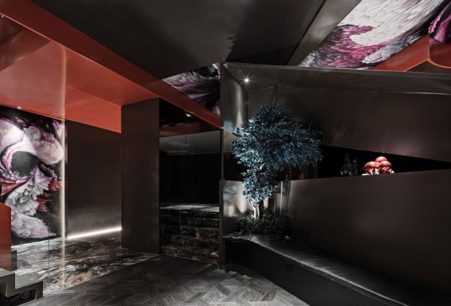
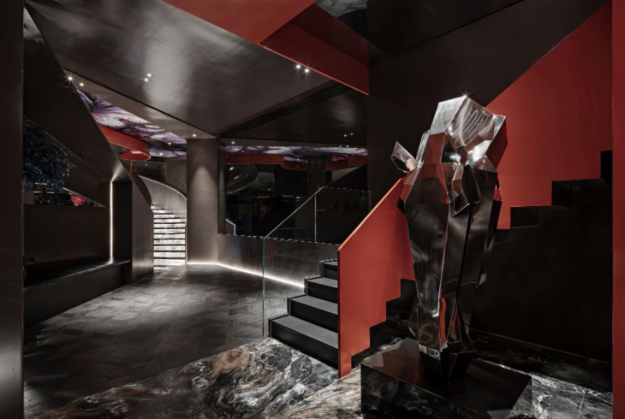
Different from the general store exhibition halls, this project uses a design approach that is closer to the art space. The space uses black and dark gray as the color tone, with calm crimson and indigo as the auxiliary, creating a low-key and avant-garde atmosphere. It is displayed with carefully selected installations to add artistic temperament.
Space layout:
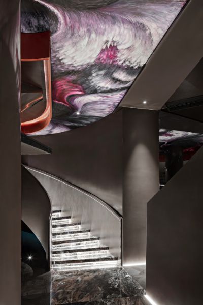
Echoing the characteristics of the spiral staircase, this project uses the golden spiral as the theme of the spatial layout. Through the spiral space module planning and the well-arranged layout, a smooth movement line is formed, and there is movement in the static, creating a fascinating space atmosphere. The design of the small area also has a majestic feeling, so that visitors can't notice the space is only 86 square meters.
Design materials:
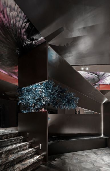
The area of this project is small, and a large number of materials such as steel plate and gray glass are used. On the one hand, it reflects the design principle of environmental protection and recyclability, and it also expands the sense of space visually. The use of natural marble, environmentally friendly wood boards and other materials preserves the unique texture and texture of natural materials, which adds points to the design.
