Design of TOP 100 Designer
Project
Introduction
Design roams in order, it is the emotional interaction of silent objects. The case of 'Qingkou Xiangyang School', as a modern teaching venue, incorporates traditional Chinese teaching concepts into its spatial layout, but also breaks free from the romantic leisure space filled with modern consciousness.
As a place for teenagers to learn, the clever design of the space will bring them more beautiful memories and perceptions. The value and emotion of space also increase, and students learn from each other, and people live up to their meeting.
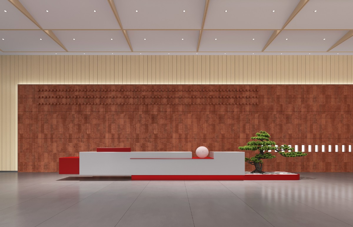
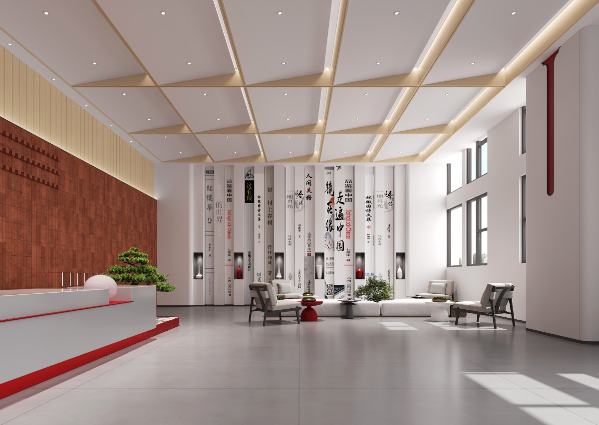
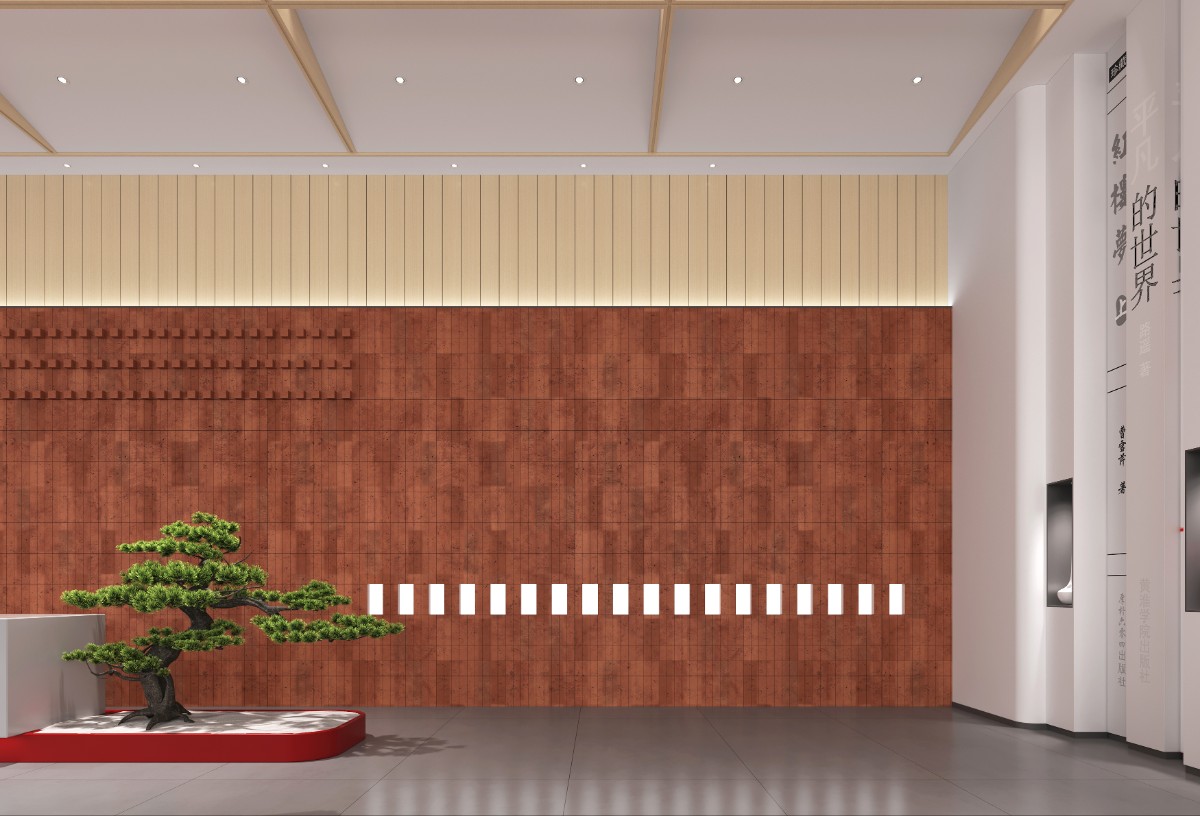
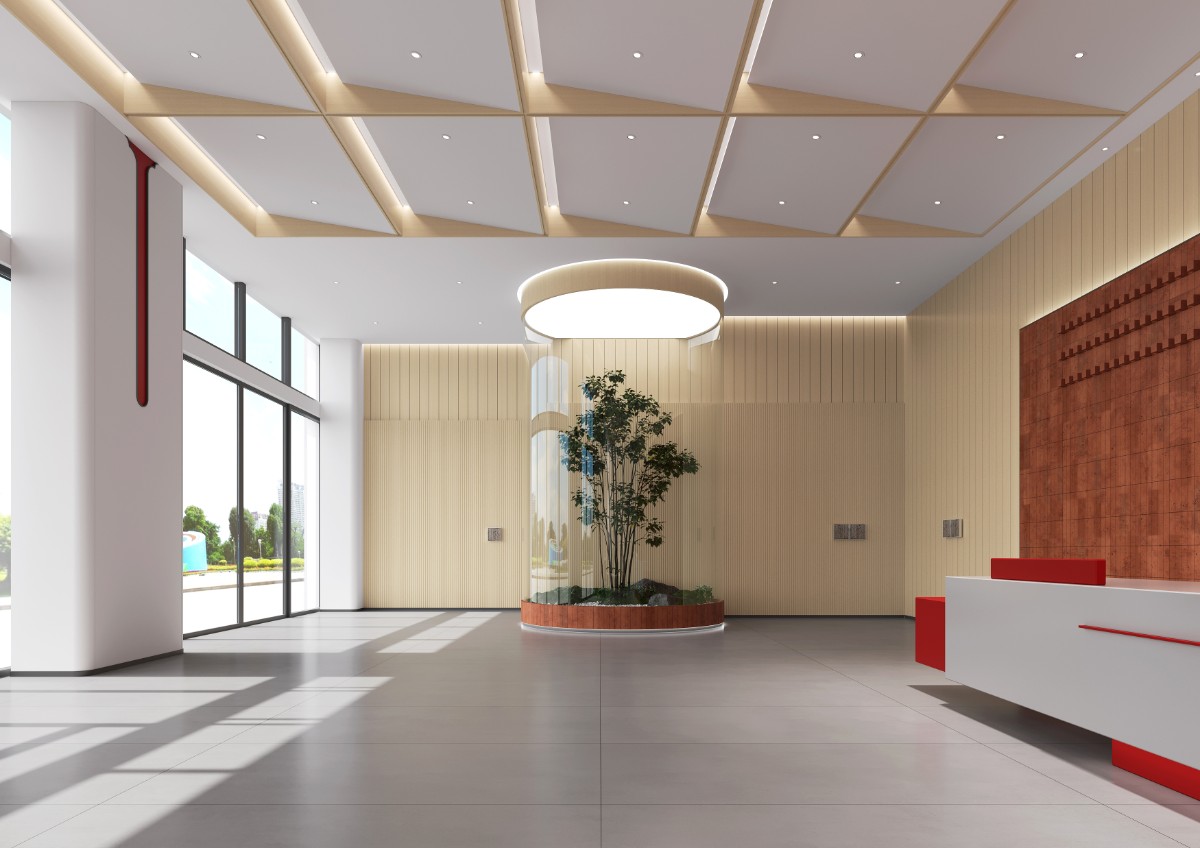
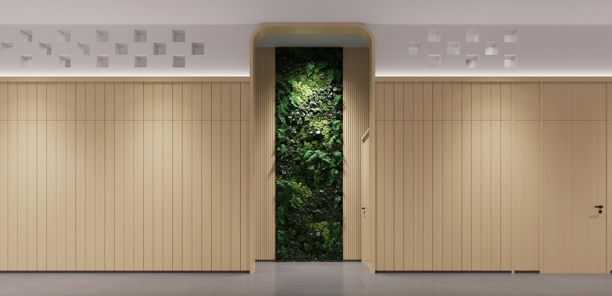
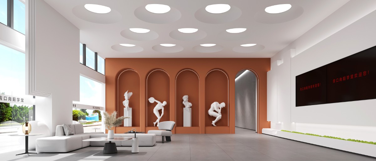
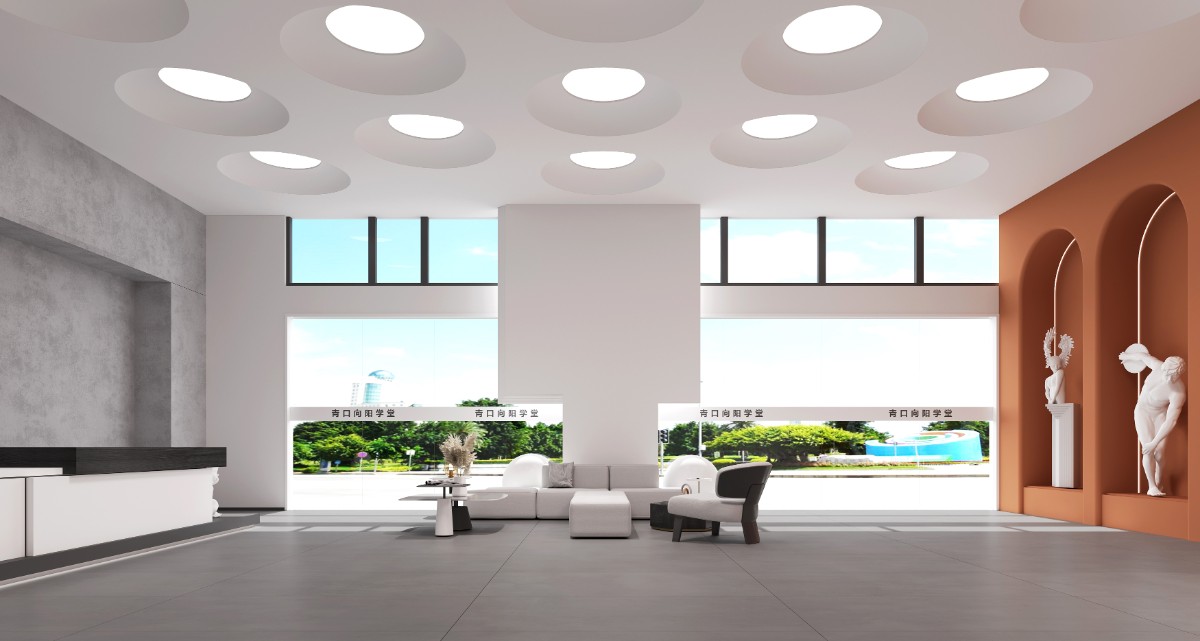
The hall of Chinese Studies uses brick red and white as the main color of the space, bringing the simple beauty of new Chinese style into the space. With silence as the core, the rectangle at the top of the ceiling shows rationality through order arrangement.
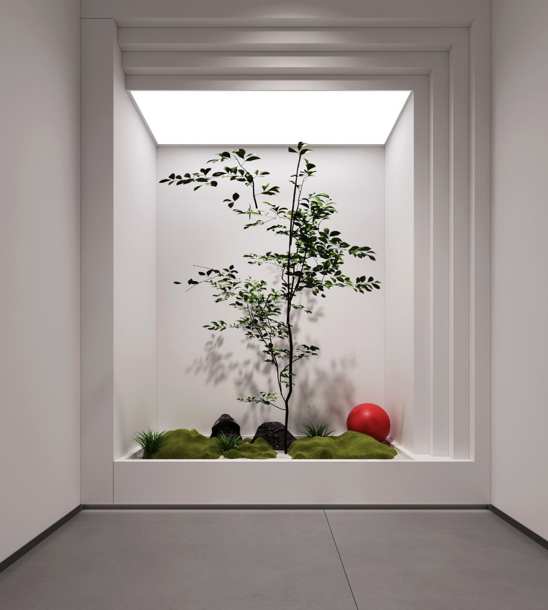
The whole hall is light and transparent, integrating green plants into the space, and further demonstrating the relationship between human and nature in Chinese philosophy. The reverence and treasure of nature inspire people's innate desire for nature.
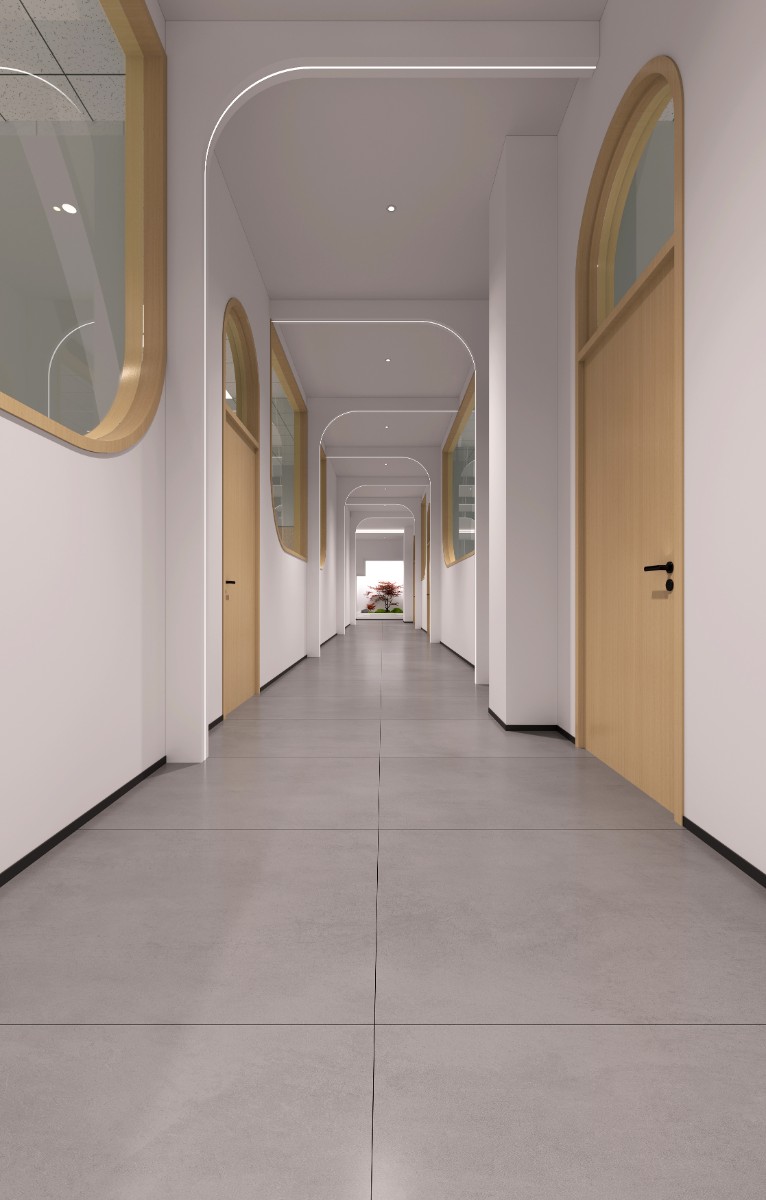
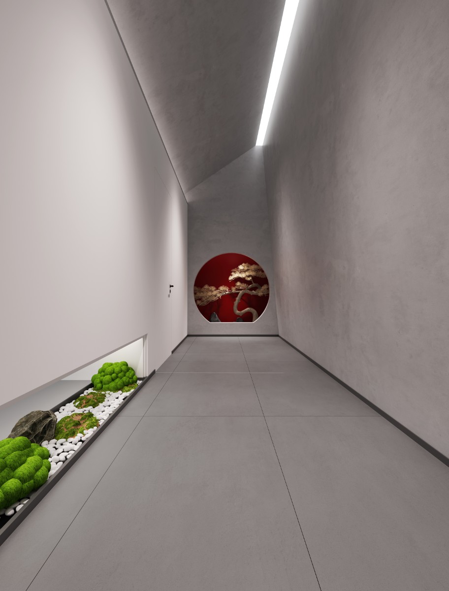
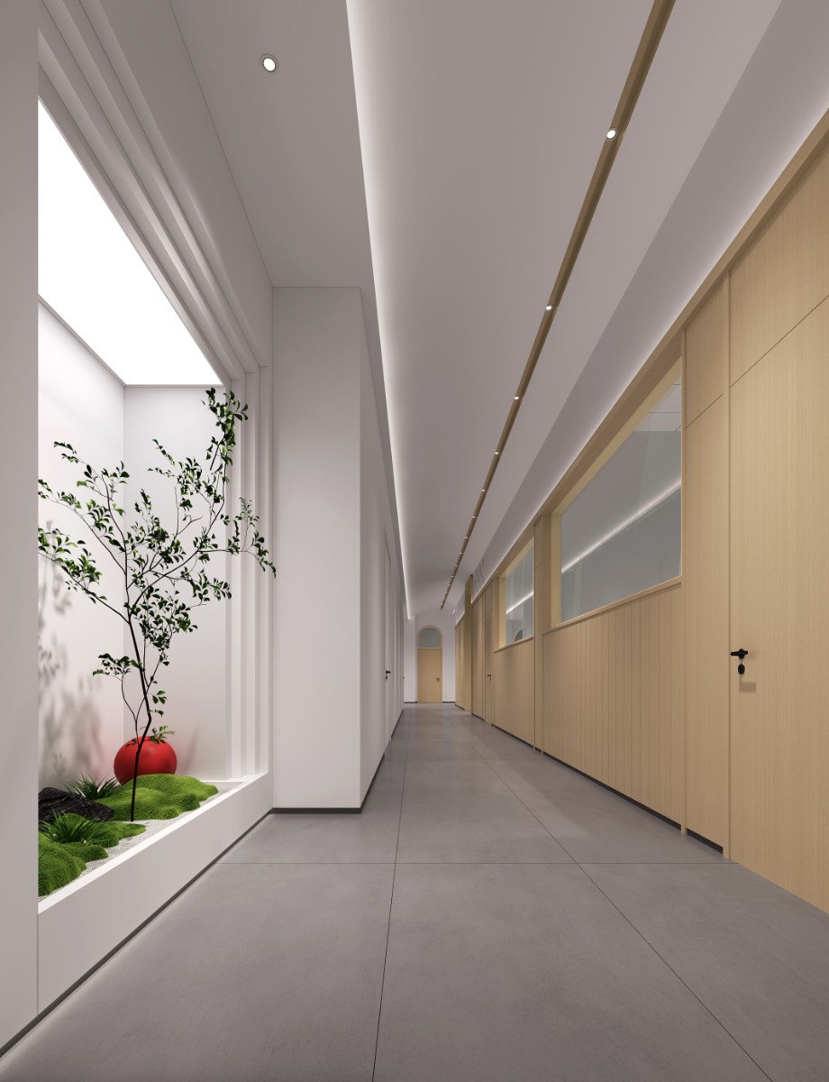
The aisles show a fresh Zen, and bring out the charm and greenery of trees through large areas of white space and simplicity, which is the natural aesthetic proposition that Chinese people have always respected. Learning in the beautiful space, time will become more and more slow.
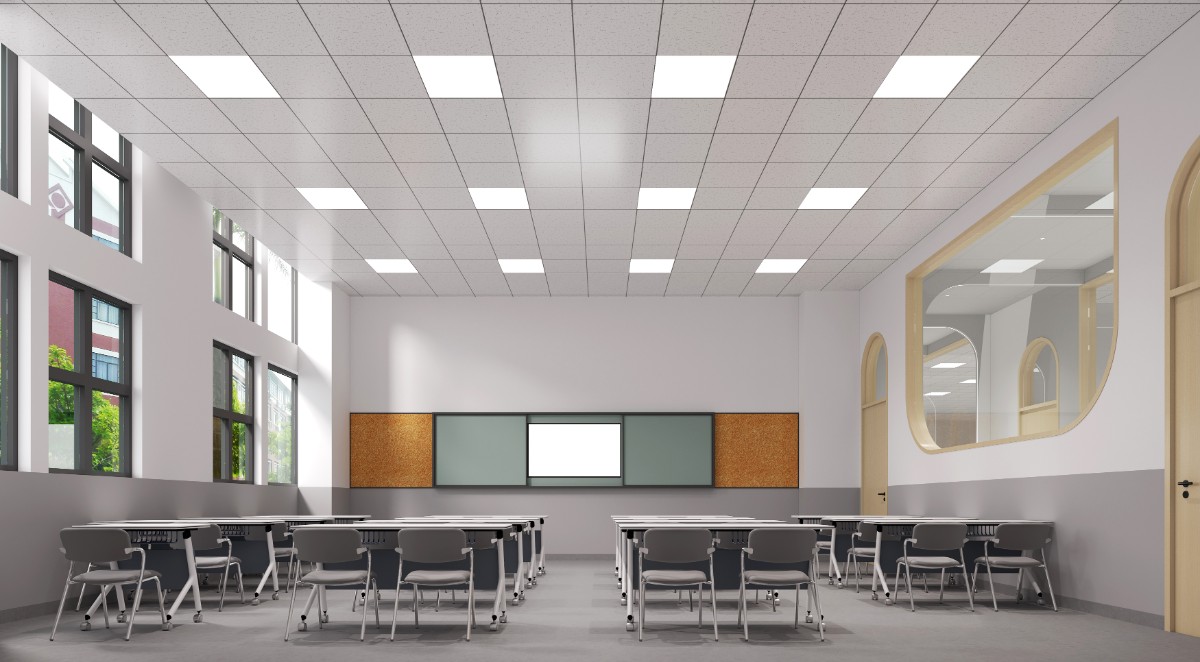
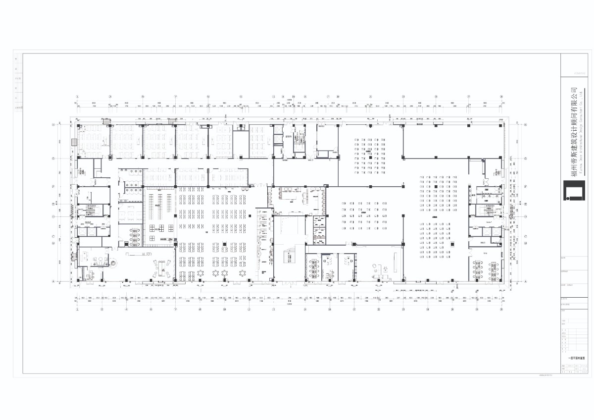
The classroom reduces the interference of impetuous decoration, and multiple open Windows and ceiling lights ensure sufficient light in the space, providing a basic guarantee for students' eyesight. At the same time, modern multimedia devices are embedded in the space to enrich the classroom elements.
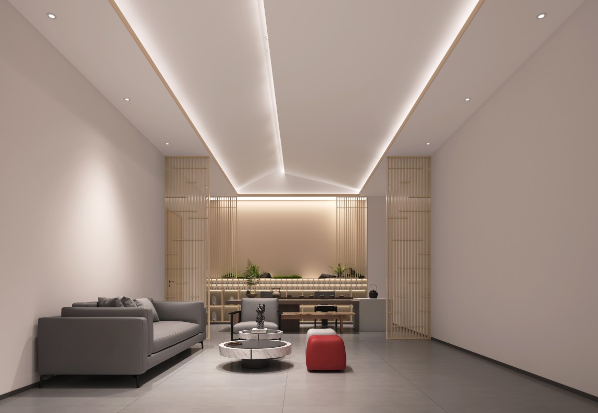
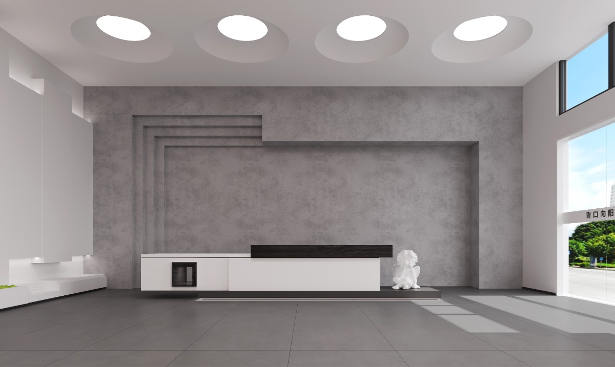
Reception leisure, with social attributes of the reception room, simple and orderly, the design inadvertently let the negotiation become comfortable and warm. Get visitors to stay more and talk better.
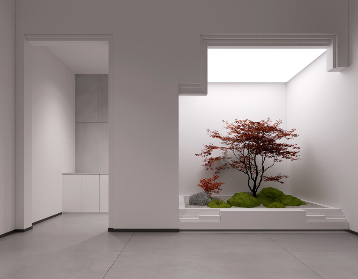
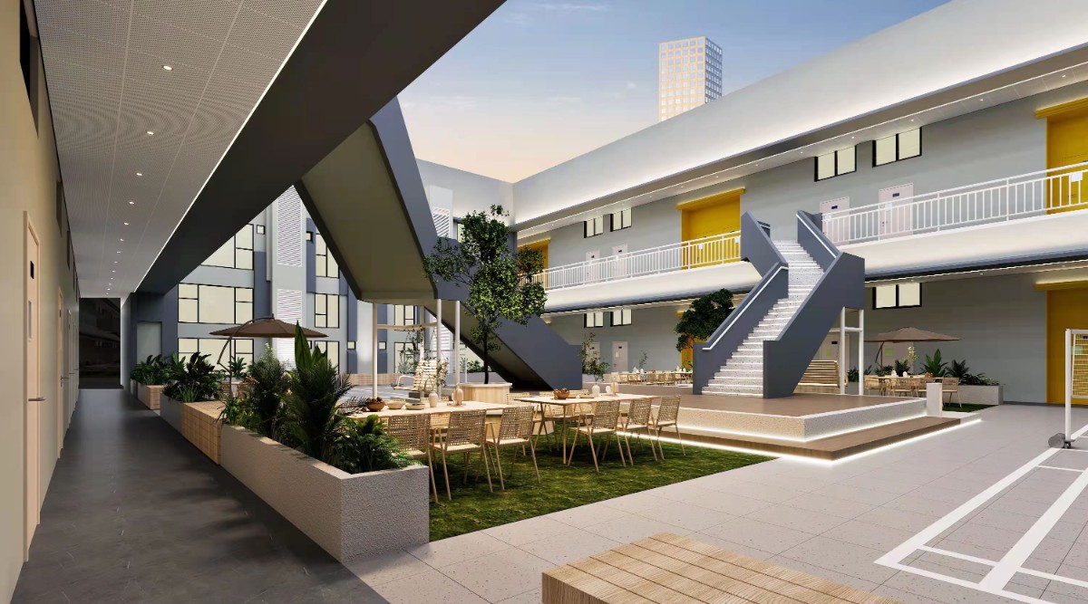
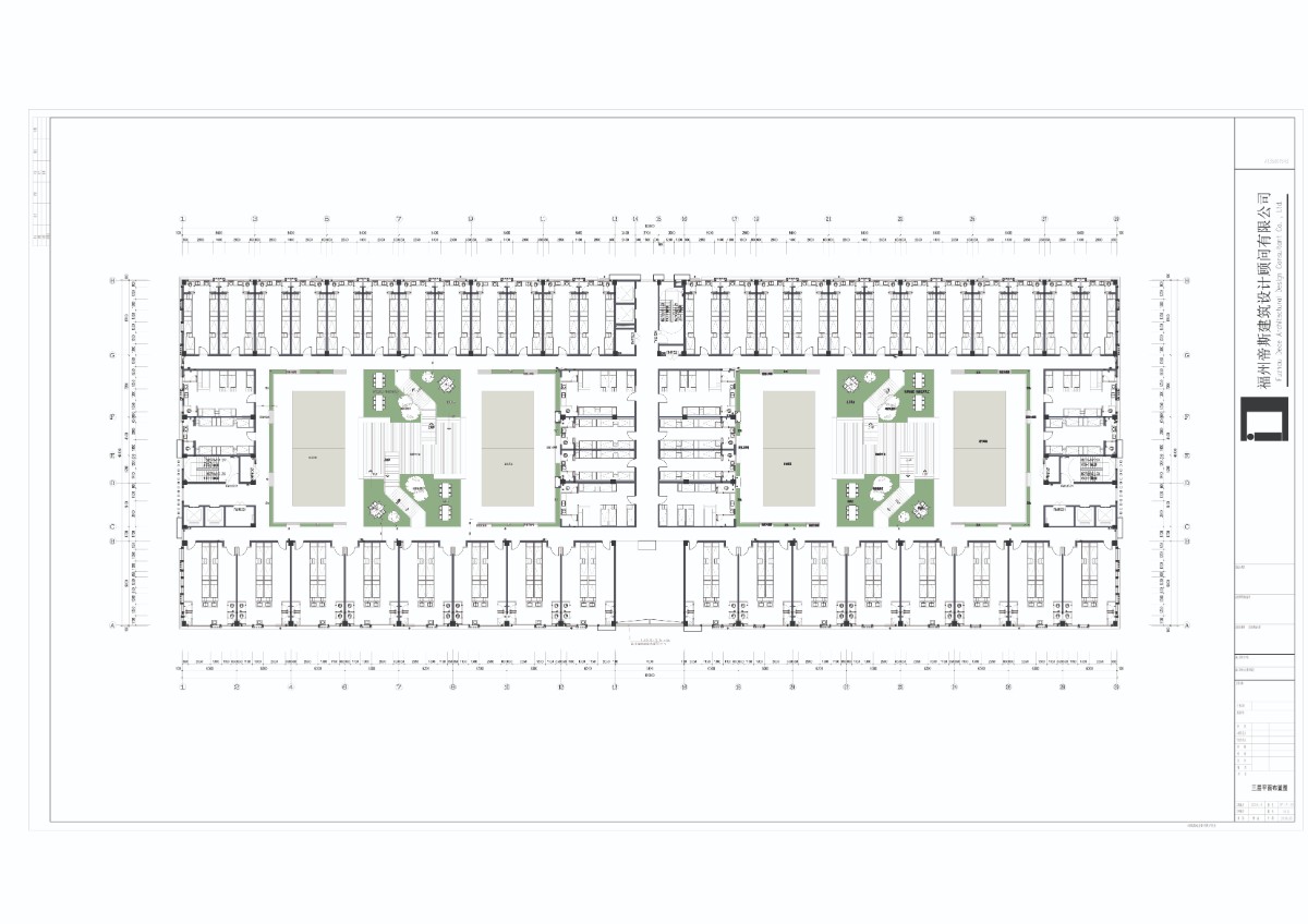
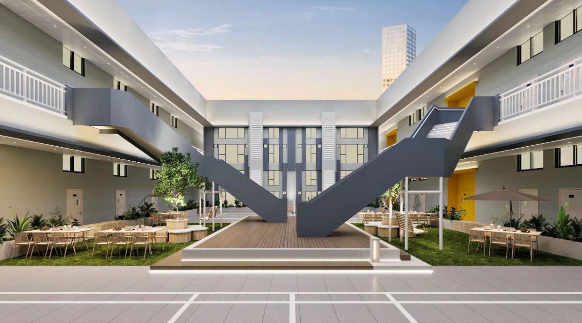
When it comes to the Hanging gardens, people always think of the legendary Hanging Gardens of ancient Babylon. In the campus, the design of the sky garden combines the spatial attributes to think, and brings a space that combines beauty and leisure for teenagers during their study breaks.
The art hall presents a space for aesthetic education without interference through geometry, sculpture and retro colors, allowing aesthetic education to open without interference, allowing creativity and perception to grow indefinitely here.
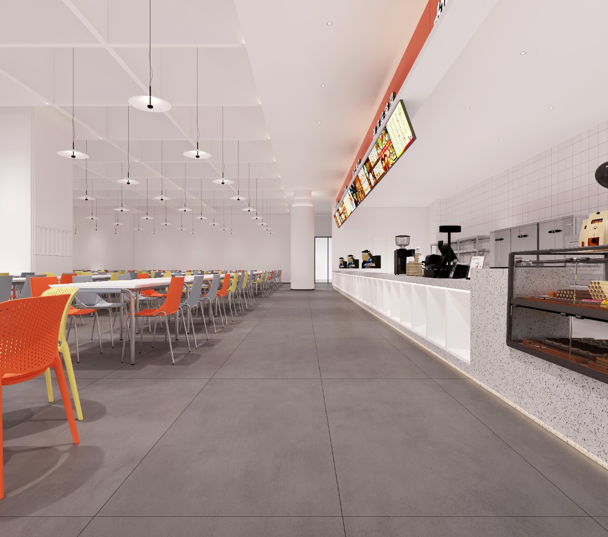
Clean and delicious is actually the most direct expectation of people for the canteen, and through the design of the diversity of colors into it, to express the vitality of youth, more experience can also happen here.
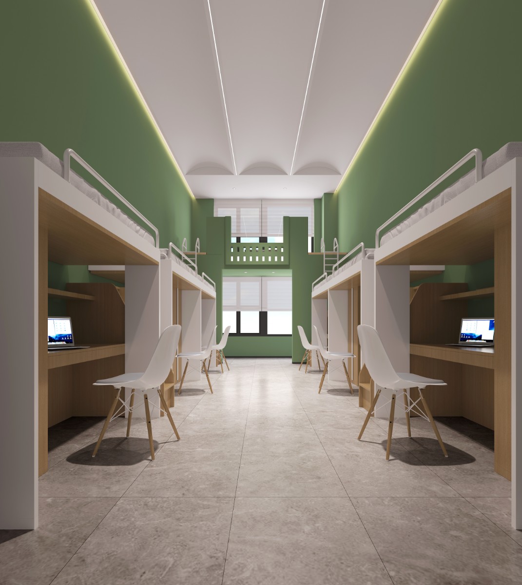
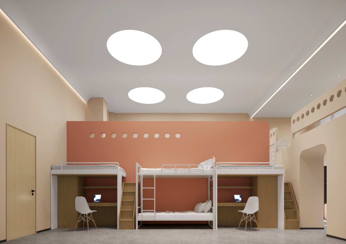
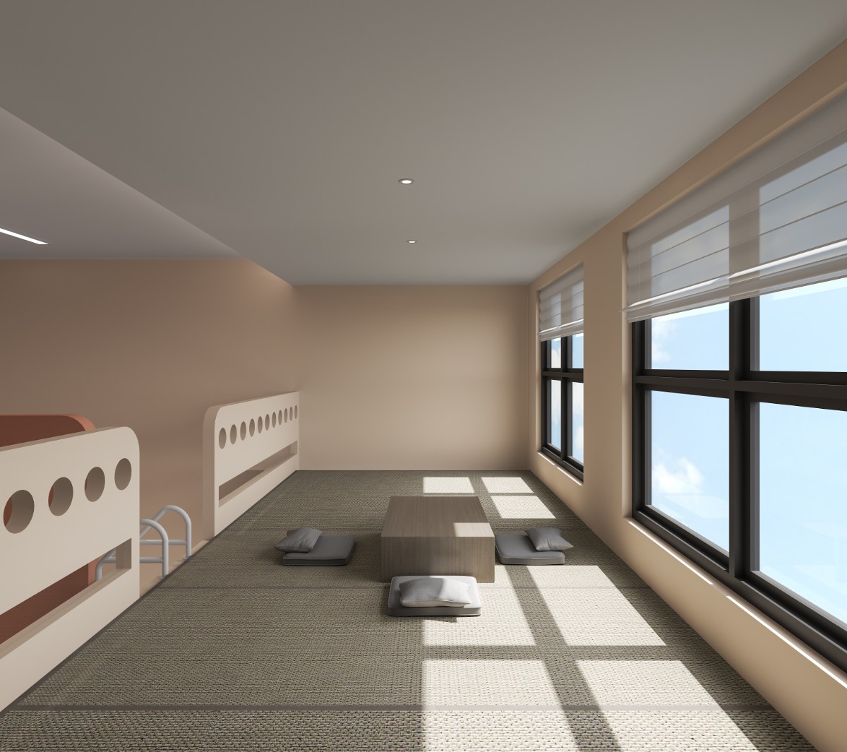
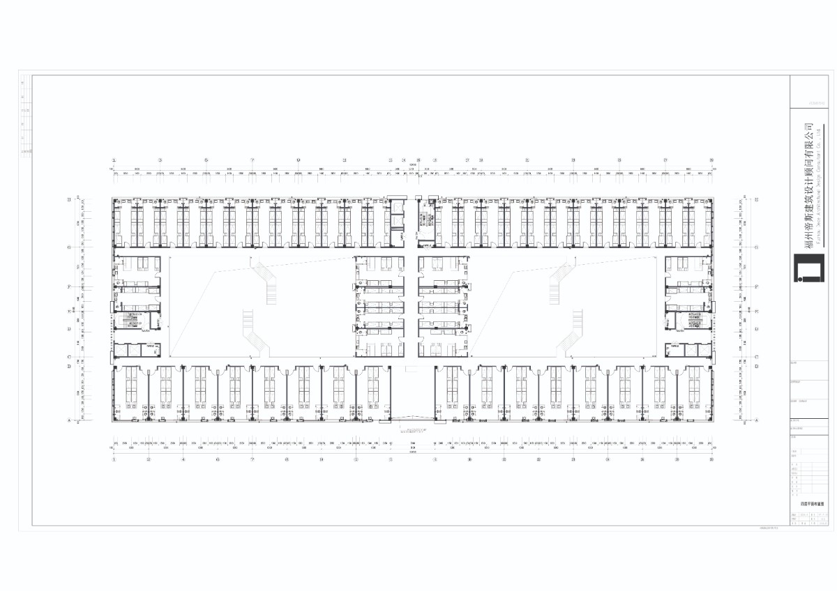
The dormitory is divided into multiple rooms and double rooms, and the capacity of the space also changes according to the needs of different individuals. However, it does not depart from its comfortable and secure bedroom environment to develop the design. Go to bed and get off the table, make life comfortable, relieve fatigue.

Design by YE ZHAOHAO

