Design of Commercial Space

Projet
Introduction
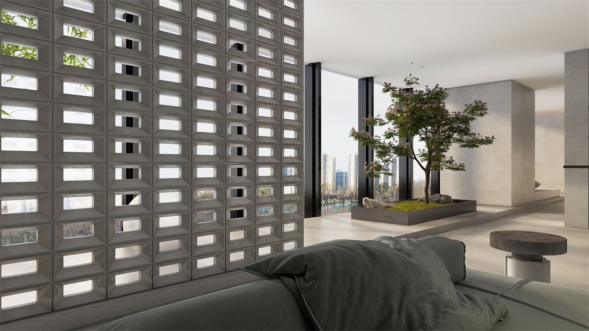
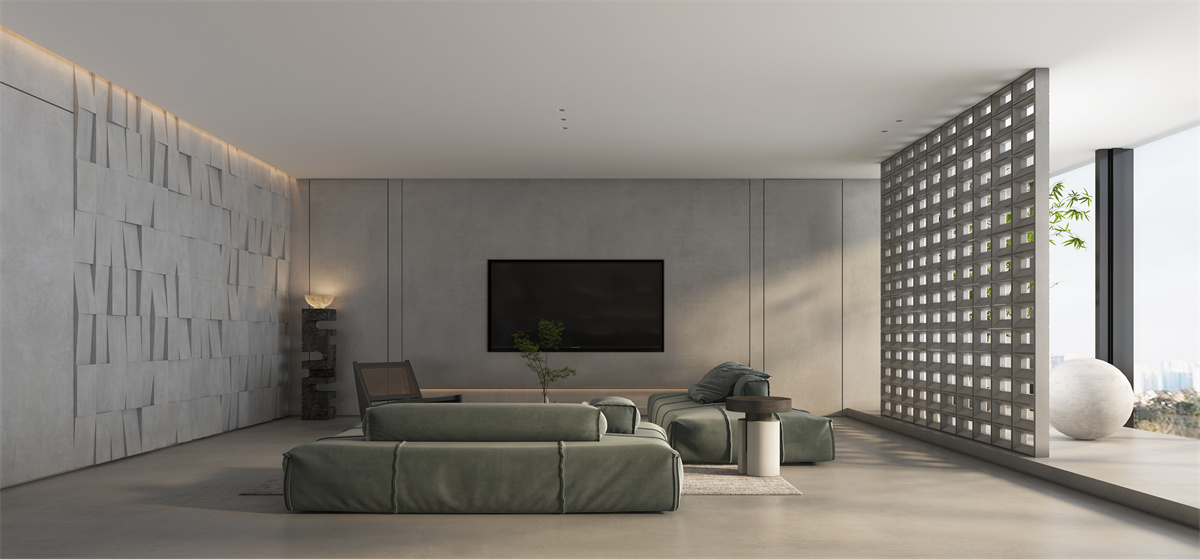
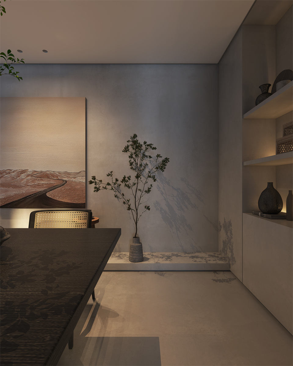
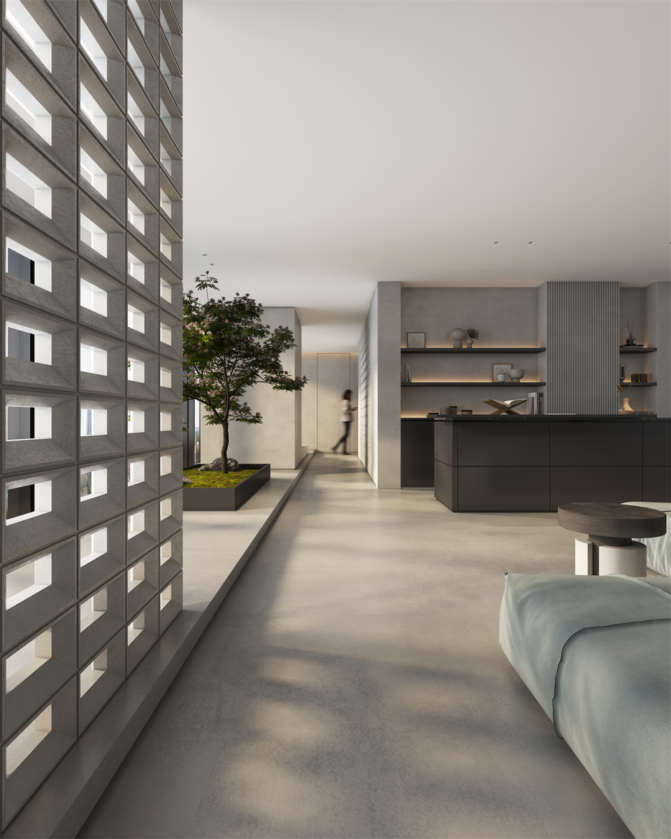
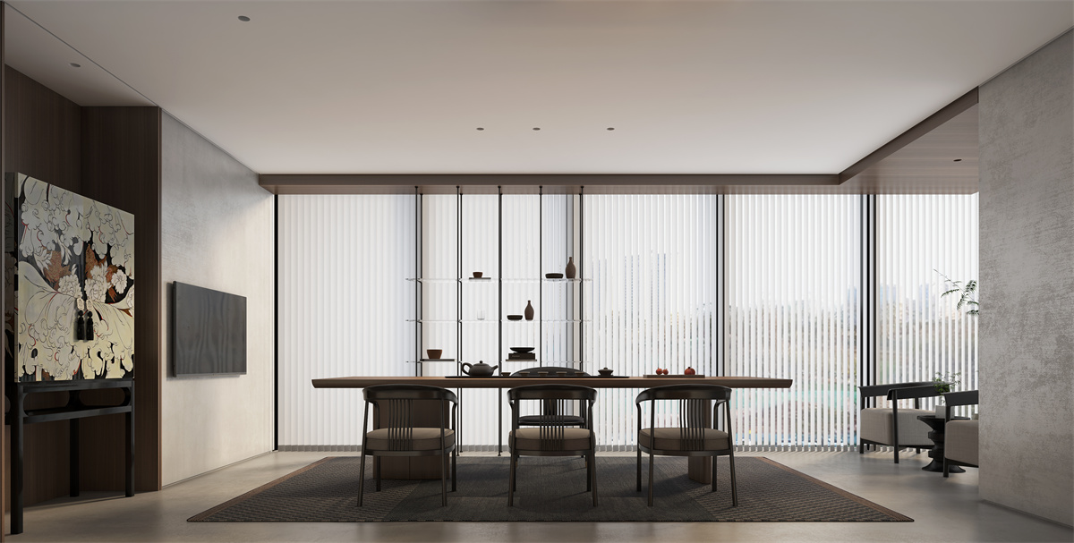
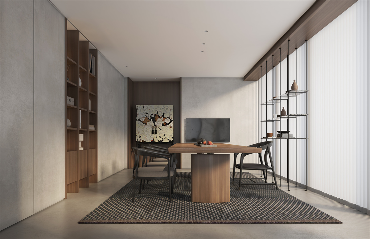
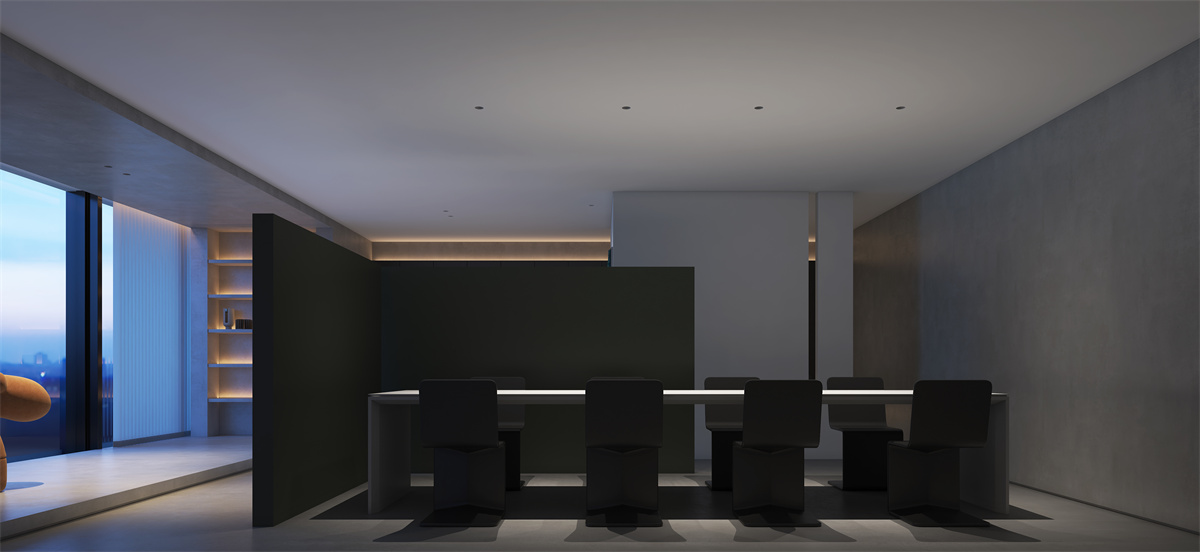
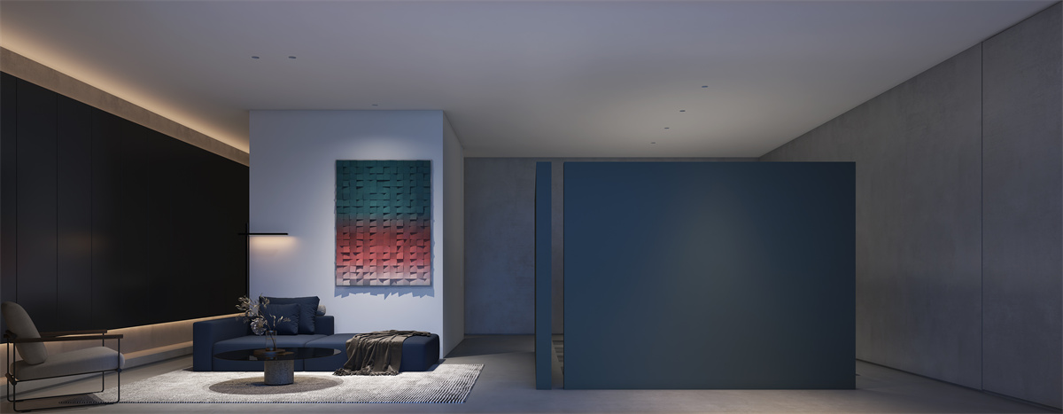
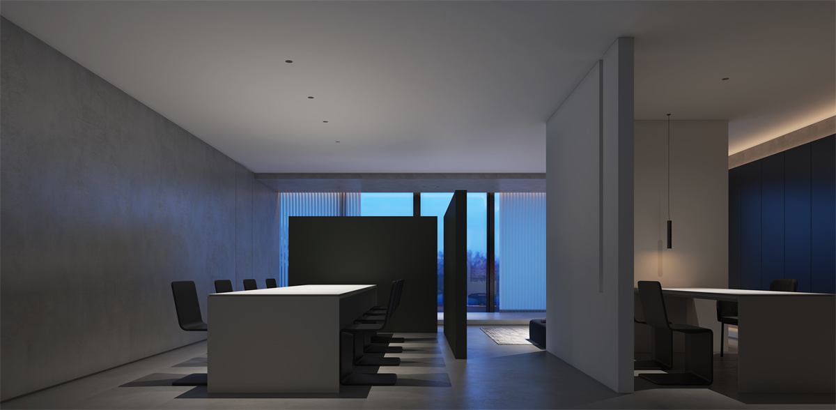
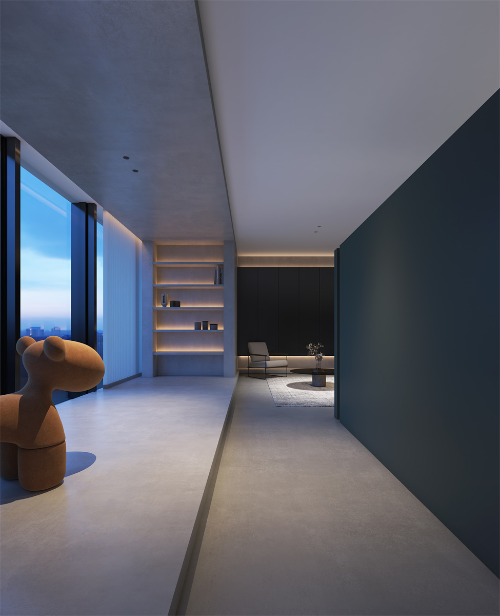
This case is a teahouse-type office space design located in Shenglong Huijin Center, Fuzhou. The designer studied the history and cultural context of the brand, and dismantled the spatial elements consisting of light, material and volume through deconstruction, and injected the corporate gene of "one thing in a lifetime" into the space. The use of integrated coatings emphasizes the integrity of the shape. In order to reflect the connotation of corporate tea culture, the designer hopes to allow users to have a real and focused experience. Therefore, the scene of drinking tea is penetrated into the transparent space inside by means of a space block, so that the volume interspersed and the light and shadow change enrich the connotation of the space function. Space is no longer a hiding place of pure nature, but has the value of emotional and psychological support. The designer deliberately weakened the constraints of traditional formats on the tea space, restrained the use of symbolic design techniques, so that materials, light and shadow are composed of unfettered free space in the form of three-dimensional senses. In terms of overall style, this case finds a state of unity and independence in the gap between minimalism and wabi-sabi. It eliminates the boredom and lag of wabi-sabi, and injects the natural and elegant texture of modernism into the minimalist simplicity. Thus, the credo of Wabi-sabi can be found in space: "poor material, rich spirit". Let the wabi-sabi space obtain a calm and comfortable atmosphere in the minimalist design concept, while retaining the roughness and simplicity of the wabi-sabi essence, composing the spatial melody of "the unity of things and me". A large area of cool colors wraps the entire building space, creating a calm and quiet space atmosphere. The primitive, rustic spatial mechanism exudes a heavy atmosphere, and adds a gentleness that will not fade with time to the rough texture of the building. The open space is relaxed, using the modeling wall to introduce light sources, light and shadow through the concrete partition, linking the interior and exterior space through light and dark, so that the space is in a delicate balance of empty but not empty. The designer avoided the wall that completely cut off the line of sight of the space, gave the space sufficient visual transparency and overall sense, and used the difference in the level of functional division to widen the distance. The migratory space layout cleverly plans the flow of employees and visitors, and the walls and beams and columns build a "no moving end" space with each other, connecting various areas to complete the multiple composite uses of space, replacing time with space, forming a unique spatial temperament. The flexible flow weakens the orderly combination form of the traditional studio, and has greater flexibility, giving the spatial form a vivid and bright rhythm. The open-plan office space echoes and distinguishes itself from the reception area. The cold blue light illuminates the basic color of the space, outlines the boundary of the space, and brings a strict and solemn working atmosphere to the space. While ensuring the privacy of the space, the office form was also reassessed. Three or five friends, three lamps and two cups of tea, three words and two words to stick to one's own secret words. There is a fresh breeze, there is light and shadow. Light and shadow change with time, jumping on different spaces and objects, and creating morning and dusk shadows like gurgling water on the undulating wall. When only light and shadow are left to diverge freely in space, abstraction and concrete gain new life in the flow of light and shadow. In the light that tends to be dark, there seems to be a jet lag in communication between people. When walking through it, you can feel the hidden spatial boundaries everywhere, and the freedom to walk is all about the ups and downs of emotions. The artistic paint surface of the natural mechanism allows designers to remove complexity one by one, one meal at a time, one drink at a time, leisurely and picturesque.

Design by QI SHENG
Design concept: break the traditional cumbersome design techniques, and substitute simplicity and comfort into life Experience: 11 years Award Experience: Character class Member of Fujian Interior Designers Association 2016 China (Fuzhou) 11th Top Ten Designers 2017 China Design Person of the Year Emerging Designer of the Year 2018 China (Fuzhou) 13th Top Ten Designers 2018 Asia Pacific Space Design Annual Selection Emerging Designers 2019-2020 Shanghai International Design Week New China Design Award (Intercity List) (Inter-provincial List) 2020-2021 Shanghai International Design Week 2020 New China Design Award (Intercity List) (Inter-provincial List) (Chao Design National List) 2020-2021 G+ Global Design Elite Competition TOP 10 in Fuzhou, China 2021-2022 40 UNDER 40 China (Fuzhou) Design Outstanding Youth 2020 Guanghua Longteng Award Top 100 Young Decorative Design in China Works, The residential space "Huai'an Peninsula - Fifty Shades of Grey" won the bronze award of the 2017 Fujian Architectural Interior Design Competition The residential space "Clean White" won the first prize of the 12th China (Fuzhou) Interior Design Competition The residential space "Play" won the third prize of the 12th China (Fuzhou) Interior Design Competition The residential space "Warm Ash" won the third prize of the 12th China (Fuzhou) Interior Design Competition The residential space "Wood White" won the first prize of the 13th China (Fuzhou) Interior Design Competition The residential space "Jing" won the first prize of the 13th China (Fuzhou) Interior Design Competition The residential space "Luxury" won the third prize of the 13th China (Fuzhou) Interior Design Competition The residential space "Butterfly" won the Excellence Award of the 12th China International Interior Design Biennale The residential space "Mubai" won the Excellence Award of the 9th China International Space Design Competition (Fujian Division). The residential space "Infocomm Yacht Bay" won the Best Conceptual Design Award at the 17th Golden Bund Awards 2022 The commercial space "Car Dazzle" won the third prize of the 11th China (Fuzhou) Interior Design Competition The commercial space "Taste" won the first prize of the 13th China (Fuzhou) Interior Design Competition The commercial space "Taste" won the gold medal of the 9th China International Space Design Competition (Fujian Division). The commercial space "Taste" won the bronze award of the 9th China International Space Design Competition MOM JUBILEE WON THE 2020 DESIGN FAUCUS INTERNATIONAL SPACE DESIGN AWARD OF THE YEAR The commercial space "Car Dazzle" won the Excellence Award of the 8th China International Space Design Competition (Fujian Division). The commercial space "Kaka Ishitani" won the Silver Award at the IAI Global Design Awards The commercial space "Coffee Resert" won the Bronze Award at the IAI Global Design Awards The commercial space "Simplicity" won the gold medal of the 13th China International Interior Design Biennale The commercial space "Light and Shadow" won the silver award of the 13th China International Interior Design Biennale Commercial space "Ka Ishitani" won the 2021 IDPA Japan International Design Pioneer Award The commercial space "Coffee Resert" won the Excellence Award of the 24th China Interior Design Awards


