Design of Graphic design

Project
Introduction
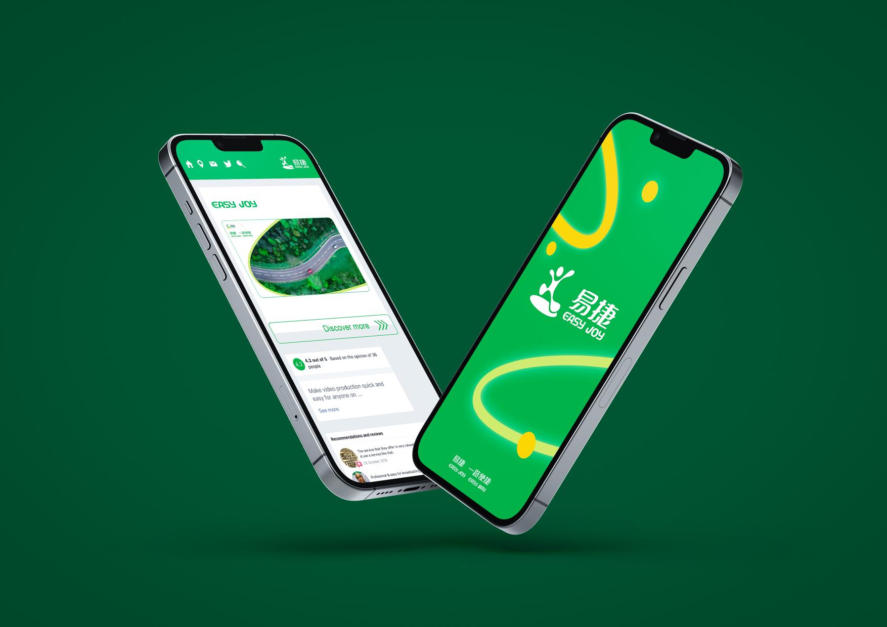
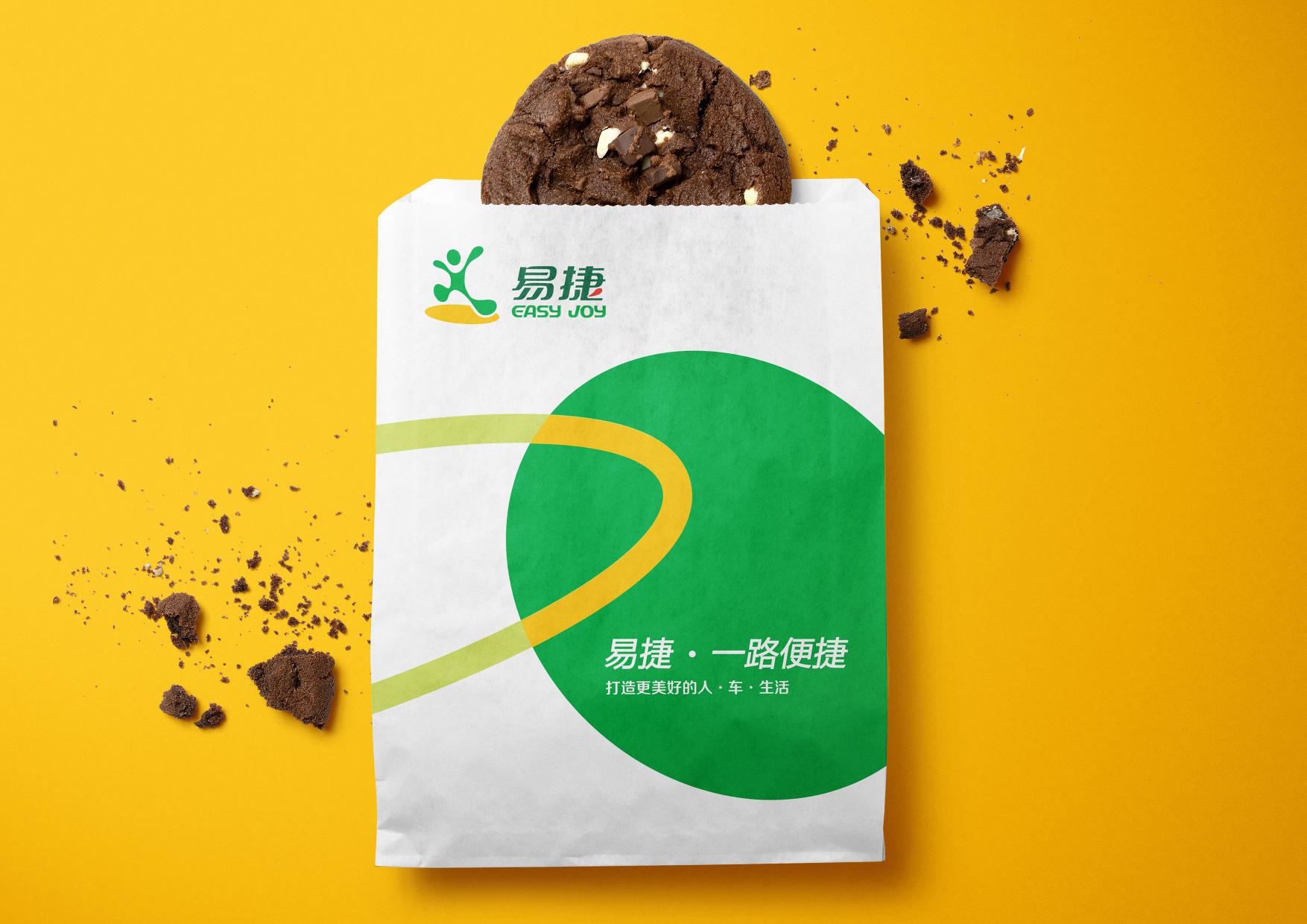
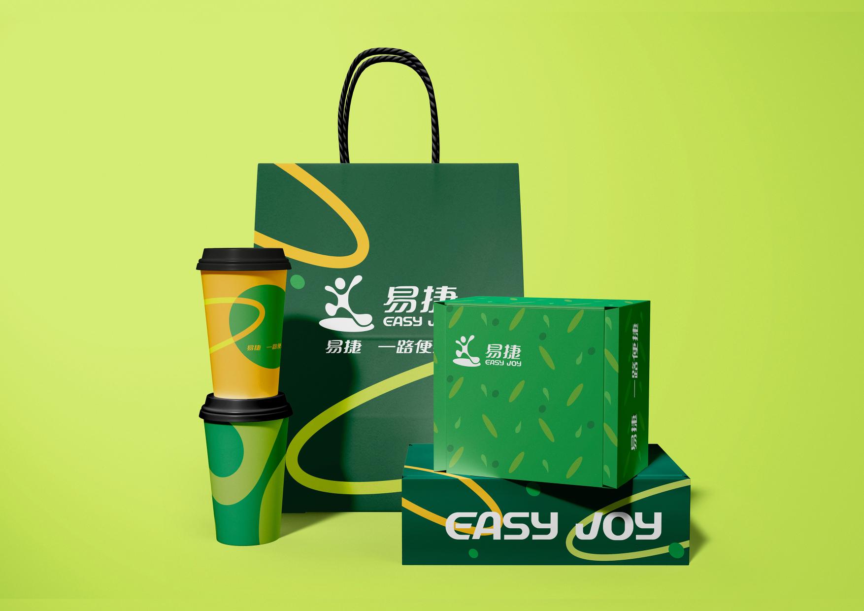
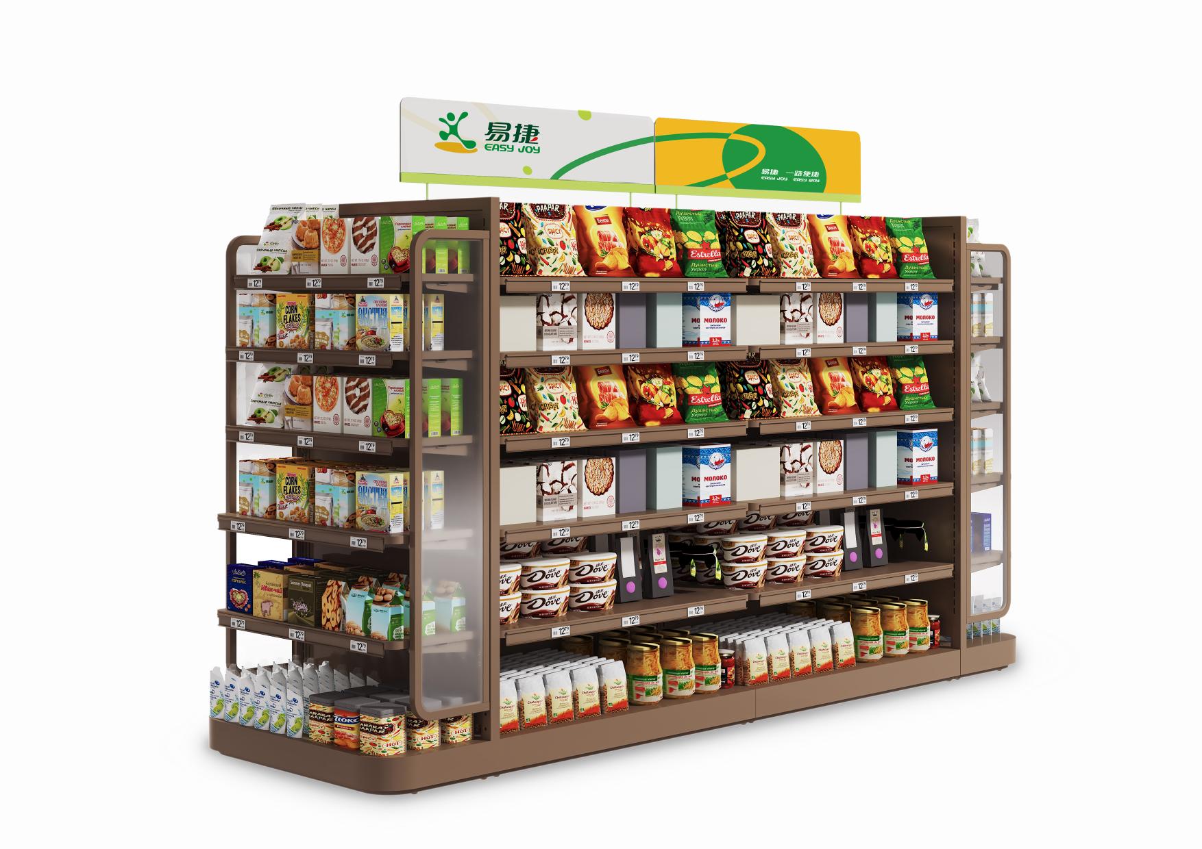
This visual identity (VI) system for the brand EASY JOY skillfully integrates the brand tone of “youth, quality, joy, and richness”, creating a vibrant visual language through geometric deconstruction and reconstruction.
Inspired by the brand’s LOGO, the project cleverly combines small dots, rings, and large circles to achieve various designs, which not only showcases the harmonious, inclusive and reliable brand image, but also highlights the brand’s youthful vigor and diverse connotations. In terms of color selection, the sharp contrast of black green and light green/yellow and green, adds a touch of calmness/vitality. This leads to a strong visual impact, while also ensuring an eye-catching yet harmonious visual effect, contributing to a more vivid and distinctive brand image.
The entire VI system utilizes rich visual elements and innovative design techniques to embody EASY JOY’s unwavering pursuit of vigor and innovation. Transcending the boundaries of age and culture, it naturally conveys the brand’s diverse connotations and positive attitude. The project immerses consumers in a symphony of youthful vigor, and leads them into a brand world full of wonderful surprises and joys, acting as a bright spot and positive force in their lives.

Design by Guangzhou ACE Renovation Design Engineering Co.,Ltd
ACE is an enterprise integrating consulting, design, project management, logo manufacturing and construction engineering, and has been committed to providing turnkey overall solutions for the visual image construction of chain brands.


