Skip to content
IIDA Italy International Design Award
IT
IT
Menu
IIDA
Jury
About
Ceremony
Informations
Blog
Winners
2023 Winners
2023 Professional Award
2023 Character Award
2023 Agency Award
2022 Winners
2022 Professional Award
2022 Character Award
2022 Agency Award
2021 winners
2021 Professional Award
2021 Character Award
2021 Agency Award
2020 winners
2020 Professional Award
2020 Character Award
2020 Agency Award
IT
Youtube
Linkedin
Facebook
Instagram
Italy International Design Award 2024
Search ...
Results
IIDA
Jury
About
Ceremony
Informations
Blog
Winners
2023 Winners
2023 Professional Award
2023 Character Award
2023 Agency Award
2022 Winners
2022 Professional Award
2022 Character Award
2022 Agency Award
2021 winners
2021 Professional Award
2021 Character Award
2021 Agency Award
2020 winners
2020 Professional Award
2020 Character Award
2020 Agency Award
IT
Menu
IIDA
Jury
About
Ceremony
Informations
Blog
Winners
2023 Winners
2023 Professional Award
2023 Character Award
2023 Agency Award
2022 Winners
2022 Professional Award
2022 Character Award
2022 Agency Award
2021 winners
2021 Professional Award
2021 Character Award
2021 Agency Award
2020 winners
2020 Professional Award
2020 Character Award
2020 Agency Award
IT
Search ...
All Categories
1. Professional Award
3. Agency Award
TOP 10 Agency
ARCHITECTURE
Architectural Construction
Commercial Architecture
Convention Centers
Cultural Architecture
Culture & Tourism Planning
Green Architecture
Homestay
Hotels
Lanscape
Pavilion
Public Service
Residential Housing
Urban Planning
Villa
Villa Landscape
Character Award
TOP 10 Designer
TOP 100 Designer
INTERIOR
B&B Space
Catering Service
Commercial Space
Cultural Space
Exhibition Space
Healthcare Space
Hotel Space
Leisure and Entertainment
Model Room
Office Space
Real Estate Sales
Residential Space
Soft Decoration
Villa Space
NEWS
PRODUCT
Accessory
Bathroom Product
Cultural & Creative Product
Decorations
Electric Products
Furniture
Home Product Design
Industrial Products
Kitchen Products
Medical Products
New Materials
Package Design
Smart Home
Uncategorized
Search
Results
Category: Package Design
Package Design
|
2023
|
GOLD
|
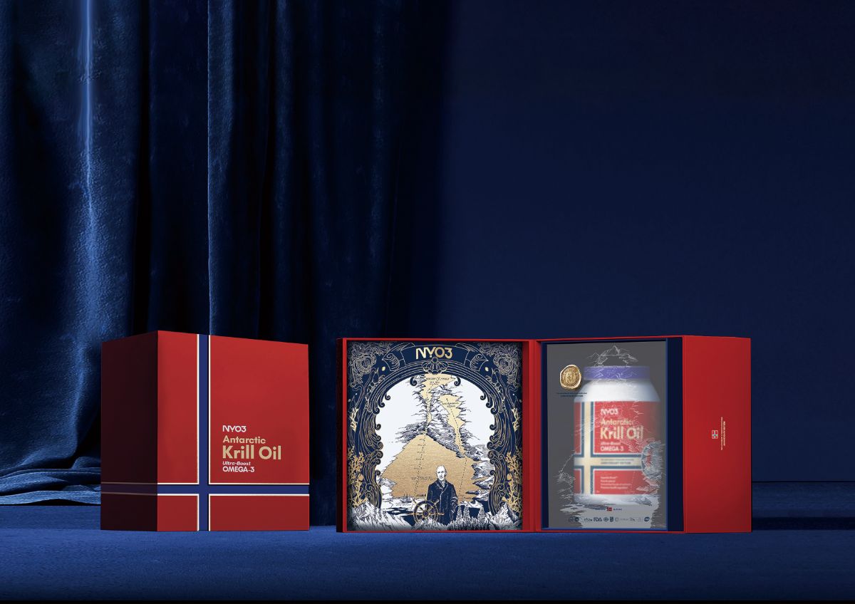
NYO3 Antarctic Krill Oil Golden Amundsen Edition
NYO3 International…
Package Design
|
2023
|
SILVER
|
ZUI XIHU
Hangzhou Langwei…
Package Design
|
2022
|
SILVER
|
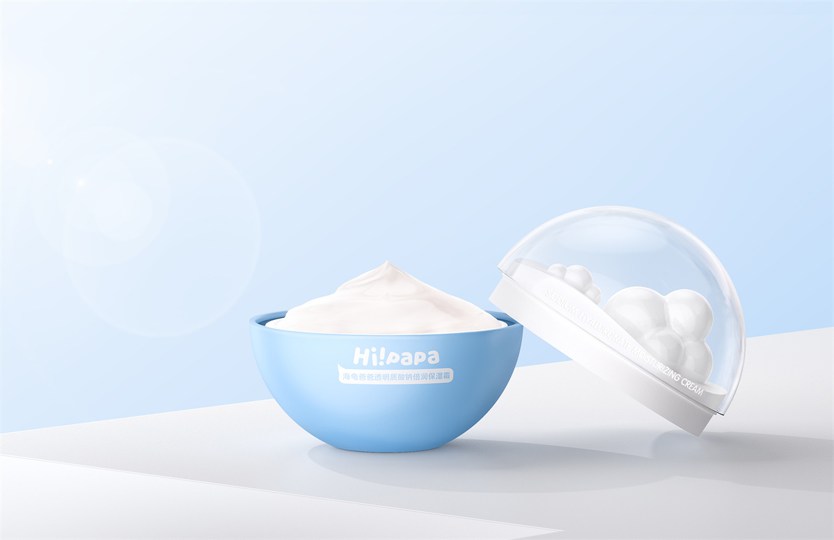
Hi!papa SODIUM HYALURONATE MOISTURIZING CREAM
Guangzhou good…
Package Design
|
2022
|
Innovation
|
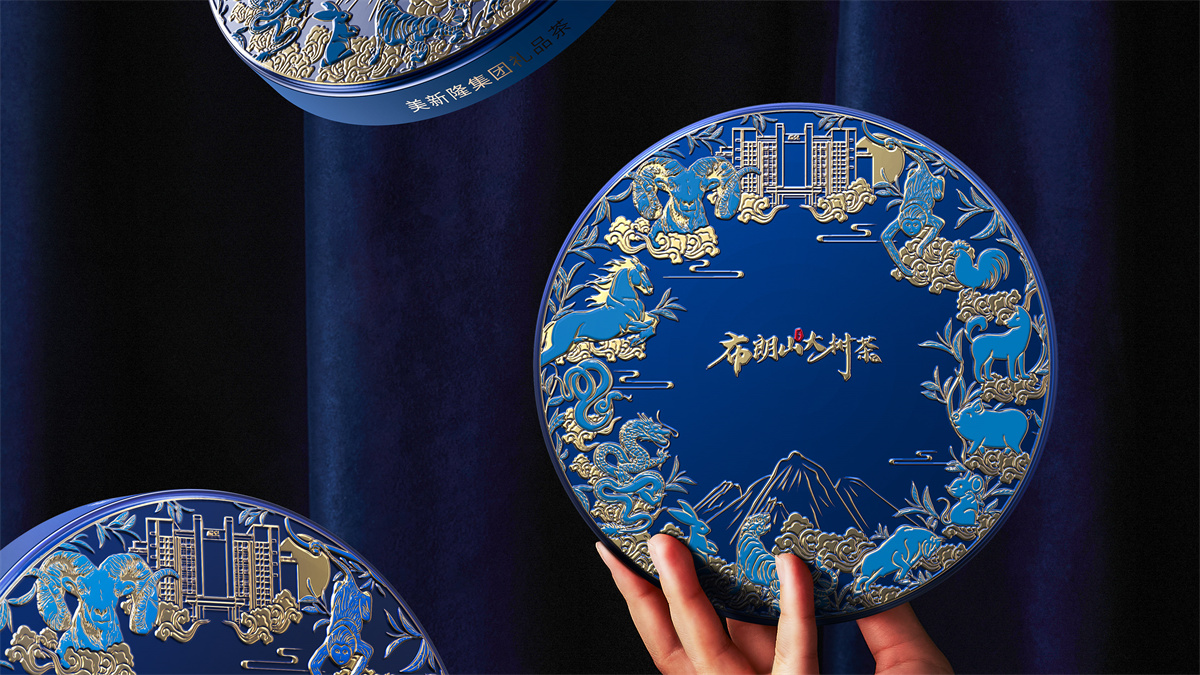
The Tree Tea on Bulang Mountain
A CREATION…
Scroll to Top