Design of Villa Space

Projet
Introduction
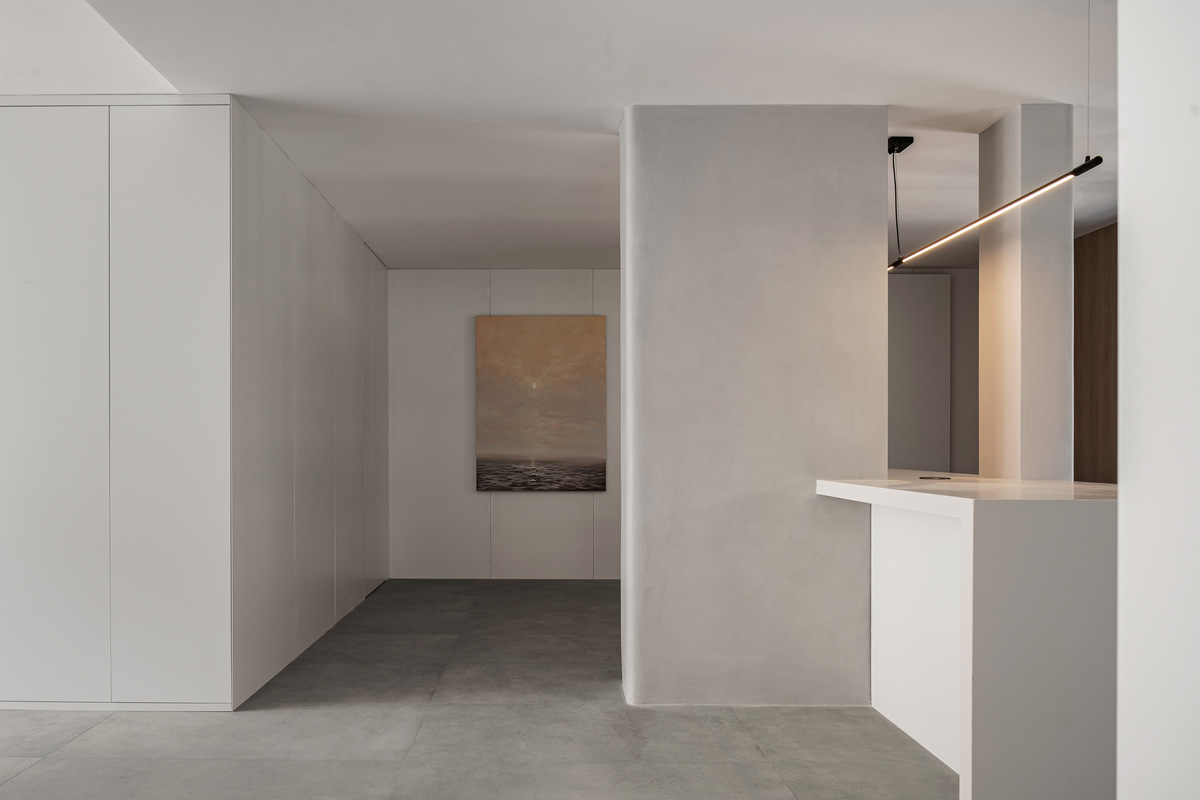
It is a quiet and quiet private space to walk through the tedious urban jungle and enter through the door. Those who know how to do subtraction in a noisy life will certainly enjoy a relaxed state.
Under the appearance of clean and stable space, it is actually a complex living system. The designer of this case carefully studied the utilization rate and utility rate of each space in the owner's life to achieve the ultimate accommodation; Curved and straight cutting, dislocation and expansion of spatial dimension, creating overlapping and penetrating spatial relations, and balancing function and aesthetics between hidden houses.
The original structure of the house is four rooms, and the owner originally requested that the four rooms be changed into two suites. Under the continuous running in, the functional requirements are gradually weighed and a consensus is reached in the requirements discussion:
1. Considering that the owner lives for two people for a long time, the double suite will increase the vacant space and the room utilization rate is not high. Part of the area of the suite can be used as a public space, and the frequently used place can be expanded to increase the usable area of two people, so as to solve the problem of narrow and long dining space and ensure that the dining space is still a comfortable sense of scale after the operation cabinet is placed in the dining room.
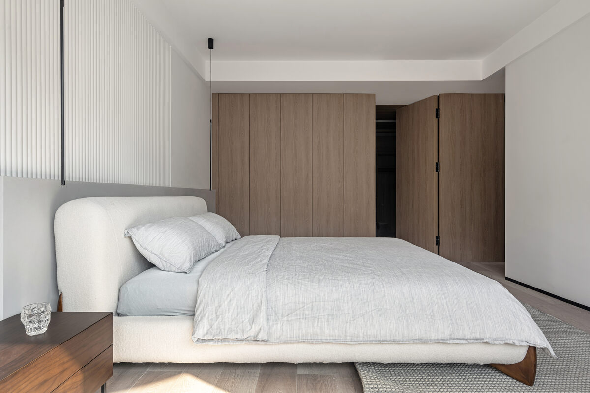
2. The original master bedroom space is further refined to ensure the comfort of the master bedroom space. The master bathroom space is expanded and divided into three parts. The cloakroom is subdivided into three parts according to living habits.
3. As the main activity space, the living room is divided into three functions on the premise of ensuring the space permeability. The living room area is divided into Cat rolling leisure area, video and audio area and reading area.
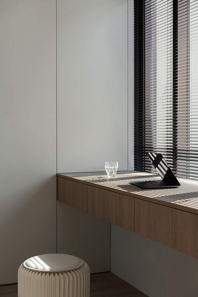
4. The storage space shall be maximized and concealed. Including TV and desk.
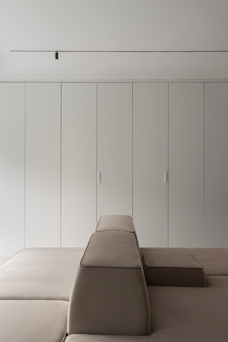
The living room also "hides" a large area of storage space, folding storage cabinet doors, hidden TV cabinets, and inadvertent walls may have holes, which is also to keep the overall atmosphere "exposed" clean and tidy to the maximum extent.
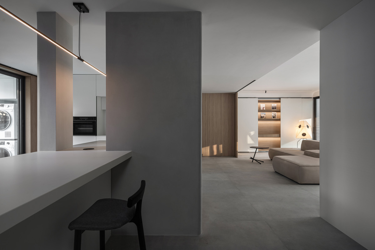
As the main activity space, the living room space is divided into three functions on the premise of ensuring the space permeability. The living room area is divided into Cat rolling leisure area, video and audio area and reading area. The whole house houses hidden design, simple wood grain, rough cotton and linen, and stone texture... Making the home a place to sort out the relationship between oneself and the environment.
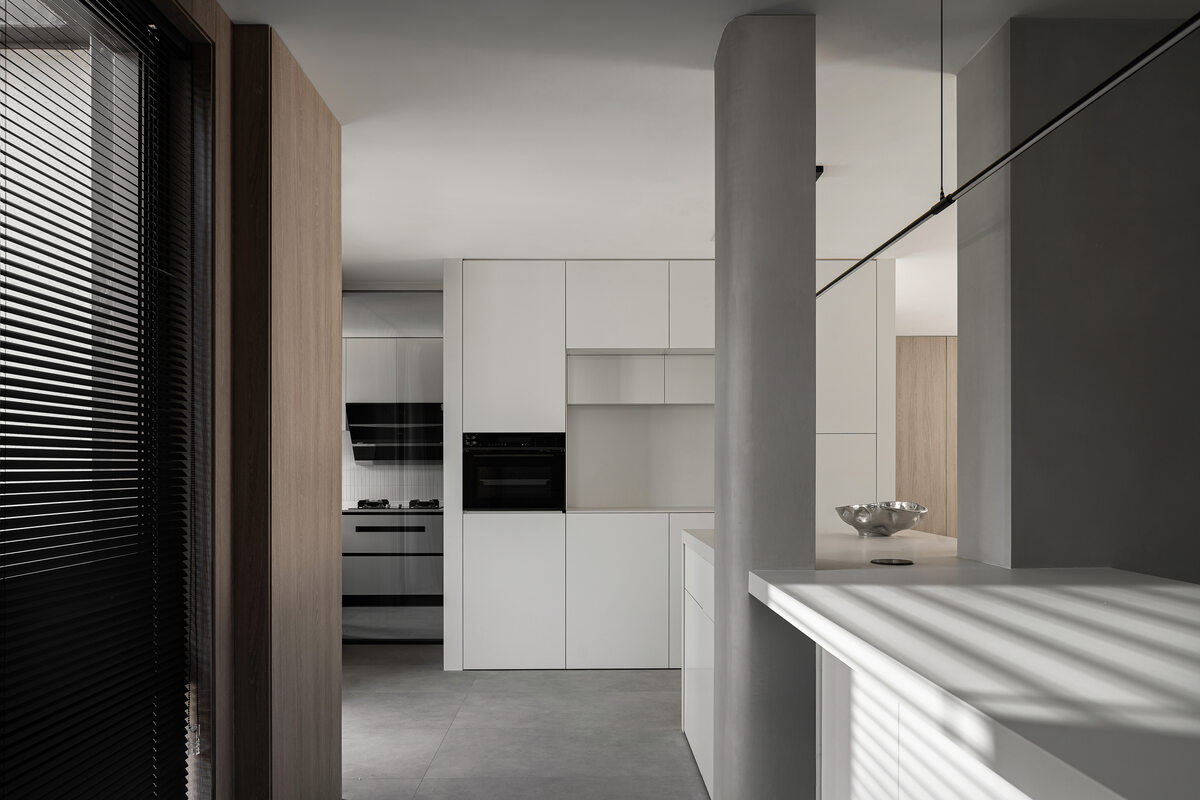
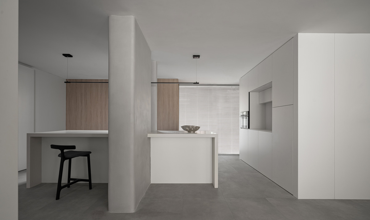
The restaurant area uses part of the suite area as a public space to hide and store, solve the problem of narrow and long, and ensure that the restaurant still maintains a comfortable sense of scale after the operation cabinet is placed.
Restrained material selection and color use, focusing on the most essential functionality of the restaurant. The bar table beside the meal is a solid and powerful existence to meet the daily dining needs. The sliding door on the inner wall of the kitchen increases the openness and concealment of the kitchen. The large kitchenware is "invisible", and the space posture is more light and simple, with sufficient storage capacity.
The ghost door on the side of the dining table is closed during the dining to ensure the sense of enclosure and ceremony. At the same time, the privacy of the next bedroom suite is also protected. This creates a subtle dialogue and creates visual interest in simple design.
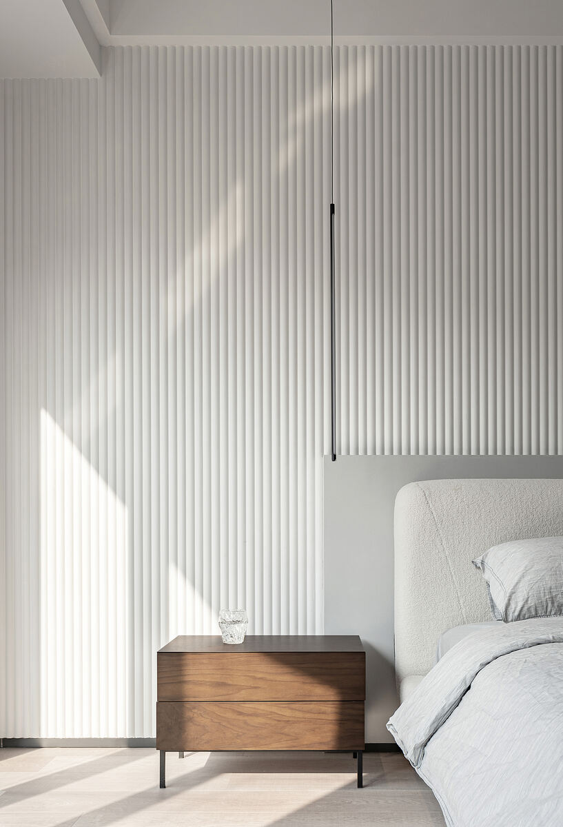
The master bedroom suite is shaped in a minimalist style. In the elegant atmosphere of low saturated ash, the wooden tone of warm style is mixed. The separation of dots, lines and surfaces creates a soft and quiet atmosphere here, which gradually spreads out, making every day a return to zero ceremony, balancing comfort and beauty.


Design by PENG YANGYANG、YangXi


