Professional Award -- Innovation
Design of Real Estate Sale Center
Sales Department, Huitong Plaza
Projet
Introduction
Wuxi is known as "Liangxi" because it flows through Liangxi. Walking through the city and exploring its urban context, self-confidence and humility are its temperament. Between tradition and modernity, the city has always maintained the prosperity of ancient times, and retains the leisure beyond the noise of modern city.
The project is located in Huinong bridge, Xingyuan North Road, Liangxi district. It is located in the south of the Yangtze River. It is also located in the political, economic and cultural center of Wuxi City. Through the creation of the scene, the sales space is given a great possibility, so that visitors and visitors can feel the fusion of traditional and modern customs and humanistic feelings in an interactive way.
Beyond the main entrance, all the stories unfold slowly.
The main functions of the sales department are divided into 10 areas: 1. Reception area of front office; 2. Sand table area; 3. Household model display area; 4. Construction method material exhibition area; 5. Sofa negotiation area; 6. Round table negotiation area; 7 , water bar area, 8, VIP negotiation area, 9, cashier financial area, 10 toilet, 11, office area, office area is an independent area, separated from the sales part. In the design, the entrance hall is the central axis, and the dynamic and static area is mainly on the left side (sofa negotiation area, round table negotiation area, VIP, financial cashier area, toilet). On the right side is the dynamic area (model area, household model area, construction method material display area) )
Projet
DESCRIPTION
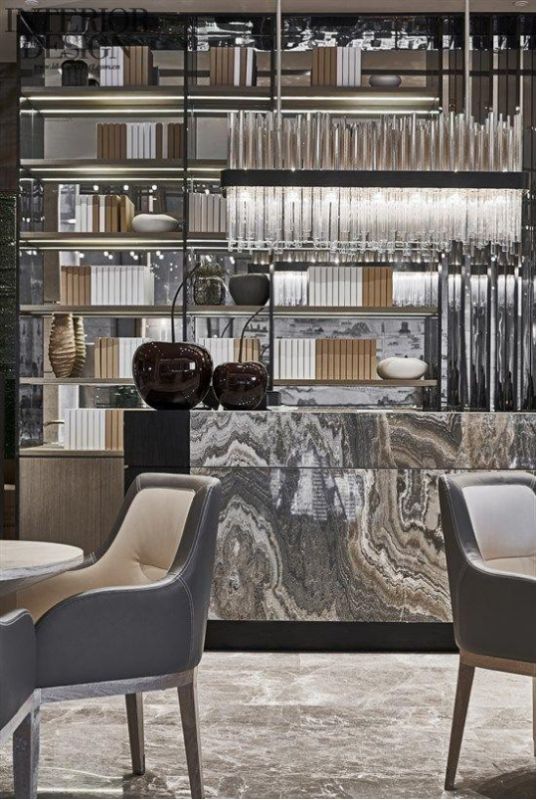
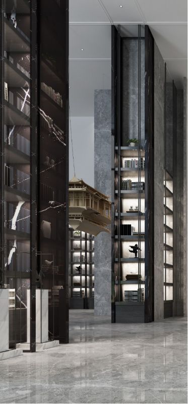
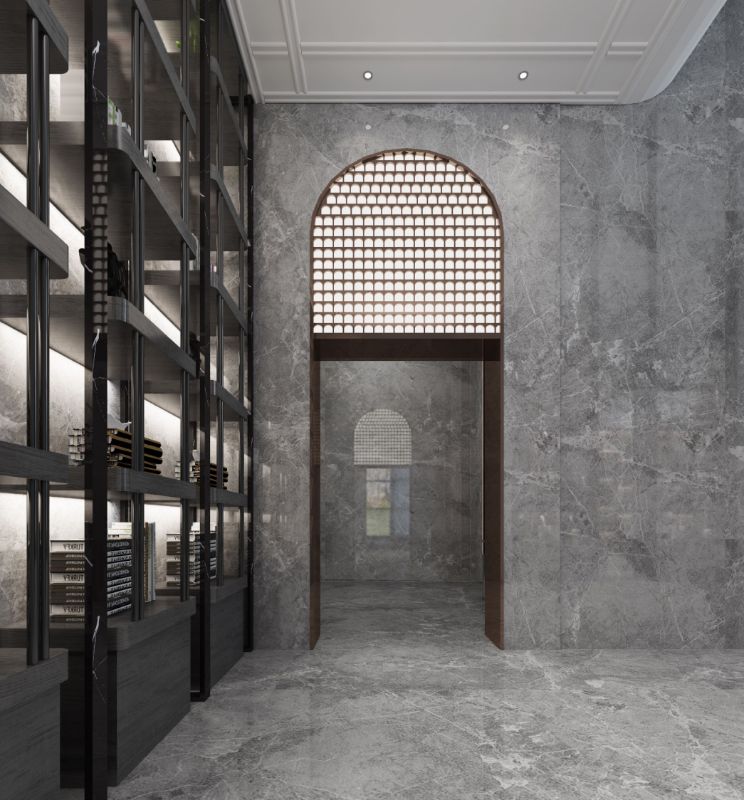
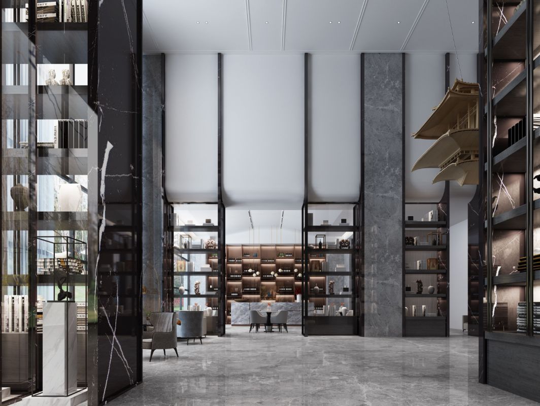
1. The front hall space is enclosed, and the welcome desk stands against the door, and is replaced by courtesy. The setting frame can be used for books and utensils. The light and shadow are integrated into the black and white stone to improve the detail quality of the display stand. The symmetrical structure inherits the beauty of Chinese tradition. The arch on the background wall of the hall introduces the arch element of Jiangnan bridge, and the material is jazz white stone, which is modest and inclusive , copper metal edge around, heavy and simple.. The reception desk is located in the center of the space, facing the front door in pairs. The ground is light gray stone, just like a piece of paper. Other modeling structures are on the paper, with a sense of atmosphere.
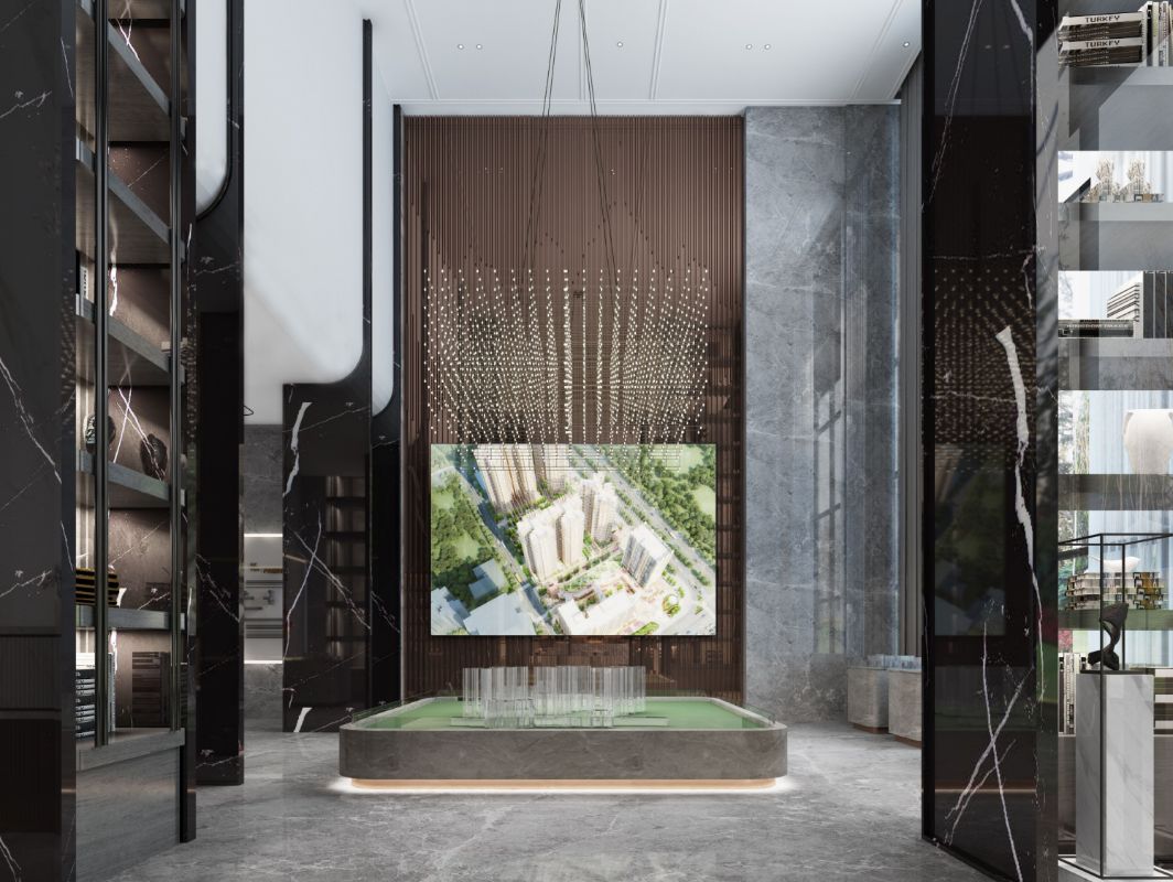
2. Sand table area uses lines to break the fetters of image meaning, and responds to the rationality and restraint of modern people with conciseness and cleanness. The circular arc design of the four corners of the main sand table makes the tour more safe and smooth. The large-scale modeling lamps with deconstructionism are hung in the air. They are modern and full of power, presenting a kind of beauty of order and overlap. At the same time, the space is perfectly reflected, which is simple and elegant. The large-scale electronic screen is used as the background wall to display the real estate information in multiple directions.
The 3-household model area is adjacent to the main sand table, which is convenient for visitors to reference and compare, so that they can understand the real estate information from multiple perspectives.
4. The construction material exhibition area (Zi) is set up adjacent to the main sand table, which is easy to visit and the space height is greatly reduced. The design is based on the viewing habits and with hidden lights to make it more attractive in the display effect and better understand the technology and main materials used in the building construction.
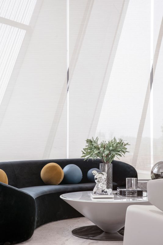
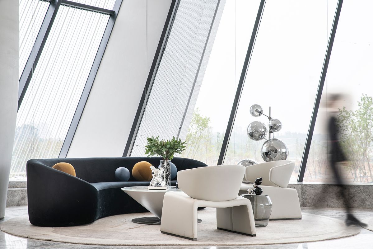
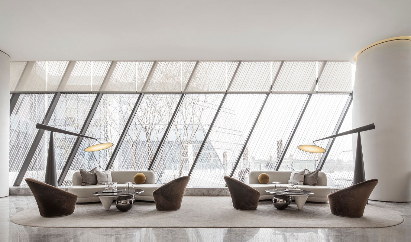
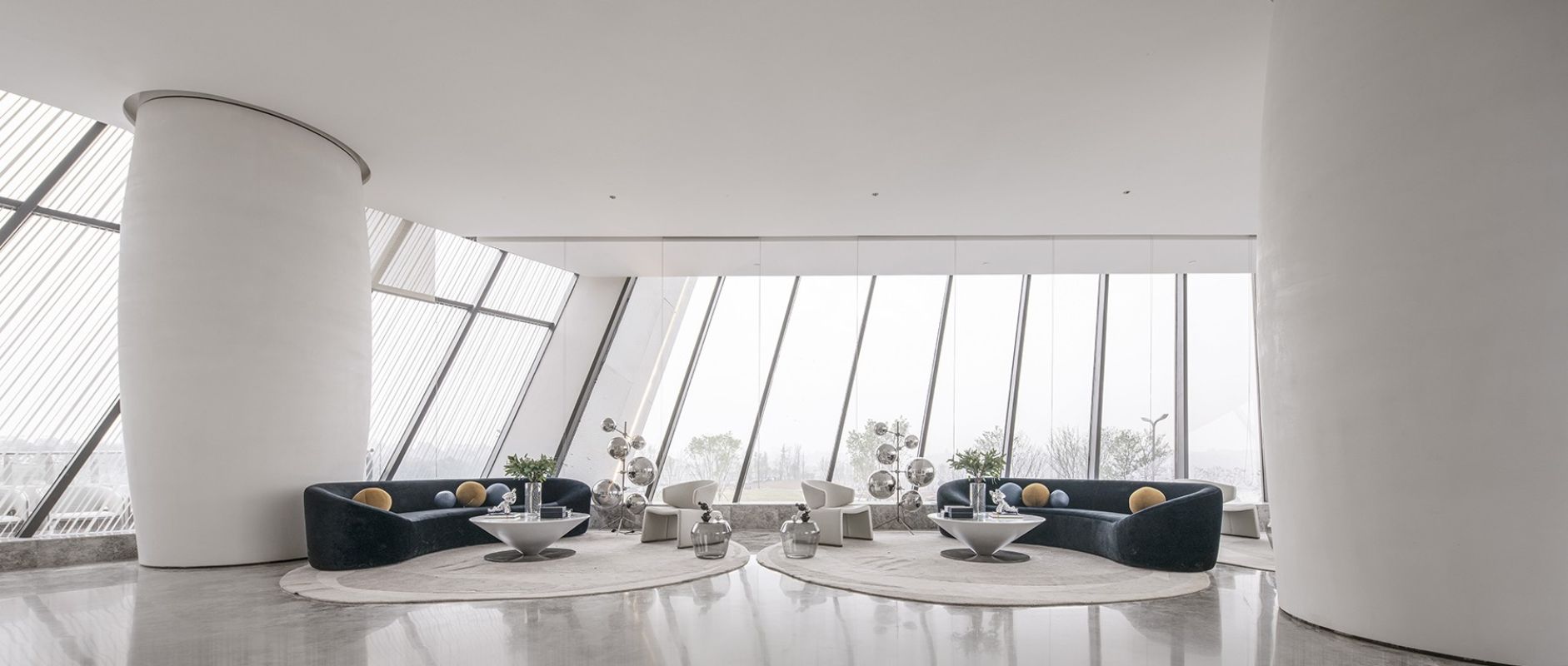
According to the spatial pattern, the sofa negotiation area is set up against the curtain wall, with the use of super-high display shelf space, free enclosure, leading scenery into the room, light flow and shadow turning, with unique charm. At the same time, the light gray sofa echoes the space tone, which is harmonious and unified as a whole, simple and generous. It helps to focus the visitor's mind on the conversation.
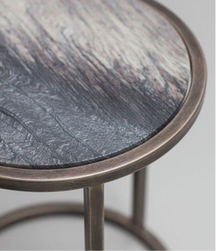
As the main way of negotiation, round table negotiation is characterized by independent and orderly functional layout and moderate reduction of space height, which improves the intimacy and warmth of the space and optimizes the functional experience. The small table is surrounded by freedom and comfort. It is like an old friend who talks with each other and is happy.
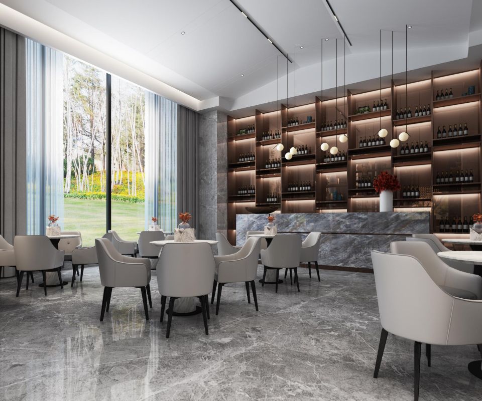
7. The water bar area continues the modern and rational reception desk, and is inclusive in design. It explores the interaction between light and material texture, and the collision between different materials to create unique urban charm. The light gray stone bar table modeling uses geometric figure as the design element, which is implicit and restrained, simple and free from vulgarity. The overall open shelf design of the rear cabinet has the ability of storage and display. With the rendering of lighting atmosphere, the water bar area has different shapes.
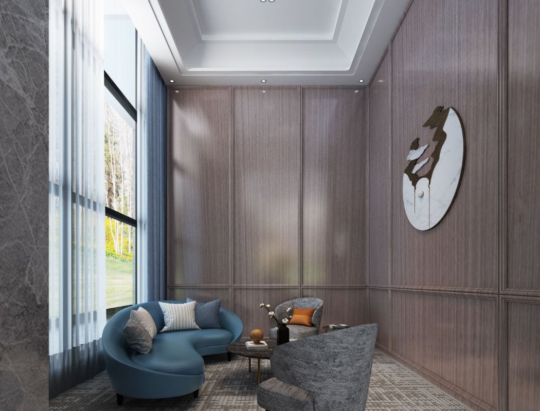
8 VIP negotiation area is a special space, which is a symbol of honor and courtesy. In terms of space effect, the wall surface is mainly made of wood veneer. The ground is covered with beige carpet to enjoy the daylighting. The background is based on an interesting wall decoration, which is natural and pure. The lighting design makes the space open and close, urgent and slow.
9. The cashier financial area is close to VIP negotiation area, and close to other negotiation areas. The incoming and outgoing lines are set outside the negotiation area, avoiding the inconvenience of directly facing the negotiation area. The design adopts the method of combining virtual and actual comparison to partially open the public area using the display shelf, which breaks the tedium and discomfort of traditional space.
The 10 toilet is close to the cashier financial area, and close to the negotiation area. It is divided into male and female areas. The number and configuration of the toilet can meet the requirements. The super large toilet area takes care of the functions of toilet and make-up, which is convenient for visitors to use.
11 office area exists independently, the functional divisions of each functional department are reasonable, the moving line is free and convenient, and the work efficiency is improved
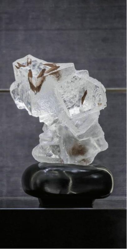
The significance of the pendant: the first point is to pay homage to the craftsman's spirit; the second is to warn every employee to learn from the craftsman's spirit; the third point means that our service and engineering will be like the spirit of the craftsman, and strive for perfection, which is the spiritual fortress.

Wang Shiqi
Wang Shiqi
Wang Shiqi, a space architect, was born in Tangshan in 1984. With modern style as the main, good at Chinese culture and art elements into its design.
Chinese Name: Wang Shiqi gender: male foreign name: wqangshiqi Nationality: Chinese Nationality: Birthplace: Tangshan, Hebei Province; date of birth: September 1984: Graduate School of professional space designer: Xi'an Academy of Fine Arts
education
Bachelor of Arts
Social position
Member of China Interior Decoration Association
Member of China Architectural Decoration Design Association
Registered senior interior designer of China Interior Decoration Association
Senior interior architect of China Building Decoration Association
Founder of Shaanxi Jianpu decoration design Engineering Co., Ltd


