Design of Villa Space

Project
Introduction
Based on the design concept of the building itself, optimize the plane layout to achieve reasonable movement lines and alignment between households. Highlighting the beauty of light and shadow and building blocks, creating a natural and comfortable elegant space.
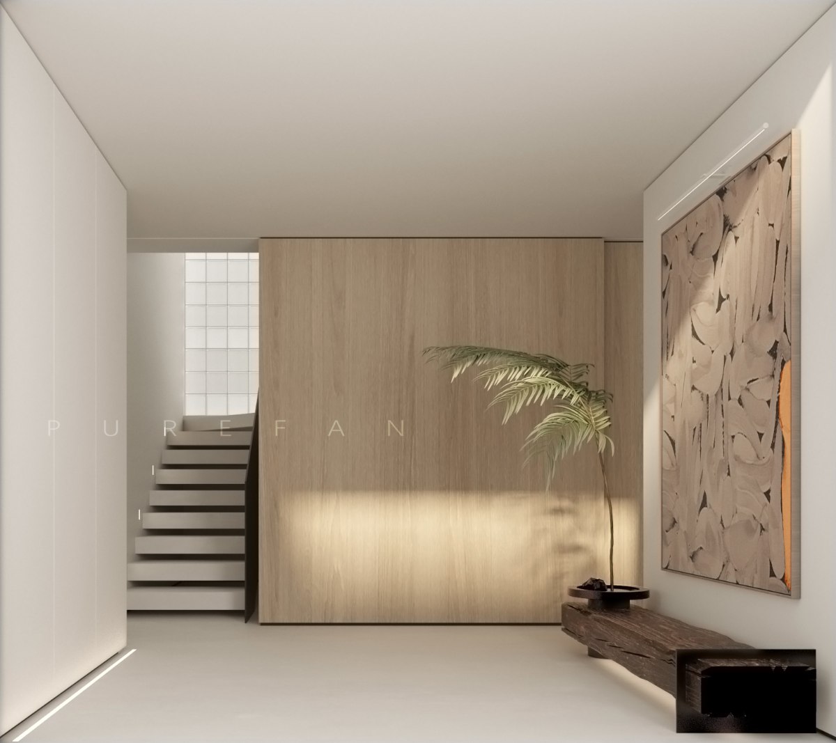
Entering the space through the main entrance door, one can intuitively feel the visual scale brought by the expanded foyer. The architectural beauty brought by the stairs, combined with the wooden sliding doors, forms the spatial background. The protagonist's halo gives the artistic installation on the right side of the space, extending a warm and natural design tone. The axis of the art wall extends towards the living room
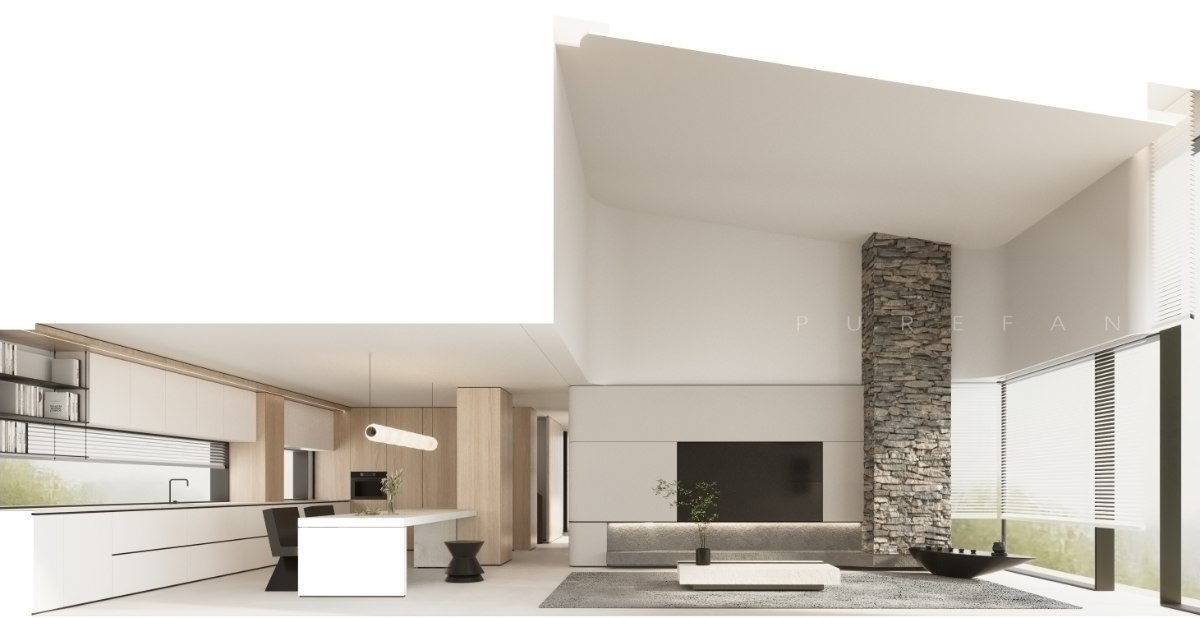
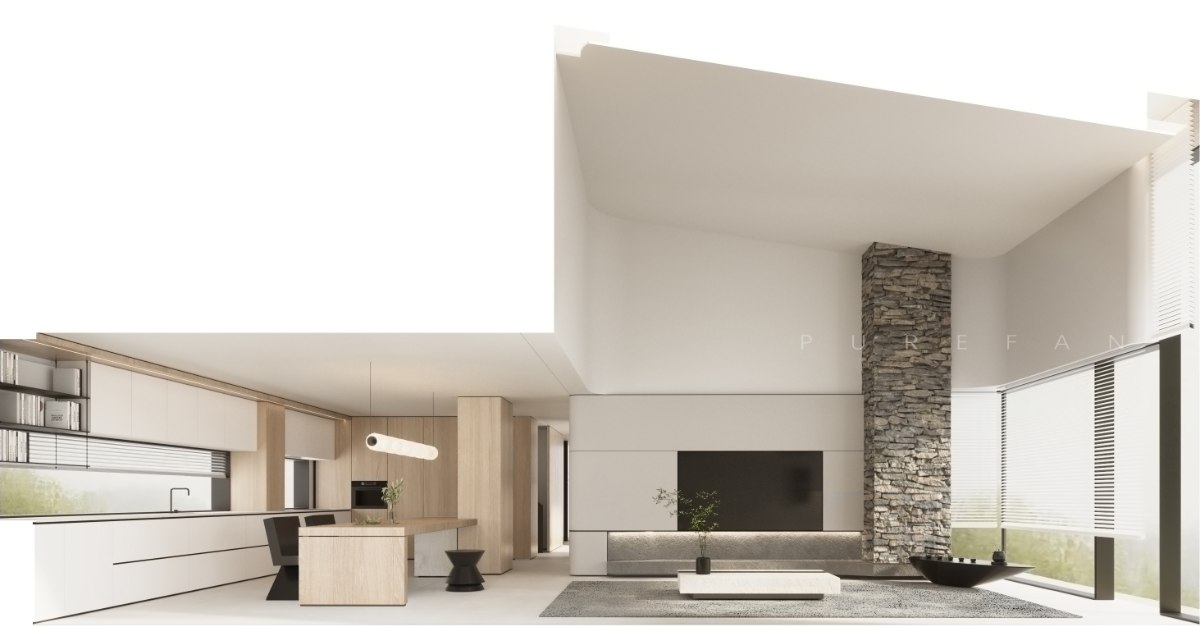
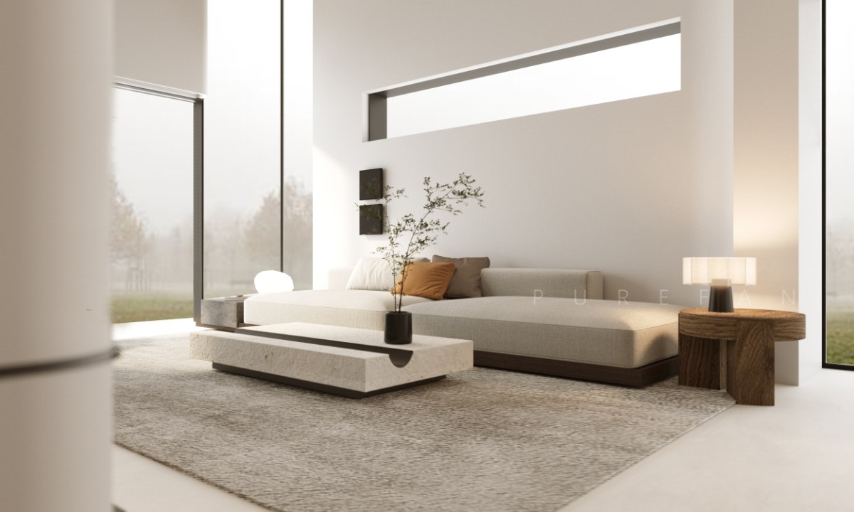
The original structure of the fireplace is too large, causing compression on the living room background wall and TV. The design has changed it to a decorative column with a stone veneer on the ground, emphasizing the vertical relationship of the space in conjunction with the high overhang. The bottom is interspersed with the TV platform to form a block intersperse.
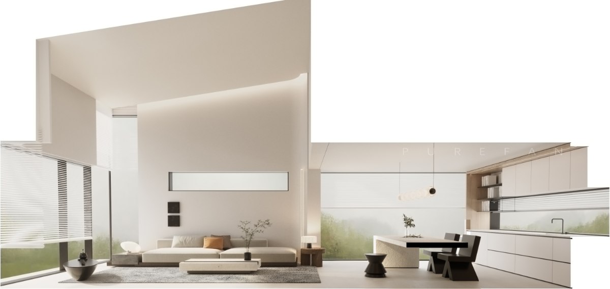
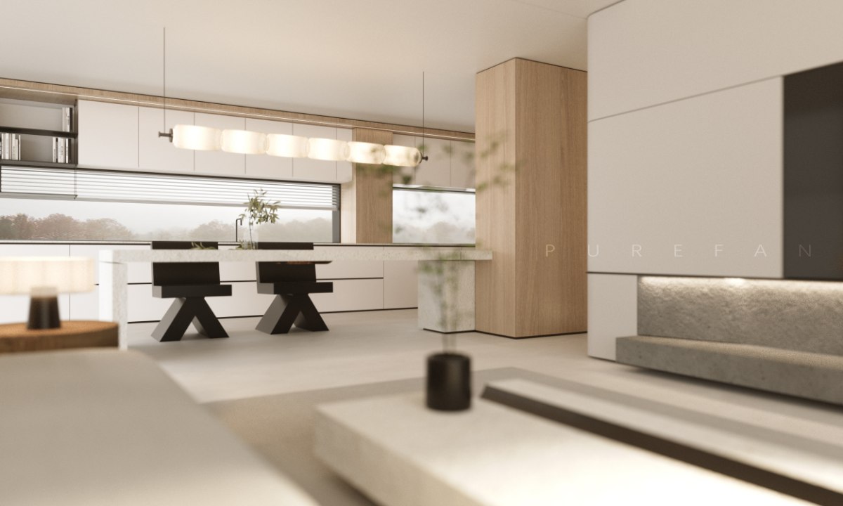
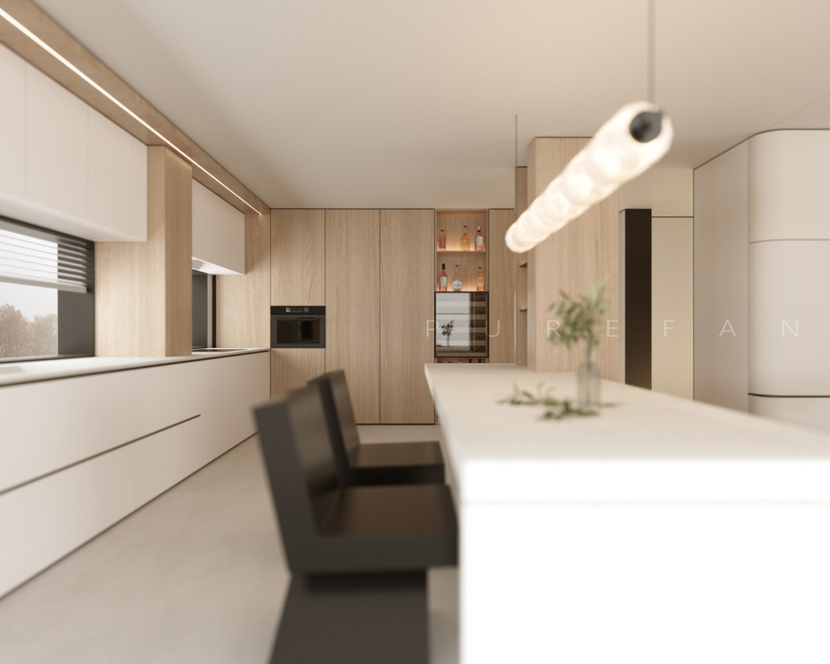
The light is projected downward from the ceiling to fill the space level. The horizontal window is combined with the large-scale landscape windows on both sides of the space to release the breathing sense of the vertical space, so that the courtyard landscape flows indoors, connecting the linkage between the living room and the kitchen space, and echoing the wooden elements dotted in many places of the soft decoration. "Two trees prosper and wither", which also prospers and withers. The forest outside the court is dense, and the house is full of interest.
The large area of wood elements show a light upward trend in the visual level, which is still in motion. With the soft decoration of heavy blocks to achieve visual balance, the entire space has taken root.
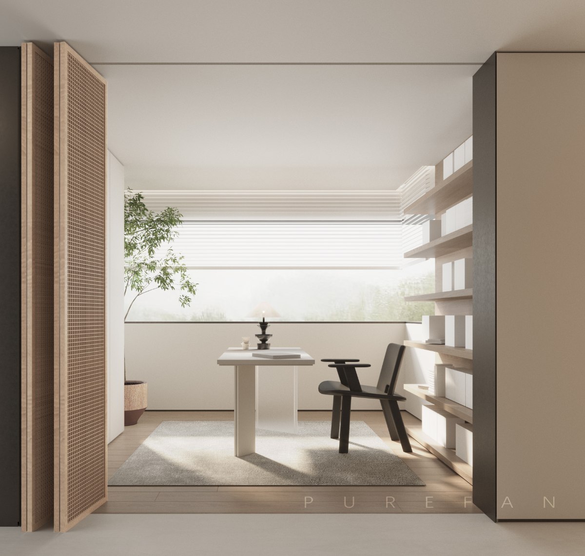
The screen door allows the study space to open and close freely, shifting with the environment. The light colored cabinet on the left hides the workbench, and the bookshelf on the right is connected to it
Forming a combination of deficiency and reality
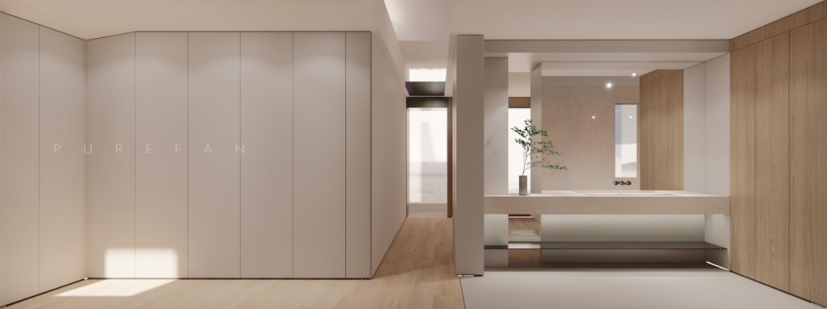
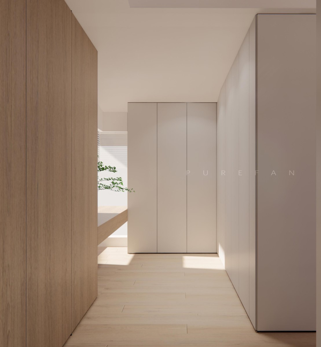
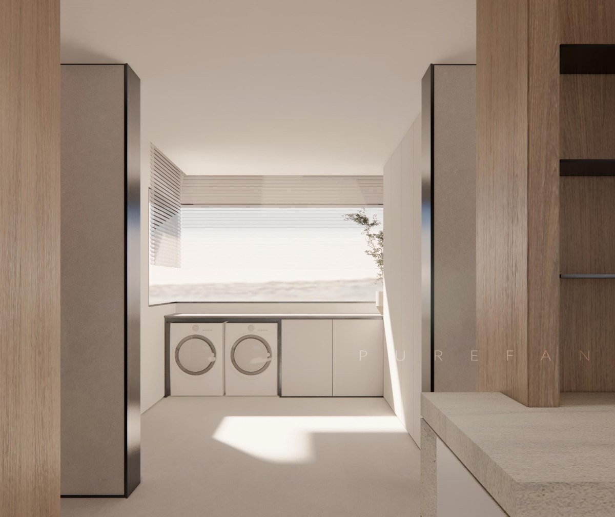
From a functional perspective, there is an operating table above the washing and drying equipment in the housekeeping room. The floor cabinet is used to store daily necessities and cleaning tools, while the right high cabinet is used for storing shoes and hats. Local cleaning tools are stored, and a power supply is reserved inside the cabinet to meet storage and operation requirements.
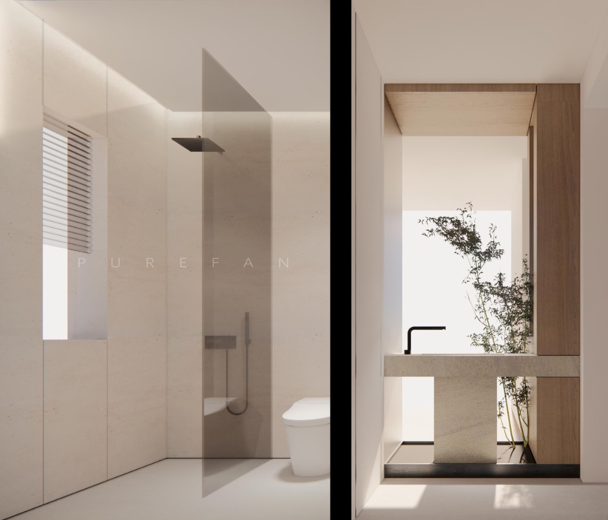
The partial decoration of the public bathroom is wooden in color, and most of the walls maintain a light texture, combined with the downward washing of the ceiling light strip, which is delicate and comfortable.
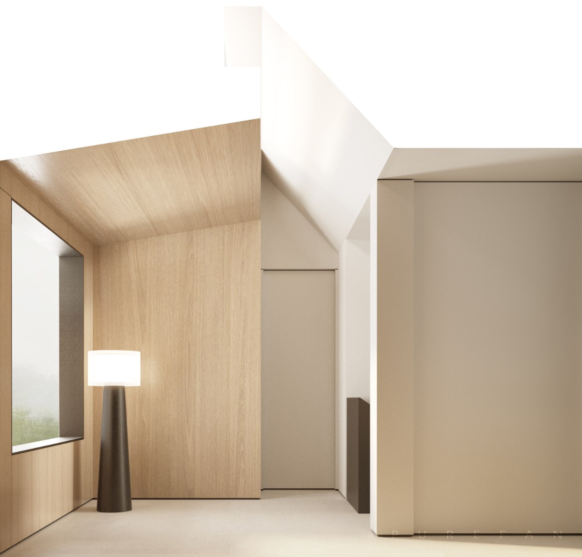
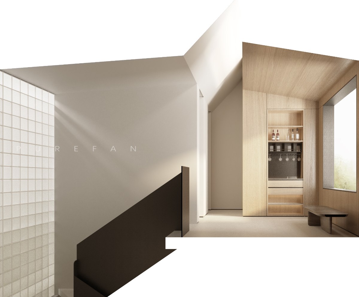
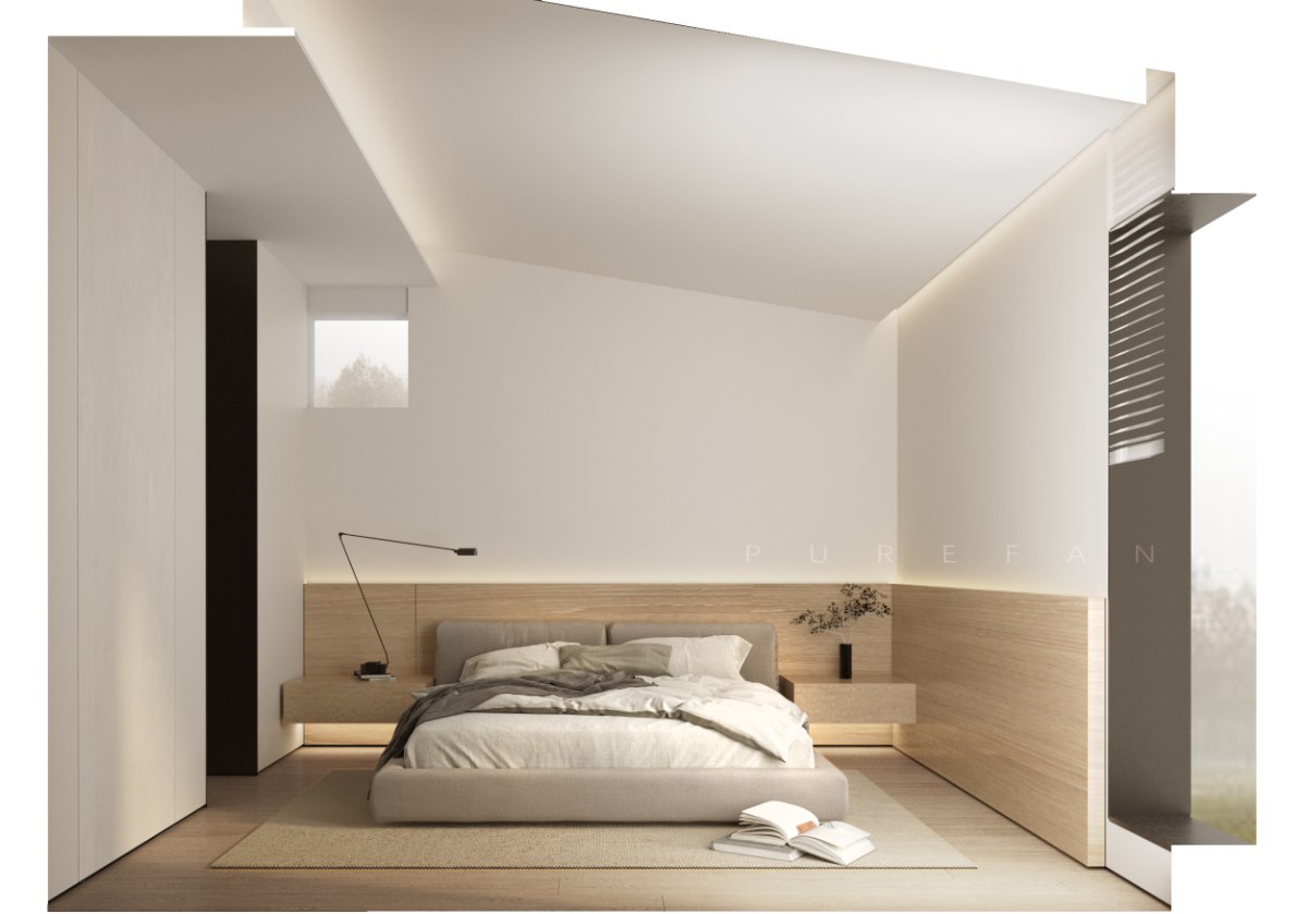
Utilizing building elevation and the original sloping roof, opposite sloping roofs overlap and intersect with each other, highlighting the building block, allowing natural light and sloping roof to shine
Diffuse reflection, light flowing down the inclined plane, and a sculptural floor lamp filling the water bar space with artistic effects.
Wrap it in wooden decorations to create a natural and warm spatial atmosphere. On the reverse side, you can see the embedded water bar cabinet, which is unified as a whole while enriching the display effect of the spatial interface.
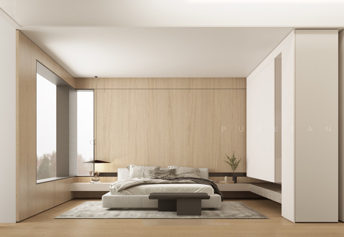
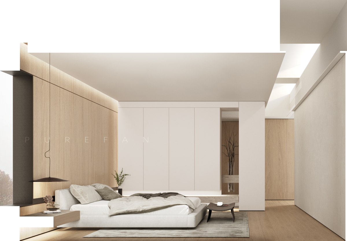
The master bedroom is a semi enclosed structure with an "L" shaped wood veneer, combined with an "L" shaped window opening, to make the wall more transparent. The right cabinet and ceiling form a longitudinal "L" shape, with the blocks interpenetrating each other.
The wardrobe block combines overhanging and perspective, with partial setting of transparent scenery, enriching the progressive layers of space, and the wardrobe does not appear dull and heavy.
The cloakroom is designed with maximum storage capacity, with the main bathroom space on the right, and the mirror surface expands the space's appearance. The bottom of the washbasin is equipped with a layer board, emphasizing the horizontal extension of the space. The right storage cabinet meets the storage needs.
A wooden bed back panel is installed at the head of the secondary bed, forming a semi enclosed bed. The original square window is retained at the top of the bed head, making the wall more transparent. The top shape hides the central air conditioning equipment, making the space more organized. The ceiling hidden light strip gently washes down the light along the sloping roof, increasing the details of the spatial interface.
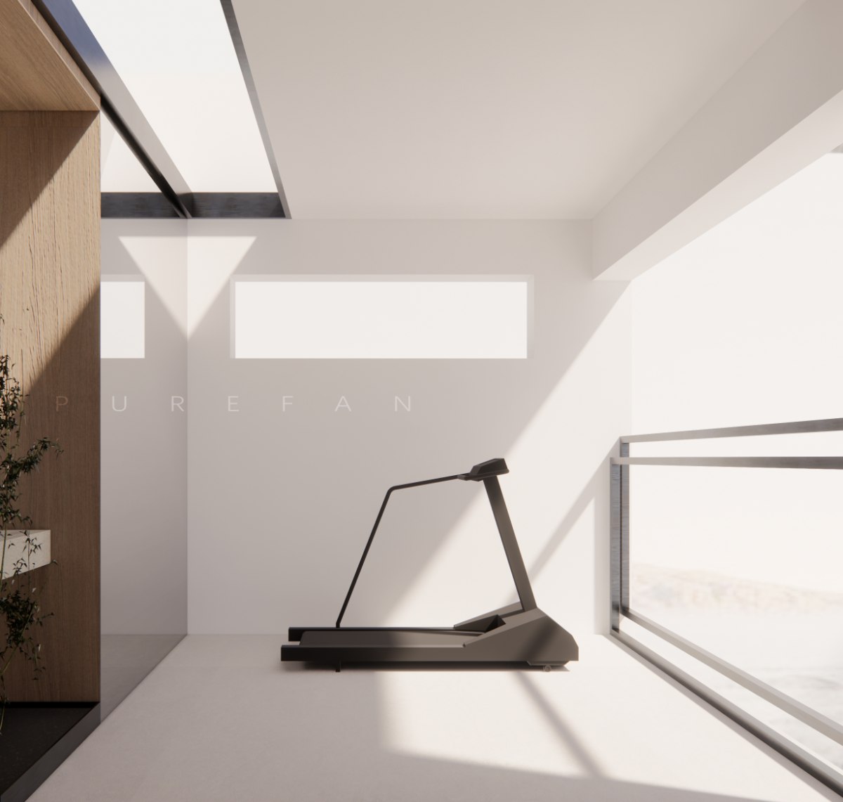
The open water basin area, combined with green plant partitions, is particularly unique, providing a unique landscape for the fitness area, where functionality and beauty can be equally divided.

Design by Tianjin PUREFAN Interior Design Co., LTD
Tianjin PUREFAN Interior Design Co., LTD is a professional interior design organization. Mainly committed to customizing unique private residential spaces for the elite class, creating value for life. Pufan adheres to the design philosophy of innovation, uniqueness, and non repetition, focusing on tailoring each project.
2022 Japan IDPA AWARD International Pioneer Design Award-TOP10 International Most Influential Design Agency Award of the Year
2022 Japan IDPA AWARD International Pioneer Design Award-Villa Space
2022 French double-faced God GPDP AWARD International Design Award-Villa Space

