Character Award
Catering Service
Aurora Restaurant – by Bin LIU
Projet
Introduction
Project Name: Aurora Restaurant
Title: semicircle
Design time: March 2019
Design style: minimalist
Main materials: latex paint, terrazzo, metal plate
Construction area: 228 M2
Projet
description
In order to create an impressive "first impression" of Aurora restaurant and allow it to occupy a place in the hearts of local customers, customers know that the focus of the project is to provide high-quality and unique dishes and services in a charming and comfortable environment. The objective of this case is to create a space that echoes the owner's ambition to produce the best food and the most distinctive dishes.
If we say that under the premise of ensuring the design effect, the real cost saving is a great challenge for the whole restaurant design. The fundamental of dining space design is to solve the operating costs of restaurants and meet the dining needs of customers. In the design of the project, the reasonable layout of the restaurant space, the accurate use of decorative materials, customer behavior trajectory and other aspects, combined with restaurant operation considerations, really achieved the optimization of cost control and solved the high cost problem that the owners worried about.
First floor bar
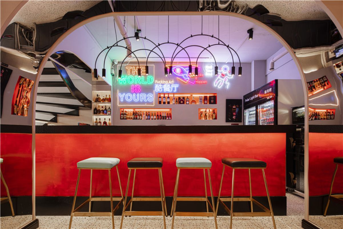
In ancient China, the circle symbolizes eternity, so the whole bar area chooses arc shape as the main design element of this space, which also means that the restaurant can operate for a long time. The collocation of lamps and lanterns is creative, personalized, arched, geometric, artistic, chandelier, and colourful neon lights. When the night falls, the lantern lanterns will start, and the charming and dreamy neon will bring different visual experience for more diners. The design elements of mirror stainless steel are skillfully used on both sides of the bar to expand the sense of indoor space and bring strong visual impact to diners.
The bar chair uses two kinds of seat surface, which are Matt and bright, giving people the feeling of steadiness and elegance, bright and gorgeous, and embodies the humanized design. Provide convenience for more waiting customers.
Dining area 1 on the first floor
Space around the unified elements, from facade geometry to decorative painting, around the U-shaped throughout the space. Lavender and Eucalyptus are used as table flowers to add fragrance to this space and relieve the tension of customers at the same time.
Dining on the first floor of area 2
This space adopts arc shape as the main design element. The simple, warm and soft characteristics of wooden tables and chairs can be well supplemented with metal materials to make it more harmonious and effectively improve the design effect of the space. Chandelier as one of the elements of dining area can not be ignored, as the soul of the space, it carries not only the function of daily lighting, but also the decoration of the dining area. The inherent linear aesthetic feeling of geometric modeling deduces the connotation of minimalism, which makes it look fashionable without exaggeration, and shows the simplicity incisively and vividly.
Dining area 3 on the first floor
The wine culture, one of the selling points of the restaurant, is skillfully integrated into the round shape. In contrast to the red light in the background, the red light is more prominent in the background.
Dining area 1 on the second floor
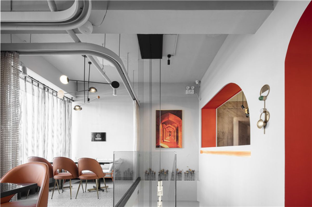
Semicircle, derived from half. The so-called "half", that is, the interweaving of the new and the old, is the collision between the trend and the secular.
Dining area 2 on the second floor
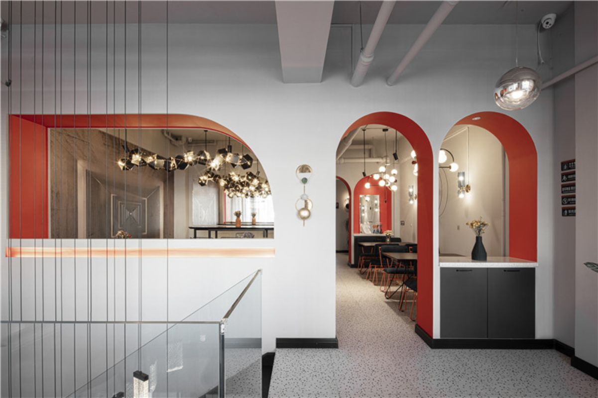
The continuous semicircle, like a beating heart, is warm, fresh, full of vigor and vitality.
Dining area 3 on the second floor
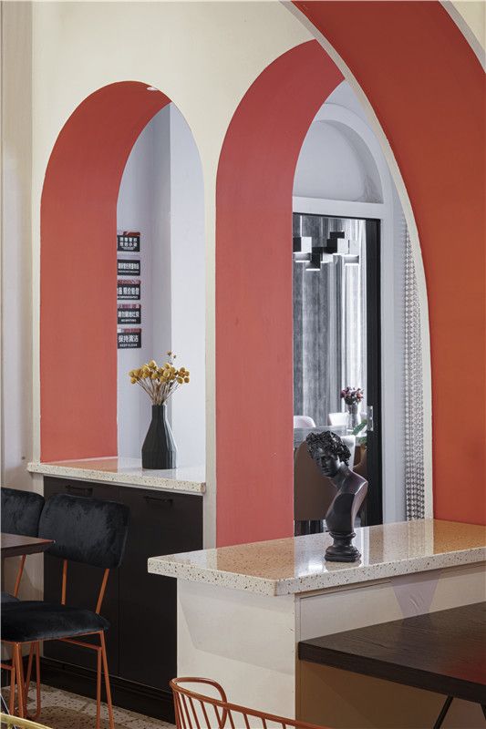
In the shape design, the arc not only brings the visual softness, but also dispels the sharpness when dividing different areas. When the appropriate proportion of the arc becomes a consistent element of space, whether in the division of space, or simple decorative form, will bring a unified artistic quality to the space. Modern orange seats add a touch of light to the dining area.
Dining area 4 on the second floor
Each piece of art is the result of careful selection. In the space dominated by gold and red, geometric black dining chairs inject some embellishment into the space.
Dining area 5 on the second floor
The artistic ornaments with smooth lines, namely Apollo sculpture of Apollo, make the space full of artistic atmosphere.
stair case
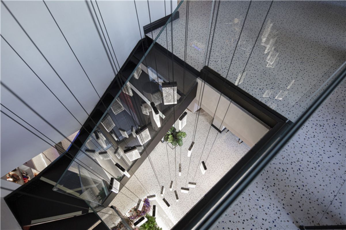
The whole color terrazzo floor of the space is like a canvas to set off the fire like enthusiasm of the space. The waterfall type chandelier is hung down from the second floor and flows like water, forming the golden red color of the space like fire, which is half water and half fire. After the combination, you will find that it is a "light" word, just like life, not blindly advance, not blindly retreat, is both enthusiastic like fire, and calm as water, advance and retreat in a certain degree.
