Professional Award -- SILVER
Design of Commercial Exhibition Display
Hainan Sanya Reich International Medical and Beauty Center
Projet
Introduction
Name: Hainan Sanya Reich International Medical and Beauty Center
Venue: Sanya City, Hainan Province
Area: 1000㎡
Cost:2 million RMB
Completion date: September 2018
AWARD’18
Prize winners: K-DESIGN AWARD’18 WINNERS
Hainan Sanya Rusi International Medical and Beauty Center is a professional medical and beauty organization providing professional medical and beauty consultation and customized beauty services.
Projet
Introduction
1/
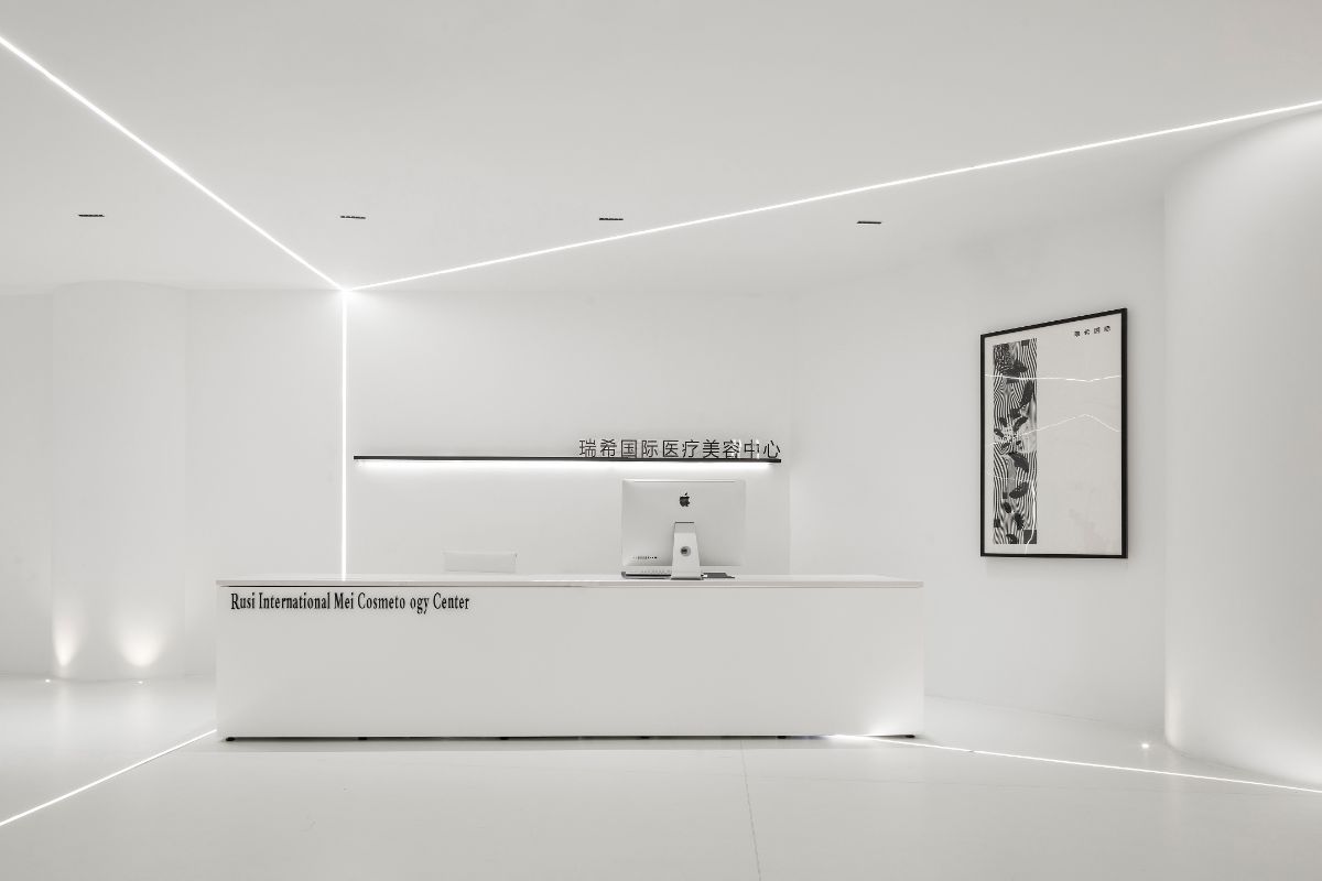
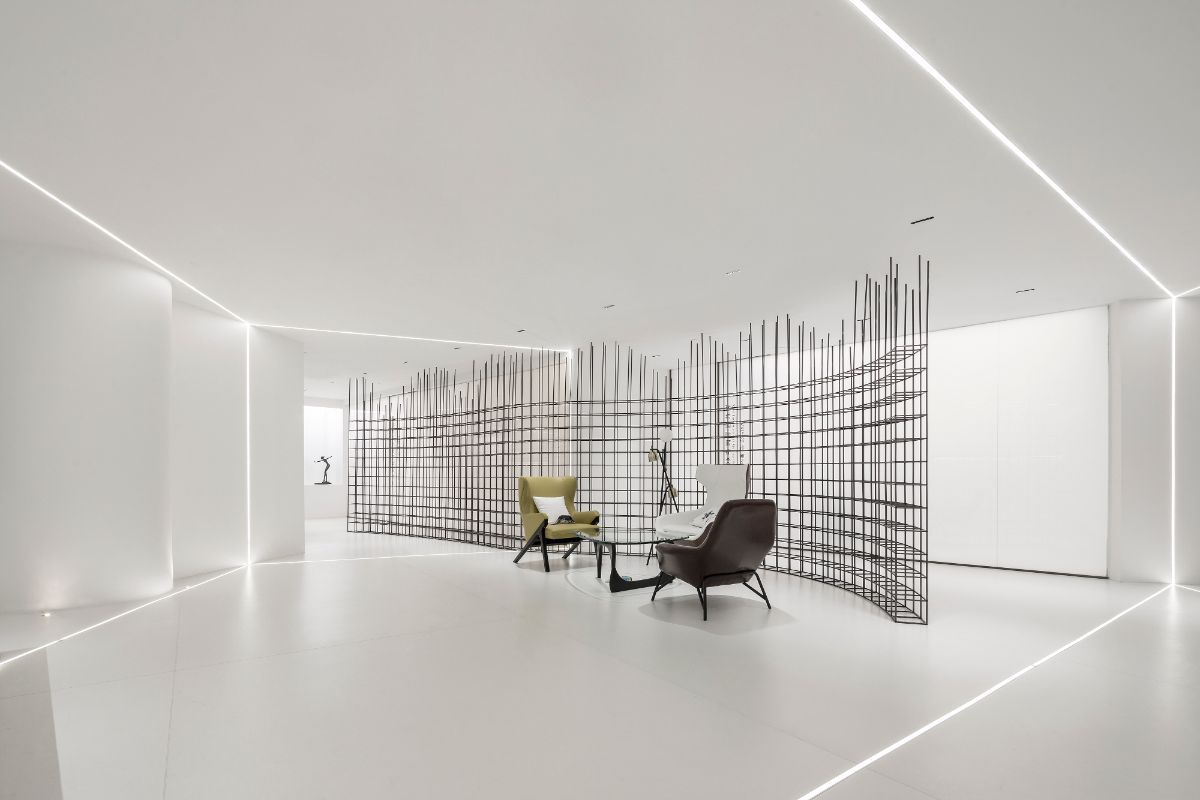
Colour: The philosopher of ancient China: Laozi. Once said: Five colors make people blind. In this case, we insist on using white as the tone. The use of white does not necessarily mean "minimalism". Minimalism does not depend on any particular color. White is a neutral color. This neutrality, like the doctrine of the mean advocated by Chinese culture, is a control of enthusiasm and a power of desire control.
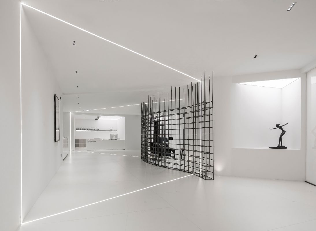
Planning white and keeping black is the principle of Chinese painting. Empty, empty and spiritual can not only be adjusted by the depth of ink, but also blank is an important means. In the case of space, large areas of white and small areas of black are combined. We try to make this combination principle conform to the principle of traditional Chinese painting, so that the viewer can produce simple and ultimate multiple experience through the organic combination of point, line, surface and body.
2/
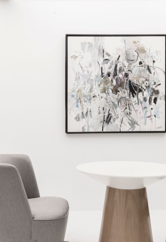
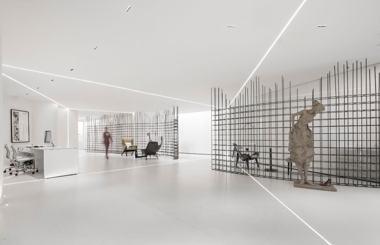
Art: Space without works of art is soulless. Like a dragon without eyes, beauty without virtue. In this case, we insist on creating works of art by ourselves. Use sculpture, painting, digital technology and other means to arrange every center or corner of the space, giving the soul of space beauty. Of course, we also use art works to produce some creative products, so that viewers can have a multi-dimensional experience in the rich space.
3/
Spatial segmentation: Basic spatial segmentation is of course aimed at functional areas. We are not satisfied with this basic way, but use the human visual illusion, using light to segment the space again. Irrespective of logic, drama was introduced into this place, and the perspective illusion came into being, and we got the possibility of cutting space again.
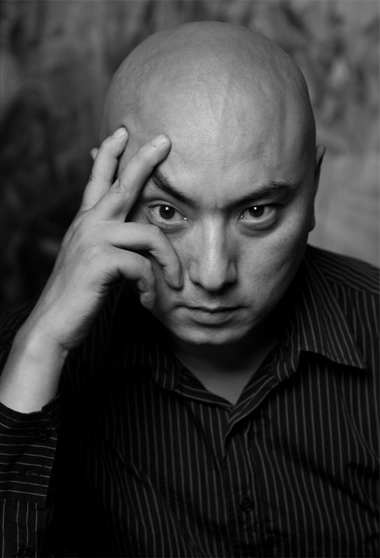
Design director:SONG XU
Assistant designe: CHEN YUE, YANG YAN
Photographer :HAHA LU
Design Company:Nanjing Xusong Decoration Design Co., Ltd.
Address:No. 52 Alfalfa Garden Street, Qinhuai District, Nanjing City, Jiangsu Province, China
Tel:86-13770759974
Mail:122334153@qq.com


