Design of Healthcare Space
Project
Introduction
Project name:Keen Dental Hospital
Design Concept: A Journey of Dental Art
Design Keywords: Modern/Fashionable/Natural/Technological/Medical/Health
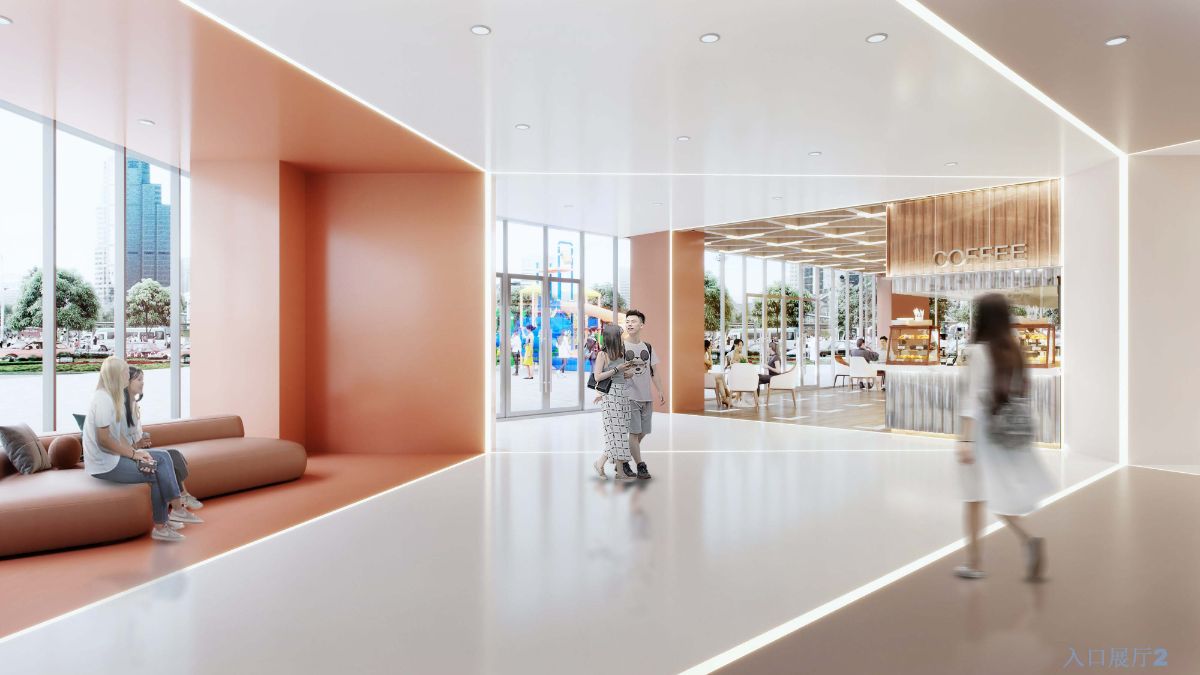
1F Hospital Entrance: Modern/Simple/Fashionable
The hospital entrance is located on the ground floor of the building, with other commercial spaces on both sides. As our main focus is the hospital project, the separation and integration of medical and general commercial spaces were key considerations in the design of the ground floor. Both the flow of people and the integration of design styles faced significant challenges, as we needed to consider both medical and commercial aspects.
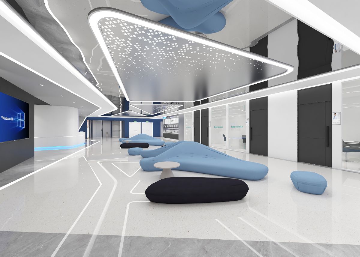
The designer chose to selectively open up the non-load-bearing walls between the commercial and medical areas, creating a space layout that incorporates a coffee lounge area. On one side is the commercial area, and on the other side is the hospital lobby, seamlessly connected without any sense of discordance. The reception, commercial, and waiting/resting areas are integrated into a cohesive whole. The style adopts a modern and minimalist approach, using large color blocks and simple lines to divide the space in an orderly manner
2F: Natural/Healthcare/Medical
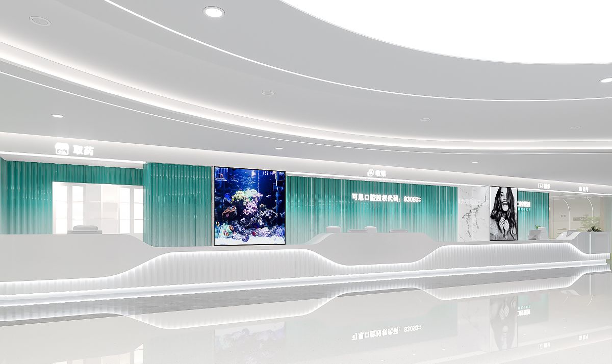
In the kingdom of art, a tooth crosses rivers, mountains, and forests, diving into the ocean. As the main space of the hospital, the designer positioned the entire space structure as "bringing nature into the indoor space" during the initial design phase. Upon exiting the elevator, a long, multifunctional bar counter for reception, registration, payment, and medication catches the eye. Through the use of lighting and shapes, the designer breaks tradition and showcases the modernity of the hospital.
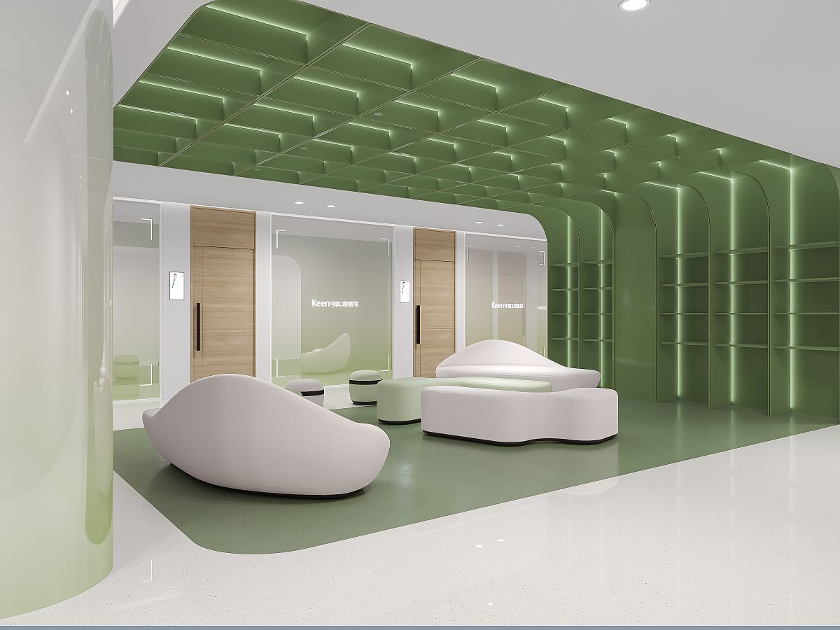
Opposite the service counter is a patient relaxation area, where the designer incorporates the local culture of Mount Tai, allowing the tooth to traverse through mountains and rivers, benefiting countless families at the foot of Mount Tai.
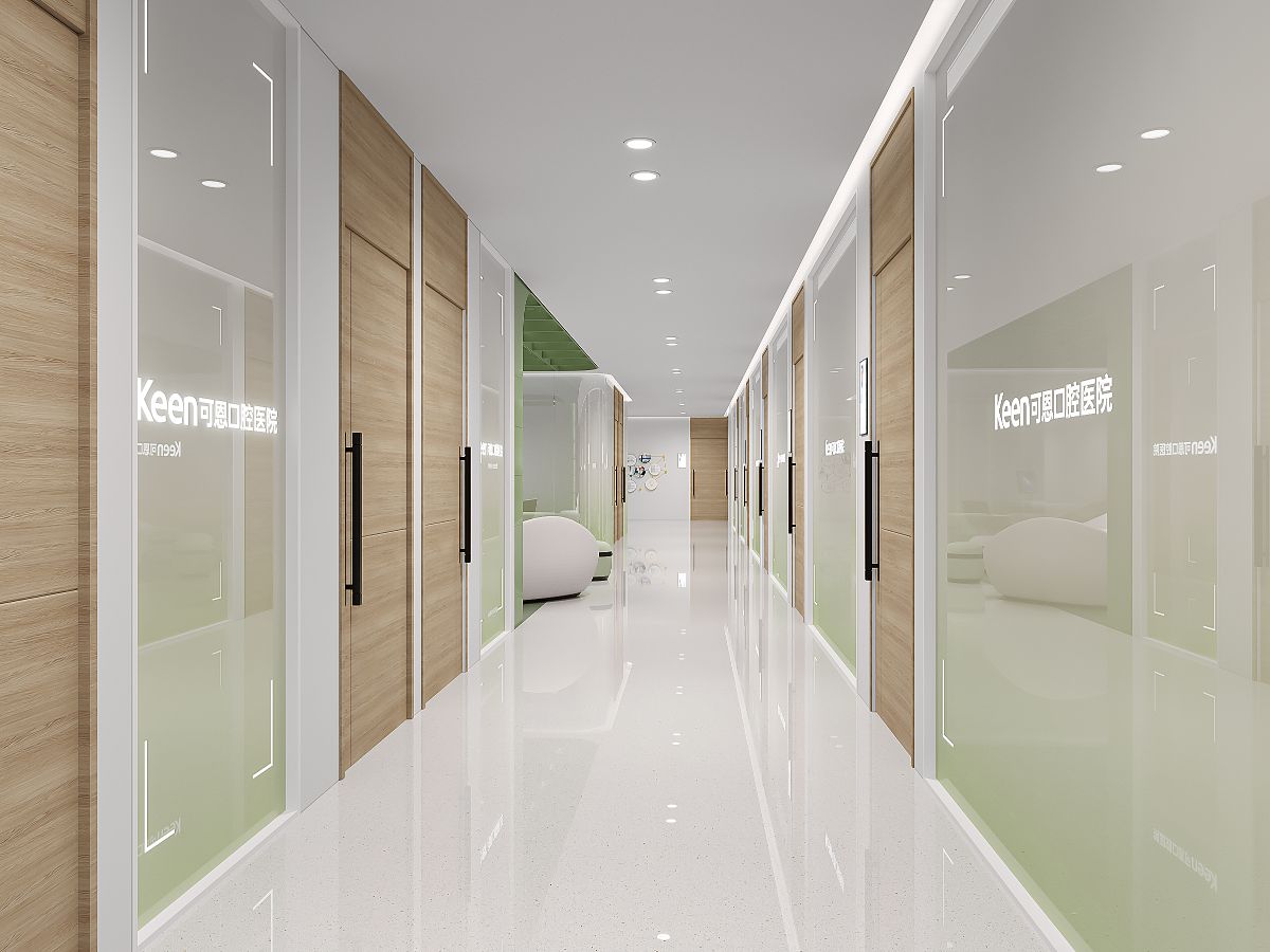
From the relaxation area to the treatment space, the designer blends the natural wood color with a large area of green, making the entire medical area intriguing. People inside the hospital seem to truly immerse themselves in nature, with a tooth traveling and weaving through the forest. The green color not only represents health but also adds vitality to the entire space. Through the use of stretched color blocks, the entire space is filled with an artistic atmosphere.

Design by NingBo ZhiYe Decoration Engineering Co.,Ltd
Ningbo Zhiye Decoration is the earliest research institution in China dedicated to dental spatial design. Since its establishment in 2008, the company has provided excellent design works for over 6,000 domestic institutions. Zhiye aims to provide comprehensive design solutions for the dental medical industry.
After 15 years of development, Zhiye has formed a core focus on dental medical spatial design, with subsidiary services such as brand design, spatial design, soft decoration design, specialized design and production of medical cabinets, and engineering construction services. The goal is to cover the entire industry chain of the dental medical industry, empower the dental medical industry, promote standardized and standardized development in the dental industry, and enhance the brand value of dental medical.
Currently, the company has served over 6,000 medical institutions, including renowned dental medical units such as Zhejiang University School of Stomatology, Hangzhou Dental Hospital, Shandong University School of Stomatology (Stomatological Hospital), Yinzhou Stomatological Hospital, Meijin Dental Group, Koen Dental Group, Tongce Group, Angel Dental Chain, Yuhui Dental Chain, Youmu Dental, and Hengmei Dental. It is a leading provider of dental medical brand services in China.
